print, glass, engraving
#
portrait
#
baroque
# print
#
glass
#
genre-painting
#
engraving
Dimensions: height 202 mm, width 149 mm
Copyright: Rijks Museum: Open Domain
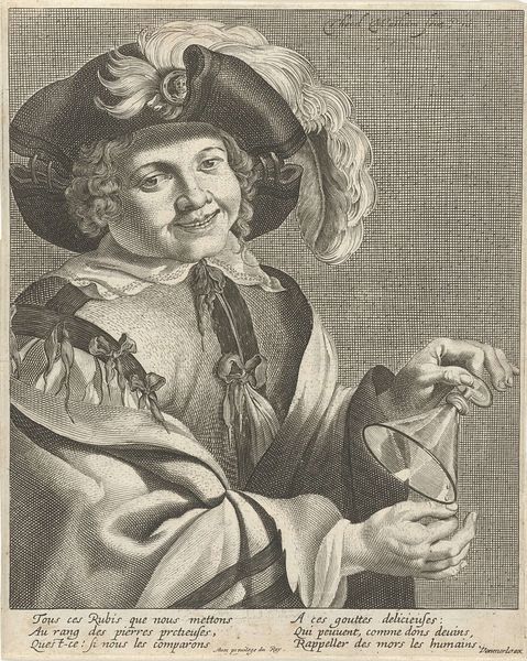
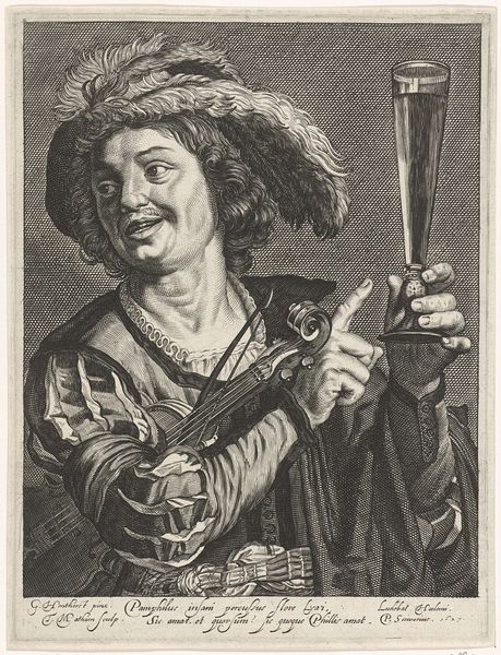
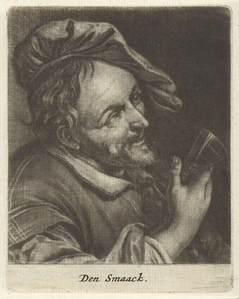
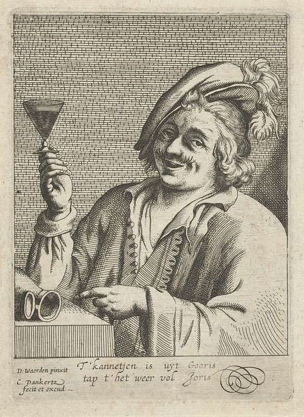
Curator: Before us is “Man met viool en roemer,” or “Man with Violin and Römer,” an engraving dating from the period of 1615 to 1726, attributed to Theodor Matham. It’s currently held here at the Rijksmuseum. Editor: What a boisterous character! He’s all diagonals and curves, from the sweep of the feathered hat to the swirling end of the violin’s neck. And look at that expectant, almost gleeful grin. Curator: Indeed! The artist skillfully uses the engraving technique to render light and shadow, drawing our eyes to the texture of the glass he’s holding and the sheen on his flamboyant plumage. Note the contrast with the stark crosshatching in the background, almost trapping the subject in our view. Editor: It’s as if he’s trying to charm the viewer, invite us to join the revelry, right? It also speaks to the rise of genre paintings during that era. The tavern scene or a depiction of merry music-making would be socially permissible themes. Did this work circulate widely? Curator: Precisely, the inscription at the bottom provides the invitation: "Je veux mourir au cabaret - Entre le blanc et le cleret.” Roughly translated as, "I want to die in the tavern between the white wine and the claret.” The inscription lends a further aspect, like so many prints, suggesting how the work’s political or moral impact would influence those that acquired it. Editor: It makes me wonder about Matham's intent. The subject seems a little coarse, a little too pleased with himself, doesn't he? And why depict someone clearly enjoying a less-than-genteel setting, knowing its place as a printed image in someone’s household? Is it an endorsement, or perhaps a satirical commentary on social excess? Curator: An excellent question! It's difficult to say definitively, but that tension is inherent to the visual language. Ultimately, it leaves it up to each individual viewer to determine for themselves. The strength of the print relies less on how and why, and relies more on the technical expertise the artist utilized, rendering a sense of tone throughout the cross-hatching. Editor: Absolutely! A study in texture and tonal contrasts that’s also a snapshot into the cultural world it reflects. Thanks! Curator: It was my pleasure!
Comments
No comments
Be the first to comment and join the conversation on the ultimate creative platform.
More like this