print, engraving
#
portrait
# print
#
pen illustration
#
pen sketch
#
old engraving style
#
mannerism
#
pen-ink sketch
#
pen work
#
engraving
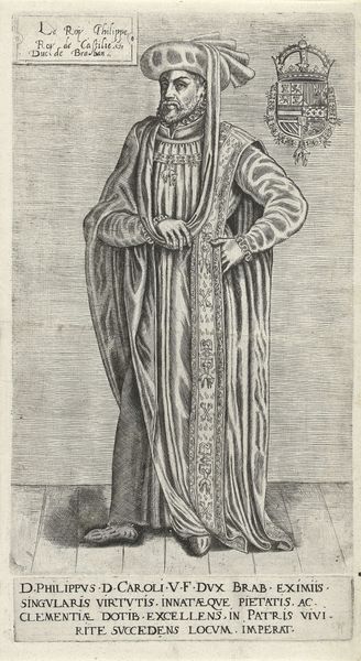
Dimensions: height 293 mm, width 178 mm, height 34 mm, width 178 mm
Copyright: Rijks Museum: Open Domain
Editor: Here we have a print titled *Portret van Filips de Schone*, or Portrait of Philip the Fair, created sometime between 1546 and 1562 by Frans Huys. The fine lines and details in this engraving are just incredible. The subject seems rather somber, almost melancholy. What's your take? What do you see in this piece, its composition, and what it might represent? Curator: It whispers tales, doesn't it? Look at the man's eyes – distant, regal, and touched with a certain weariness, perhaps from carrying the weight of an empire? Notice the detail in his robes versus the flatness of the background; it's a dance of status and… well, emptiness? To me, Mannerism often explores that tension between idealized form and the messy reality of power. The inscription below, a lament for his untimely death – does it romanticize or honestly reflect his impact, I wonder? Editor: That tension is definitely palpable! I was so focused on the subject that I hadn't really considered the contrast. Curator: It’s the artist making choices! Also, observe the Habsburg coat of arms. What might its inclusion suggest about Frans Huys’s intentions in creating this portrait? Propaganda? Adoration? Memory? All of the above? Editor: Probably a potent mix! I guess I was thinking more about artistic expression than the more political angles. Curator: Oh, but my dear, is there *ever* a line between the two? A challenge for us all, wouldn’t you say? Thank you, Philip, for this tiny mirror to ponder big questions. Editor: Absolutely, a perfect encapsulation of the era. That gives me a fresh perspective, thanks!
Comments
No comments
Be the first to comment and join the conversation on the ultimate creative platform.
More like this