drawing, ink
#
portrait
#
drawing
#
imaginative character sketch
#
quirky sketch
#
animal
#
pencil sketch
#
personal sketchbook
#
ink
#
sketchwork
#
ink drawing experimentation
#
pen-ink sketch
#
sketchbook drawing
#
storyboard and sketchbook work
#
sketchbook art
#
realism
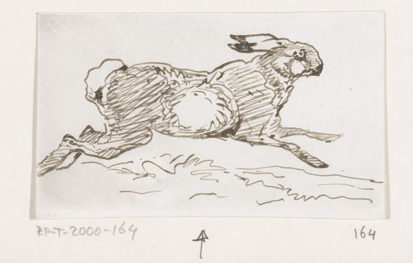
Dimensions: height 111 mm, width 132 mm
Copyright: Rijks Museum: Open Domain
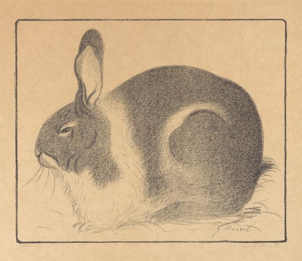
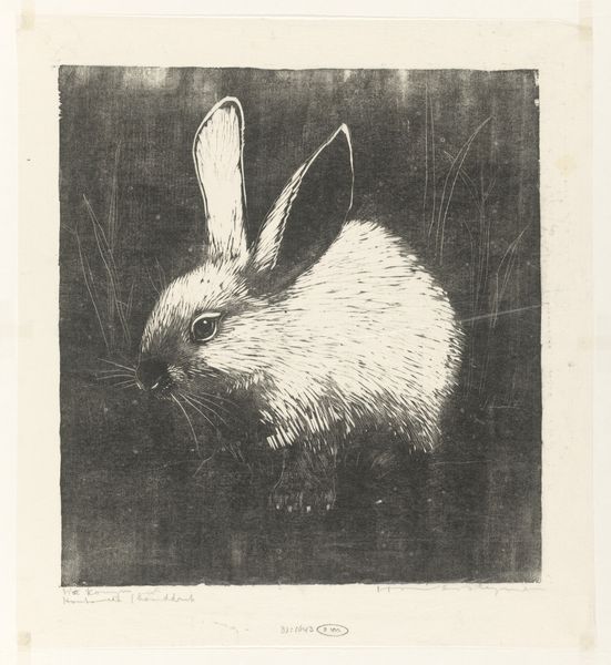
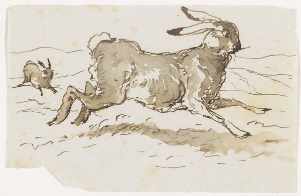
Editor: Here we have "Konijn," which I understand to be "Rabbit" in Dutch, created by Henri Verstijnen sometime between 1892 and 1940, in ink and graphite. It's such a simple sketch, but the line work gives the rabbit such a palpable form. What stands out to you about this work? Curator: What strikes me immediately is Verstijnen's deft use of line. Note the density and direction of the strokes; they model the rabbit’s form, creating volume and suggesting the texture of its fur. Consider how the density varies to define shadow and light. Where do you see the most contrast? Editor: Certainly, the underside of the rabbit is heavily shaded, creating a sense of roundness. And those small, almost frantic lines around the base suggest the straw it's sitting on, providing ground. But I'm curious about the overall effect. It feels unfinished, almost ephemeral. Curator: Precisely. The 'unfinished' quality is not a detraction, but an integral part of its aesthetic. The spareness of the background against the carefully articulated animal is deliberate. Observe the deliberate constraint in detailing only key elements - eyes, ears and then diffuse stokes everywhere else, this reinforces what could be its 'essence'. The medium itself -- ink and graphite -- invites a sense of immediacy and intimacy with the creative process. Would you agree that is successful? Editor: Yes, it highlights Verstijnen's skill in capturing the essence of the animal with such limited means. It’s made me reconsider how much information a work of art actually needs to convey a complete idea. Curator: Indeed. By paring down to the essentials, the artist directs our focus to form and texture, inviting contemplation on the inherent qualities of the subject. The line work gives depth to form beyond the typical static. A form study, as well as it seems. Editor: I appreciate how looking closely at the lines reveals so much about Verstijnen's intent and the impact of the drawing.
Comments
No comments
Be the first to comment and join the conversation on the ultimate creative platform.
More like this