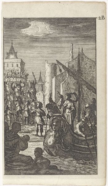
drawing, print, etching, ink, engraving
drawing
baroque
pen drawing
etching
figuration
ink
cityscape
history-painting
engraving
Dimensions: height 112 mm, width 88 mm
Copyright: Rijks Museum: Open Domain
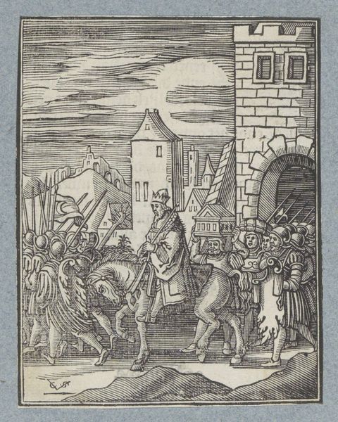
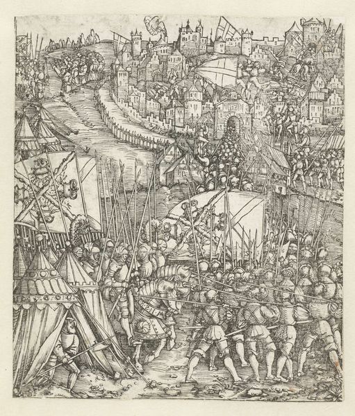
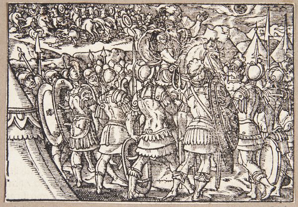
Curator: This is "Krijgslieden voor een stad," or "Warlords Before a City," an etching and engraving crafted by Christoffel van Sichem II, dating roughly to 1645-1646. It’s part of the Rijksmuseum's collection. Editor: My initial response is one of organized chaos! There’s so much detail packed into a relatively small space, and the repetition of lines and forms creates a dynamic, almost vibrating effect. Curator: It is densely packed, isn't it? Sichem was known for these detailed narrative prints. What I find striking is how the tools—the etching and engraving techniques—lend a particular visual language. Consider the lines, the cross-hatching: they communicate not only form, but texture and depth using very specific and limited means. It makes you think about production and availability to the public in the mid-17th century. Editor: Exactly. It is a fascinating study in contrasts. The city in the background is rigid with sharp geometric shapes, while the soldiers in the foreground display a strange dynamism; and even then their rigid spears counter that dynamism. Curator: The socio-political context here is vital. Prints like these played a role in shaping public perception, of authority, perhaps even justifying military action in a time of widespread conflict. The figures are ennobled, their armor meticulously rendered through laborious efforts. What stories do you think such details convey? Editor: Well, given the precise linear quality and stark contrasts, there’s a palpable sense of both anticipation and anxiety. I look at those warlords and it evokes an aura of contained anticipation, as if these subjects are aware of and even poised for imminent military actions against their distant city destination. Curator: Yes, the composition almost directs our gaze towards the city, framing it as the inevitable object of their focus. The social role of images and printed media comes to the forefront when analysing its historical interpretation, I find. Editor: Absolutely. Looking closer at the printmaking itself reveals Sichem’s technique: the build-up of tiny parallel lines create shading that, from afar, coalesce into solid figures. Each tiny mark contributes to the overall structure and narrative. The visual vocabulary reinforces that sense of hierarchical structures and collective strength that was desired at that period. Curator: And isn't that juxtaposition so symbolic, showing the means of production emphasizing this controlled yet somewhat fragile socio-economic dynamic of power between city dwellers and its external invaders. We have here not only a piece of visual communication but also a testament to the printing industry's increasing capacity to participate in and perhaps dictate such perspectives. Editor: Fascinating; analyzing the balance of lines, tone and shapes brings forth many historical implications to consider about this unique etching. Curator: Indeed; it is by analyzing these printmaking methods from 350 years ago that makes the narrative not just visual but material and human.
Comments
No comments
Be the first to comment and join the conversation on the ultimate creative platform.