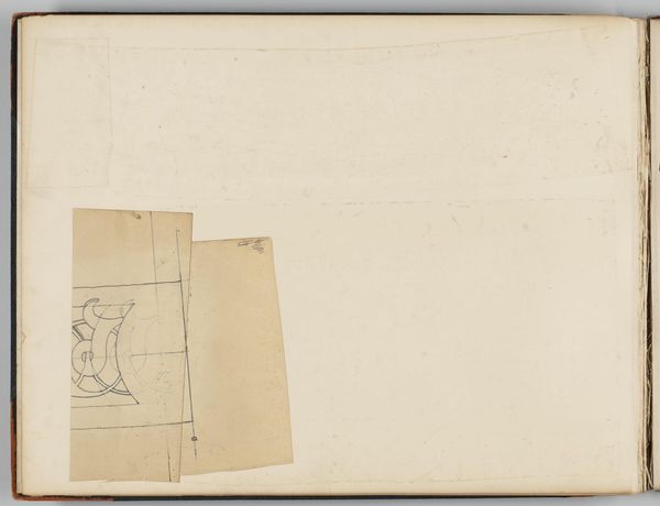
Ontwerp voor een briefhoofd van Motshagens handel in apotheek- en drogisterijbenodigdheden 1884 - 1952
0:00
0:00
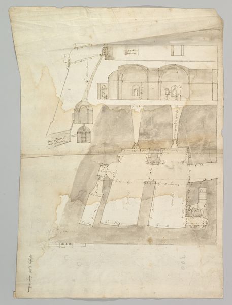
drawing, paper, ink, architecture
#
drawing
#
aged paper
#
toned paper
#
light pencil work
#
quirky sketch
#
sketch book
#
paper
#
personal sketchbook
#
ink
#
sketchwork
#
geometric
#
line
#
sketchbook drawing
#
storyboard and sketchbook work
#
sketchbook art
#
architecture
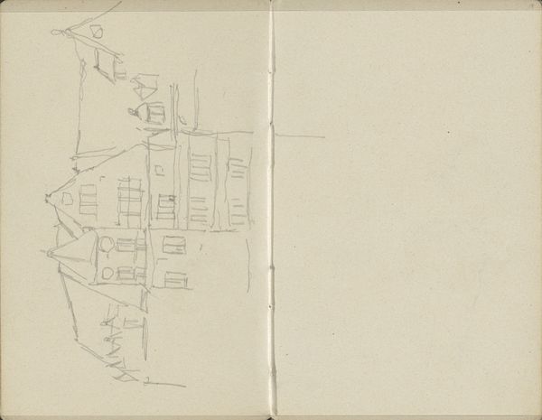
Dimensions: height 127 mm, width 208 mm
Copyright: Rijks Museum: Open Domain
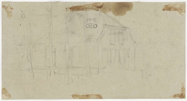
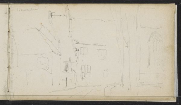
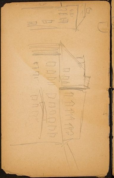
This is Reinier Willem Petrus de Vries's design for a letterhead, made with pencil. I love seeing the bones of a design, you know? It's all laid bare here, the marks plain as day. The drawing is so simple, yet so effective. Look at the stark black lines against the off-white paper. It is a straightforward image of a building, maybe even a bit clumsy but I am drawn to its imperfections. The hand of the artist is so present, the materiality so clear. I see how the lines were built up, each one considered, each one contributing to the overall image. It reminds me of those early modernist architects, the ones who were so obsessed with function, with stripping away the excess. Or even some of Agnes Martin's grids, where the slightest variation in line weight becomes deeply meaningful. Ultimately, it's a testament to the power of simplicity, of embracing the beauty in the raw, the unfinished, the imperfect.
Comments
No comments
Be the first to comment and join the conversation on the ultimate creative platform.
More like this