Copyright: Rijks Museum: Open Domain
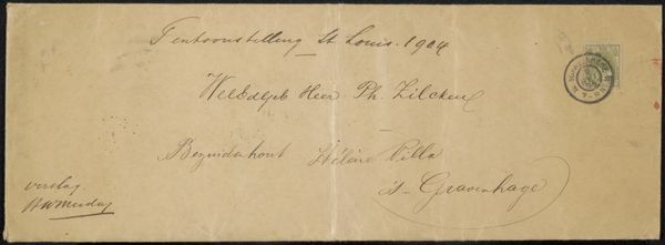
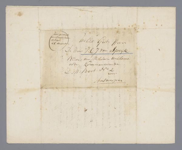
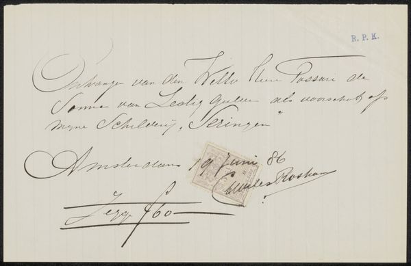
Curator: We're looking at "Envelop aan Philip Zilcken" by Paul Verlaine, crafted before 1899. It's a drawing on paper, using ink, held in the collection of the Rijksmuseum. What's your first reaction? Editor: A ghostly echo. The faded ink and the worn paper speak volumes about time and memory. It evokes a sense of fragile communication across years. Curator: Verlaine's romantic calligraphy provides a visual structure that mirrors the very act of sending and receiving. Note how the elegant flourishes counteract the simple utilitarian form of the envelope. Editor: Absolutely, but consider what an envelope represents. It’s a vessel for secrets, emotions, perhaps even desperate pleas. This particular script hints at sophistication, yet there’s a melancholy undertone suggested by the wispy quality of the marks. The paper’s fragility also speaks of human vulnerability. Curator: Agreed. The paper's surface texture acts as a key structural element that gives each mark added emphasis and depth. Even the blueness of the faded stamp offsets the off-white color of the paper itself, forming a microcosm of color relations that work as both harmony and counterpoint. Editor: What's striking is that Verlaine chose this ordinary object as his canvas, elevating it to the realm of art. Think of the power of such small things. Love letters that shift empires or casual postcards from friends or family—they create lasting human connections. Curator: Indeed, there is a deliberate and beautiful imbalance here. A formal system broken, but always controlled. He creates, erases, then builds again. It is communication formalized, not standardized. Editor: Yes, what starts as simply informative transcends the mundane; an ordinary vessel becoming imbued with romantic sensibilities. This envelope becomes less about where it goes and more about the human hands it traveled through and who longed for it when it arrived. Curator: Precisely, a fascinating study in contrasts—the intersection between the epistolary and aesthetic forms. Editor: An evocative visual testament to the human desire for contact. Thank you for your insight!
Comments
No comments
Be the first to comment and join the conversation on the ultimate creative platform.
More like this