graphic-art, print
#
graphic-art
#
shape in negative space
#
art-nouveau
#
childish illustration
#
cartoon like
#
cartoon based
#
animal
#
shading to add clarity
# print
#
old engraving style
#
figuration
#
geometric
#
limited contrast and shading
#
cartoon style
#
shading experimentation
#
clip art
#
monochrome
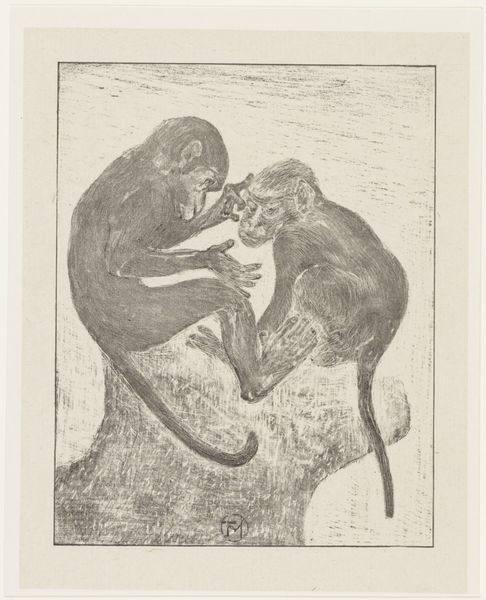
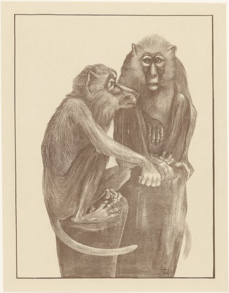
Dimensions: height 116 mm, width 155 mm
Copyright: Rijks Museum: Open Domain
Curator: Well, isn’t this curious? Theo van Hoytema’s “Catalogusomslag met twee apen” or "Catalog Cover with Two Monkeys" created around 1900, part of the Rijksmuseum collection. A graphic print featuring, as the title suggests, two primates in monochrome. What are your immediate thoughts? Editor: Strikingly simple. It reminds me of those old cartoonish illustrations, something almost medieval, but with a whimsical touch. There's a minimalist quality despite the subject being, well, monkeys. Curator: The "old cartoonish illustrations" style might connect with Art Nouveau’s influence. It promoted a return to craftsmanship and simplified, stylized forms inspired by nature. Perhaps Van Hoytema, known for his naturalistic depictions, saw in these primates an opportunity to explore form and character. A return to a less developed time period, if you will. Editor: I'd agree there. It plays into that fascination with animal symbolism prominent at the time. Think of apes as stand-ins for human behavior – mischievousness, imitation, perhaps even a satirical view of societal rituals reflected through these creatures meeting hand-to-hand. Also there is an emptiness in this that makes me feel like it is yearning to be developed in some way, even to be child-like in design, makes you wonder, what else would these characters get up to if given life! Curator: I find that element especially interesting, thinking about cultural memory and continuity. For centuries, monkeys and apes in art served as caricatures, reflecting human foibles, vanity, or social climbing. Is Van Hoytema continuing that visual tradition or subverting it by depicting an almost gentle interaction? Are they exchanging something valuable, some vital human-like essence? Editor: I lean toward seeing it as subversion. The Art Nouveau aesthetic often questioned traditional hierarchies. Making these creatures, usually symbols of mockery, the focal point, framed within geometric shapes and minimalist aesthetics, is a subtle political statement, maybe an empathy not often afforded in other forms of visual imagery. Curator: Precisely, or perhaps highlighting that boundary between animal instinct and conscious decision is quite thin after all, not at all obvious. In truth they seem to look a lot more self-assured than much of society did in the early 1900’s, a very strange thought! Editor: In the museum context, think about how an image like this functions. It's a cover, a visual invitation. Its playful tone might suggest the contents are engaging or informative – subtly guiding perceptions even before the viewer engages directly with the subject matter. I see these as symbolic doormen guarding their gallery! Curator: A wonderfully put final note. Indeed! Now I'm eager to explore how else animals functioned as more than mere beasts! Editor: As am I, I feel like there may be far more going on with these little animals and images than first meet the eye!
Comments
No comments
Be the first to comment and join the conversation on the ultimate creative platform.
More like this