Copyright: National Gallery of Art: CC0 1.0
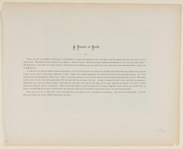
Curator: At first glance, I'm struck by the stark simplicity. It feels almost like a page torn from an ancient illuminated manuscript, but stripped down, very minimal. Editor: Exactly. What you’re looking at is "Psalm I," a print on paper by Charles Knowles, created around 1957. Knowles, although perhaps not a household name, worked conceptually using graphic design, as you see, exploring how image and text could resonate. He engages powerfully with typography here. Curator: Typography is certainly an evocative medium—it always has an impact. The lone Roman numeral "I" carries echoes of traditional illuminated books. This numeral looms—like a weighty declaration or a visual anchor that beckons reflection. And what an opening text! I'm reminded of the very foundations of Judeo-Christian moral narratives. Editor: Indeed. It functions as both art object and a declaration of principles. Structurally, you'll notice the interplay between the solid block of the numeral and the carefully typeset verses of Psalm 1. The negative space is as important as the inked areas, giving the work a sense of balance and rhythm. It reads sequentially and visually, really offering layers for contemplation. Curator: This contrast mirrors the symbolic content: the 'blessed man' against the 'ungodly', order contrasted with dispersal, the eternal and immutable word against the transient and temporal. Chaff being scattered— such a powerful image that carries across time. It even feels psychologically apt, embodying fundamental archetypes of the human condition. Editor: Semiotically, the text operates as both image and text, of course. We visually 'read' the lines just as we derive literal meaning, it seems an act of conscious art making and also invites the viewer to meditate on its themes. The muted colors, too, play their part – there's a quiet authority in it's graphic declaration. Curator: A really wonderful example of conceptual art imbuing traditional religious symbolisms. To me, it transcends simple representation, providing almost an emotive echo from an older cultural canon, allowing for the interpretation of archetypes that still resonate to this day. Editor: And, structurally speaking, that quiet color creates an interesting dynamism when you focus in and out of the negative space, forcing one to reflect on its components—visually and literally—well after stepping away from the image.
Comments
No comments
Be the first to comment and join the conversation on the ultimate creative platform.
More like this