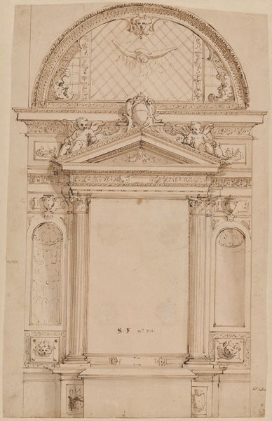
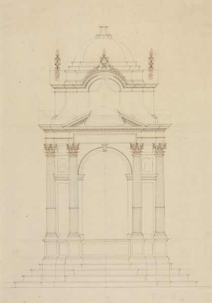
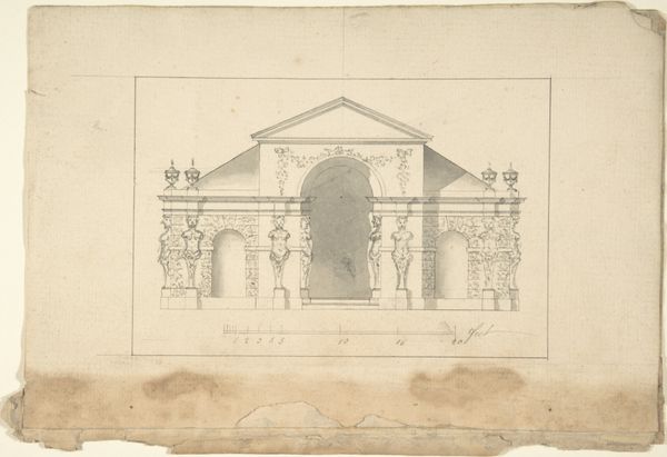
Ontwerp voor een tuinpaviljoen van gedeeltelijk verguld smeedwerk, met eronder een plattegrond 1785
0:00
0:00
drawing, paper, ink, architecture
#
drawing
#
neoclacissism
#
landscape
#
paper
#
ink
#
geometric
#
architecture
Dimensions: height 566 mm, width 449 mm
Copyright: Rijks Museum: Open Domain
Curator: This meticulously rendered drawing is titled “Ontwerp voor een tuinpaviljoen van gedeeltelijk verguld smeedwerk, met eronder een plattegrond,” or, in English, “Design for a garden pavilion of partly gilded wrought iron, with a ground plan underneath” by Elias Samuel Korschelt, dating to 1785. It’s a symphony of ink and paper. What’s your first take? Editor: Airy. Almost weightless. Despite the geometric rigidity, there's a delicate, ethereal quality to the lines. It’s all subtle grays and tans against the white background—restrained but promising elegance. Curator: Absolutely. Observe how Korschelt utilizes the grid not merely as structure but as a visual motif that's repeated and refined throughout the pavilion’s design, influencing both the verticality of the supports and the dome's curvature. The interplay of lines evokes a sense of both containment and expansion. Editor: The centrally placed, almost sun-like ornament feels almost pagan, though softened by the architectural restraint. It breaks the geometry just enough to add life. I see connotations with light, fertility, and growth. This symbol disrupts the rigidity, almost like nature reclaiming constructed space. Curator: Precisely. One cannot ignore the neoclassical elements at play, though. Notice how Korschelt subtly uses recurring motifs to imply nature and geometry in conversation. How do we interpret its significance within the broader cultural landscape? Editor: Considering this was drafted in 1785, right before the French Revolution, it seems deeply connected to that era's yearning for an idealized pastoral escape, where leisure and nature meet the established order. It’s wishful thinking crystallized in ink. The symmetry suggests control over chaos, while the touches of "gilded" suggest wealth. Curator: And yet it also stands as a purely formal exercise. Look at the strategic voids, those rhythmic pauses between structural elements, each is just as important as the pen strokes. Editor: Indeed. While seemingly lighthearted and escapist, the structure resonates on multiple levels – personal sanctuary and commentary on societal values during a period on the precipice of immense change. A beautiful articulation. Curator: Well put. I find myself more appreciative of the way Korschelt merged visual theory with the era's obsession for perfect form.
Comments
No comments
Be the first to comment and join the conversation on the ultimate creative platform.
More like this