graphic-art, print, paper, typography, ink, engraving
#
graphic-art
#
script typography
#
hand-lettering
#
dutch-golden-age
# print
#
old engraving style
#
hand drawn type
#
hand lettering
#
paper
#
typography
#
ink
#
hand-drawn typeface
#
fading type
#
pen work
#
handwritten font
#
engraving
#
calligraphy
#
small lettering
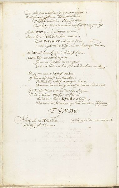
Dimensions: height 294 mm, width 355 mm
Copyright: Rijks Museum: Open Domain
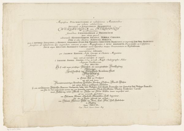
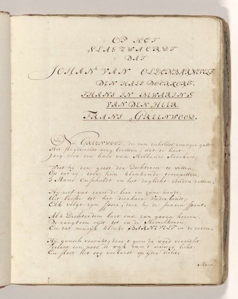
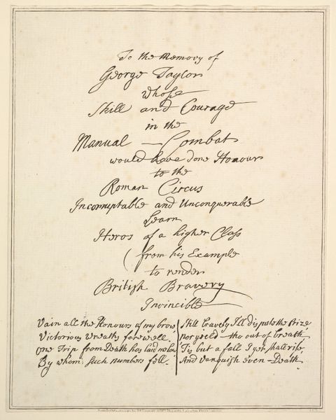
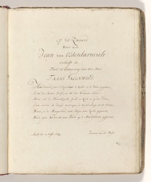
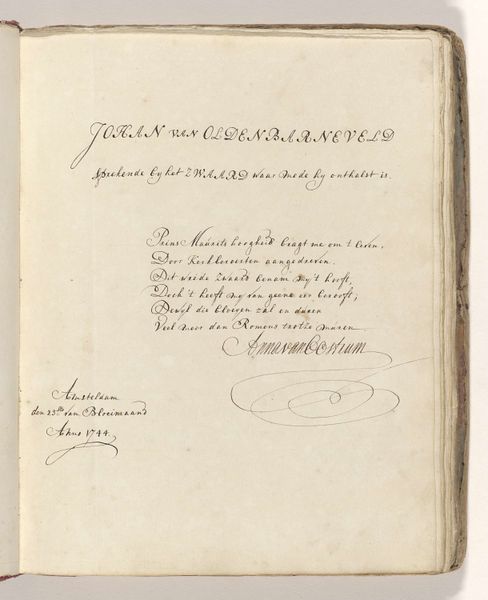
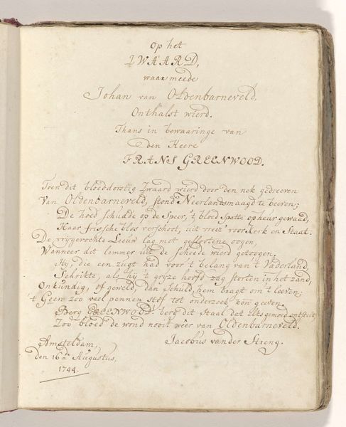
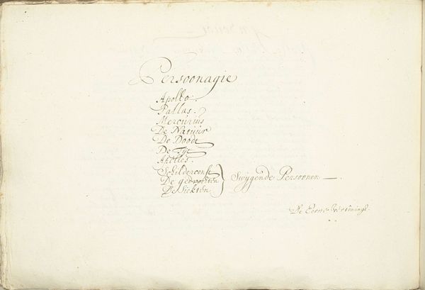
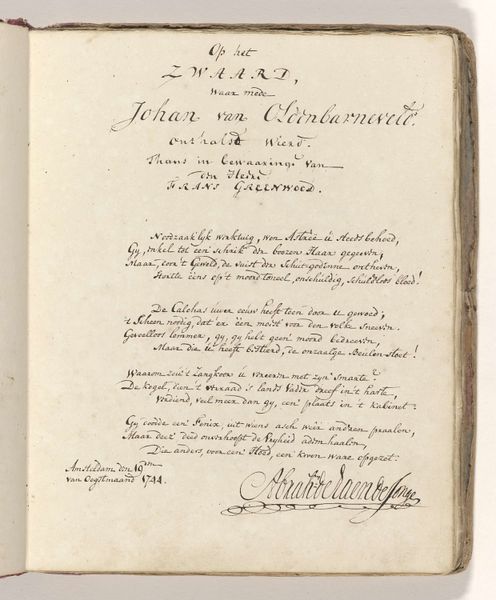
Curator: This is the title page of the Lucas van Leyden collection. Created between 1680 and 1721, it presents as a rather unassuming example of graphic art from the Dutch Golden Age. Editor: My immediate impression is one of intricate craftsmanship; it feels like holding a tangible piece of history, yet simultaneously, it fades almost into ephemerality with its delicate lines on aged paper. Curator: Indeed. Its materiality is fundamental to understanding its value. We're looking at ink on paper, an engraving. Consider the physical act of production; the painstaking labour involved in hand-lettering this text with precision. Think about the networks of paper production, ink manufacture, and printmaking that made such an object possible, a complex material exchange. Editor: From a historical perspective, what strikes me is the context in which this title page functions. It acts as a portal, guiding the reader into a collection but it also signifies the status of Johannes Wtenbogaerdt. The text indicates Wtenbogaerdt, an Amsterdam public treasury official collected and compiled the artworks over half a century. How do those institutional networks contribute to this page's existence? Curator: Absolutely. The Dutch Golden Age was a time of burgeoning capitalism, of a new public. Notice how the script typography itself conveys both authority and refined taste? The lettering isn’t just informative; it’s performative, communicating wealth and knowledge, key tools for solidifying political standing. Editor: Precisely! This "simple" title page encapsulates broader cultural shifts, doesn’t it? It bridges artistic accomplishment with political power and the emerging role of civic institutions in shaping artistic canons. How do we even begin to understand the significance of a collection through the lens of its title page? Curator: For me, the emphasis is always on the hand and how the artist mediated culture through materiality and how its circulation solidified artistic value at the time. It also forces me to contemplate contemporary hand lettering practices on the internet, which although visually reminiscent are drastically different in production, distribution and subsequent cultural role. Editor: A fascinating juxtaposition. And I'm left pondering how our interpretation of this work might shift with further insights into the personal narrative of both Lucas van Leyden, Johannes Wtenbogaerdt and the specific institutional dynamics in Amsterdam during the Golden Age.
Comments
No comments
Be the first to comment and join the conversation on the ultimate creative platform.
More like this