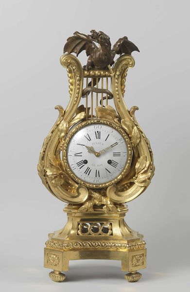
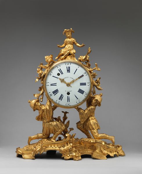
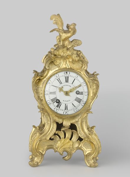
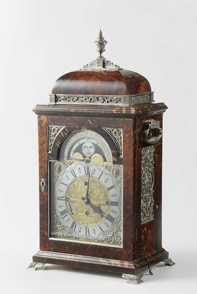
Tafelklok of consoleklok, gefineerd met marqueterie van koper en tin op een fond van schildpad c. 1780 - 1830
0:00
0:00
Dimensions: height 96.5 cm, width 48.5 cm, depth 20.5 cm
Copyright: Rijks Museum: Open Domain
Curator: What a flamboyant object. So ornate, and clearly intended as a statement of status and taste. Editor: Absolutely, and that's exactly what I think when looking at this so-called "Tafelklok of consoleklok." Made around 1780-1830, it demonstrates the convergence of opulence, technological advancement, and the commodification of time during the late 18th and early 19th centuries. How might its design reflect the prevailing power structures and social anxieties of the time? Curator: Power structures, anxieties... well, let's first address the immediate aesthetic impact. The clock’s form is really the epitome of Rococo design. Notice the elaborate marquetry using copper, tin, and tortoiseshell. It really is a testament to meticulous craftsmanship and attention to detail. And what do you think of the interplay of light and shadow across the brass ornamentation? Editor: The opulence definitely tells a story. This piece served a purpose beyond simply telling time. I'd argue its elaborate decoration highlights the rise of consumer culture and the importance of decorative arts as a symbol of social distinction and privilege during this period. Who owned clocks like these and what did time mean to them versus other social groups? Curator: That's true, this certainly isn't just about temporal awareness. I would also focus viewers' attention on how its physical presence and intricate detailing demand contemplation. Consider the contrast between the smooth dial and the busy frame around it... the maker is really emphasizing shape and form here. The material itself holds an interest. Editor: For me, that materiality represents how those in power would like to see themselves. We might ask if the feminized curves, along with that figure atop, suggest not only that time has arrived but also can be contained and dominated through control and patriarchal dominance? Curator: I appreciate that you call the clock into a discussion about patriarchy but to be honest it appears that, although detailed, the metal artwork atop resembles Cupid, readying his arrow. The figure strikes me as both ornamental and narrative—a playful addition atop the rest of the clock's serious job! Editor: Well, it does invite an interrogation of values and world views during that specific period. And from that consideration alone, I now read clocks like these as reflections of those particular class assumptions and imperial appetites. Curator: Still, I think if we only look at historical materialism we miss the intrinsic beauty and technical virtuosity embedded in the object itself. Both perspectives add valuable layers of meaning.
Comments
No comments
Be the first to comment and join the conversation on the ultimate creative platform.
More like this