About this artwork
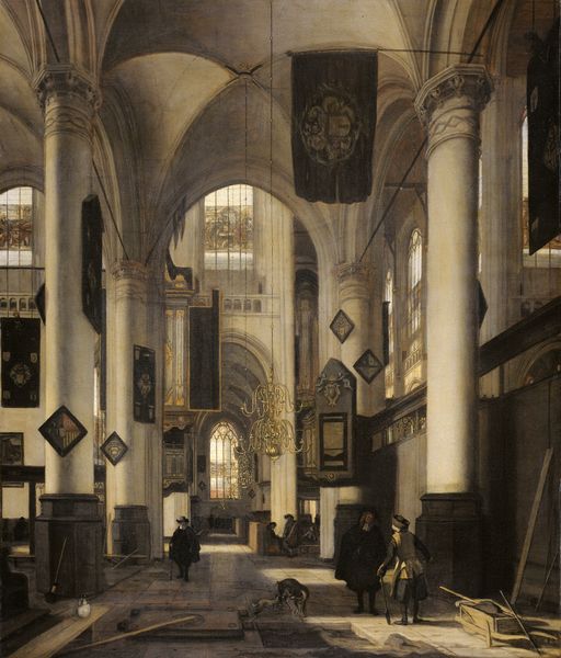
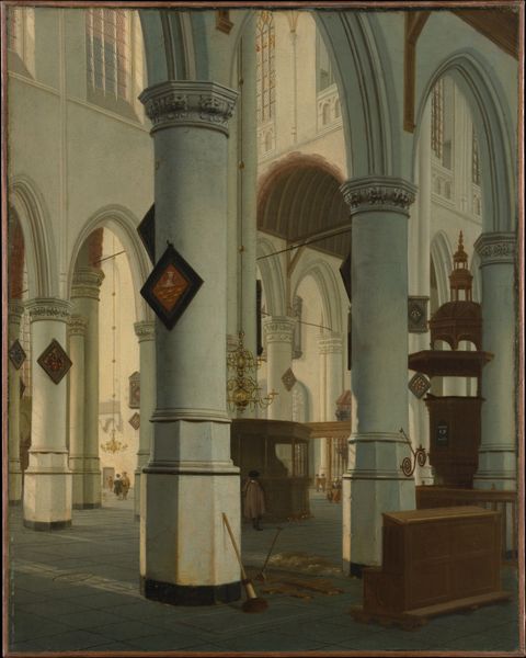
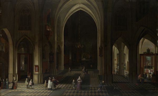
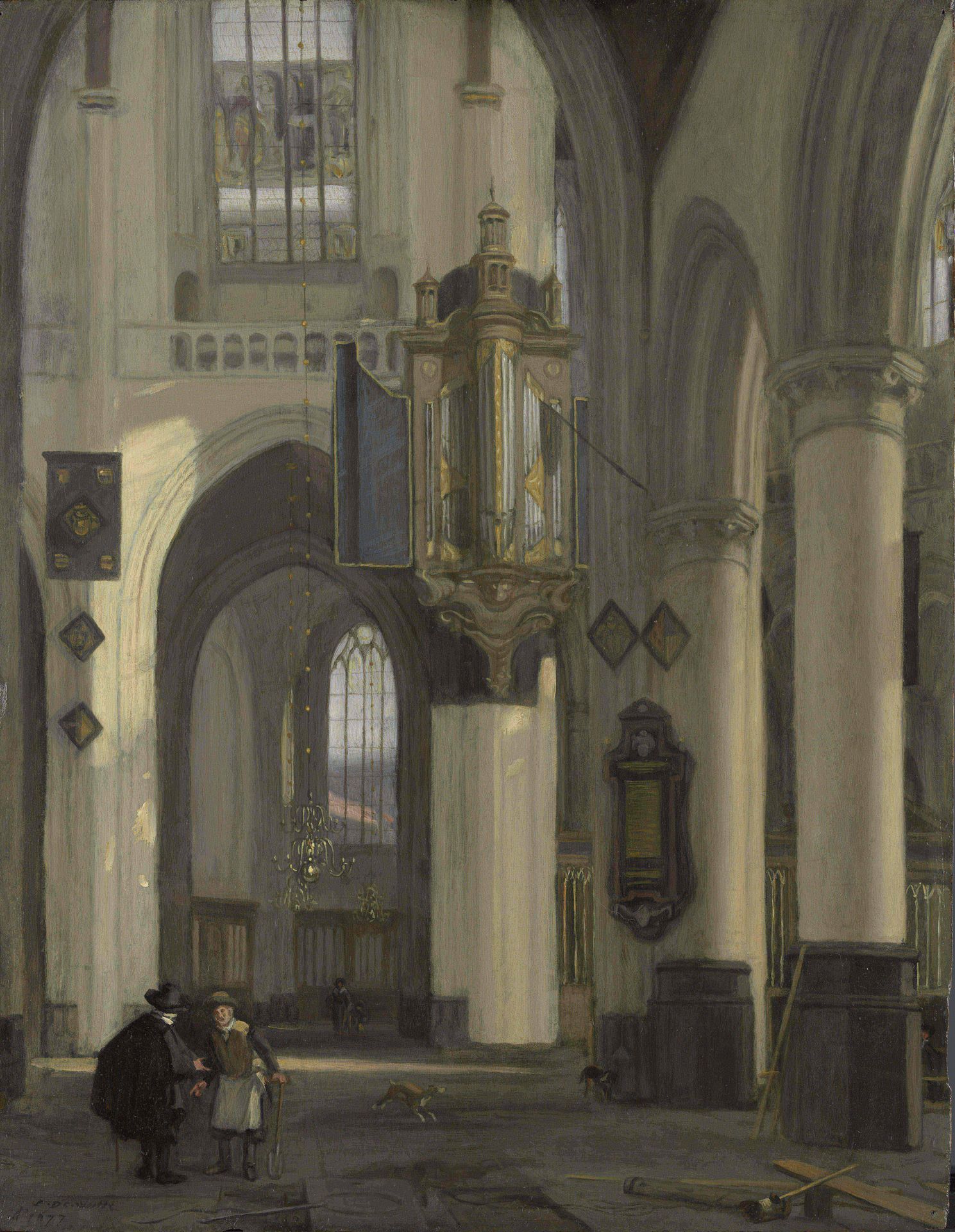
Editor: So, here we have Emanuel de Witte’s "Interior of a Protestant Gothic Church with Motifs from the Oude and Nieuwe Kerk in Amsterdam," painted in 1677 using oil paint. What I find striking is the interplay of light and shadow – it almost feels like a stage set. How do you interpret this work, focusing on its form and composition? Curator: Let's begin with the masterful perspective. Notice how the converging lines of the architecture draw the eye deep into the picture plane. De Witte manipulates the light, or lack thereof, to articulate the architectural space. Observe, in this context, how this serves not merely to render detail, but to create volume. Note how the organ becomes a visual anchor. What effect does this central placement achieve? Editor: I suppose the organ emphasizes the height of the space, creating a feeling of awe and grandeur through its position in relationship to the architecture, perhaps indicating musical form in the same space. Are there any particular artistic choices, you feel, which speak directly to de Witte’s formalist strategies? Curator: Certainly. The reduction of colour – this near-monochrome palette – it isn't simply mimetic of the church’s interior, it foregrounds the formal elements of light and shadow, line and shape. The figures become almost incidental, don’t you think? Anchoring the material against which we can percieve the composition as a whole. Their scale contrasts against the architectural scale, further enhancing this visual effect. Editor: Yes, I see that. It’s as if he is directing our attention toward the artifice of the space, using people only to enhance or augment that vision. It is as much a construction of space as it is a rendering of an actual location. It strikes me as so clever that the forms enhance the experience of seeing. Curator: Precisely. And it's through this interplay of formal elements, colour and shadow primarily, that we understand de Witte's visual objective. How powerful the image, through its composition. Editor: I hadn't considered that before, or realized how he downplayed content in favour of the interplay of color, lines, and perspective to show the volume this space can render. Fascinating! Curator: Indeed, by concentrating on form, we gain a clearer appreciation for the artist’s skill, and how he translates reality into a complex structure on canvas.
Interior of a Protestant Gothic Church with Motifs from the Oude and Nieuwe Kerk in Amsterdam
1677
Artwork details
- Medium
- painting, oil-paint
- Dimensions
- height 48 cm, width 37 cm, depth 5 cm
- Copyright
- Rijks Museum: Open Domain
Tags
Comments
Share your thoughts
About this artwork
Editor: So, here we have Emanuel de Witte’s "Interior of a Protestant Gothic Church with Motifs from the Oude and Nieuwe Kerk in Amsterdam," painted in 1677 using oil paint. What I find striking is the interplay of light and shadow – it almost feels like a stage set. How do you interpret this work, focusing on its form and composition? Curator: Let's begin with the masterful perspective. Notice how the converging lines of the architecture draw the eye deep into the picture plane. De Witte manipulates the light, or lack thereof, to articulate the architectural space. Observe, in this context, how this serves not merely to render detail, but to create volume. Note how the organ becomes a visual anchor. What effect does this central placement achieve? Editor: I suppose the organ emphasizes the height of the space, creating a feeling of awe and grandeur through its position in relationship to the architecture, perhaps indicating musical form in the same space. Are there any particular artistic choices, you feel, which speak directly to de Witte’s formalist strategies? Curator: Certainly. The reduction of colour – this near-monochrome palette – it isn't simply mimetic of the church’s interior, it foregrounds the formal elements of light and shadow, line and shape. The figures become almost incidental, don’t you think? Anchoring the material against which we can percieve the composition as a whole. Their scale contrasts against the architectural scale, further enhancing this visual effect. Editor: Yes, I see that. It’s as if he is directing our attention toward the artifice of the space, using people only to enhance or augment that vision. It is as much a construction of space as it is a rendering of an actual location. It strikes me as so clever that the forms enhance the experience of seeing. Curator: Precisely. And it's through this interplay of formal elements, colour and shadow primarily, that we understand de Witte's visual objective. How powerful the image, through its composition. Editor: I hadn't considered that before, or realized how he downplayed content in favour of the interplay of color, lines, and perspective to show the volume this space can render. Fascinating! Curator: Indeed, by concentrating on form, we gain a clearer appreciation for the artist’s skill, and how he translates reality into a complex structure on canvas.
Comments
Share your thoughts