Vaandels, standaarden en pauken veroverd door de Nederlanders tijdens de oorlog, 1713 Possibly 1713 - 1717
0:00
0:00
woudenberg
Rijksmuseum
graphic-art, print, engraving
#
graphic-art
#
baroque
# print
#
geometric
#
engraving
Dimensions: length 54 cm, width 60.3 cm
Copyright: Rijks Museum: Open Domain
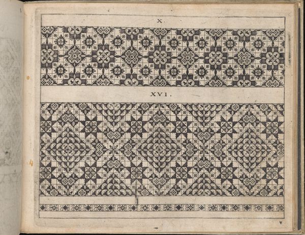
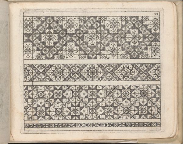
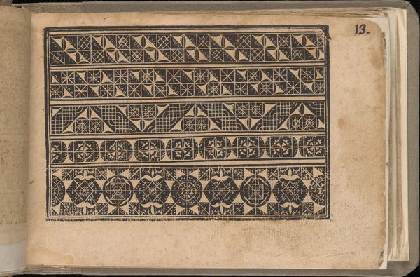
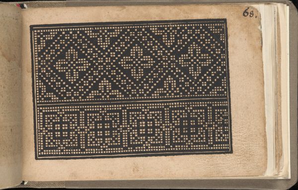
Editor: Here we have "Vaandels, standaarden en pauken veroverd door de Nederlanders tijdens de oorlog, 1713," a print made possibly between 1713 and 1717. It's filled with rows and rows of flags and drums. It strikes me as a very ordered, almost scientific presentation of war spoils. What stands out to you in terms of its form and construction? Curator: Indeed. The graphic organization immediately asserts itself. Note the meticulous arrangement of forms – the flags, standards, and drums – each presented as a distinct, almost isolated, unit. How does this ordered repetition affect your reading of the print? Editor: It makes me think of a catalogue, or a visual inventory. Everything is very clearly laid out, but it also feels somewhat detached. Curator: Precisely. Consider the lines, the geometric shapes, and the calculated placement of color. Each element is delineated with an almost clinical precision. Observe, for example, how the engraver uses hatching and cross-hatching to define form and create tonal variations. This formal approach prioritizes structure and order above all else. Editor: So the emotional impact is secondary to the composition itself? Curator: It seems the engraver aims to classify, rather than evoke emotion. Do you see any instances where the forms themselves become more expressive than representational? Editor: Perhaps the slight variations in the flag designs themselves. Even within the rigid grid, they hint at something unique. Curator: An astute observation. The minimal deviations from the geometric structure create a visual tension, wouldn't you agree? It suggests that the inherent visual elements - the line, the shape, the tone - carry their own communicative potential separate from the context or subject. What a complex achievement of art, to transcend boundaries in the purest formal structure. Editor: That’s a great point! Looking at it that way makes me reconsider what I initially perceived as detached – it’s really emphasizing the inherent visual power of the forms themselves.
Comments
No comments
Be the first to comment and join the conversation on the ultimate creative platform.
