print, paper, typography
aged paper
typeface
hand drawn type
paper
personal sketchbook
typography
hand-drawn typeface
journal
fading type
stylized text
thick font
handwritten font
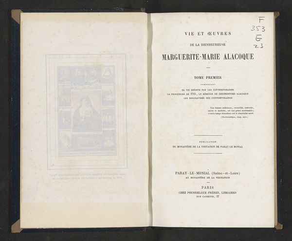
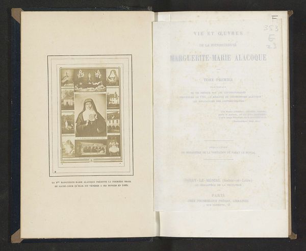
Dimensions: height 220 mm, width 140 mm, thickness 35 mm
Copyright: Rijks Museum: Open Domain
Curator: This is "Vie et oeuvres de la bienheureuse Marguerite-Marie Alacoque..." from 1867. It’s a printed book on paper. Editor: It seems so aged, but I think that the text and graphic are really quite stark! I wonder what we can learn from it? What do you see in this piece from a formal perspective? Curator: What is striking here is the clear division and interplay between textual elements and the visual image on the opposing page. The typography itself acts as a visual component, doesn’t it? Note the variations in font size and weight which construct a visual hierarchy across the page, guiding the viewer's eye. The aging of the paper lends a patina that adds another layer, subtly altering our perception. Editor: I see what you mean, the layout and type choices definitely create visual interest, almost like an abstract composition. But what about the image, the illustration? Does it relate formally to the text, or contrast with it? Curator: Precisely! The illustration, framed within a rectangle, introduces a different texture. Consider the relationship between the precision of the typeset text and the possibly more organic, expressive qualities within the illustration, and its integration (or lack thereof) with the main body of text. Notice too, how the foxing and aging affect your interpretation of the image compared to the page’s starkness. Editor: That makes a lot of sense. I was initially drawn to the content, but analyzing the form reveals so much more about the relationship between the words and the image! Curator: Yes, by closely examining these formal elements – typography, image placement, and material condition – we gain deeper insight into not just the aesthetic qualities of the book, but also perhaps the intentions of the printer, designer, or publisher. Editor: Thank you. I now understand how powerful formal analysis can be. It gives us a new language to explore the work.
Comments
No comments
Be the first to comment and join the conversation on the ultimate creative platform.