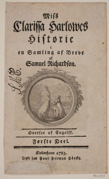
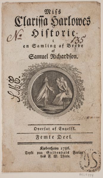
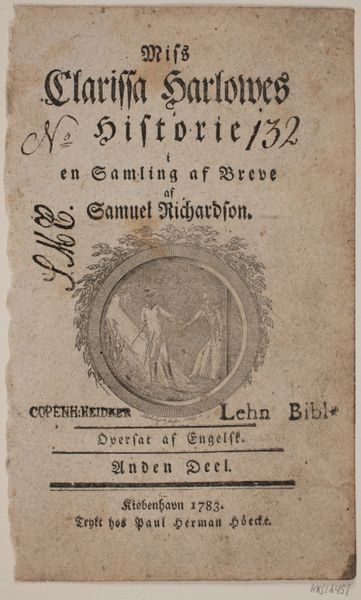
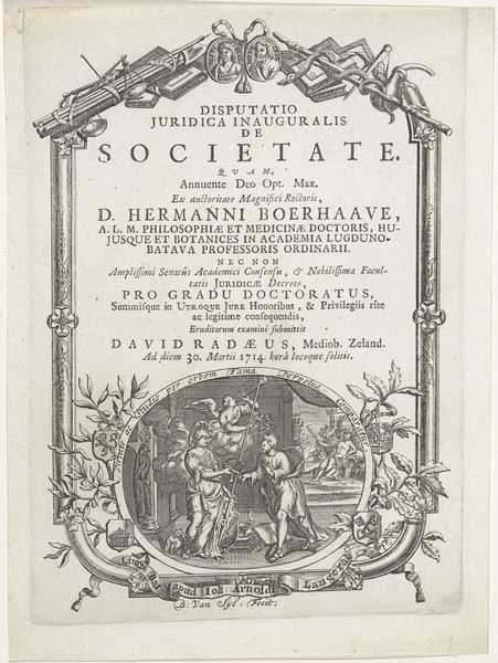
Titelblad med vignet til S. Richardson: "Miss Clarissa Harlowes Historie", tredje del 1783
0:00
0:00
print, engraving
# print
#
engraving
Dimensions: 170 mm (height) x 102 mm (width) (bladmaal)
Editor: Here we have the title page for the third part of S. Richardson’s “Miss Clarissa Harlowe’s History,” engraved by Georg Christian Schule in 1783. The composition, with its vignette encased in an ornate border, seems quite formal and deliberate. What do you make of the visual arrangement here? Curator: Observe the deliberate stratification. Note how the text commands the upper register with a controlled typographical hierarchy. This directs the eye to the central vignette. A closer examination of the vignette reveals a controlled interplay of light and shadow defining the figures. The circular form acts as a compositional frame. How does that strike you? Editor: It makes me think about how much the framing defines the space of the image. And also I noticed how the characters within seem like they are almost on a stage. Curator: Precisely. The frame around the image dictates how the depicted content is viewed by a beholder external to the artwork itself. Moreover, let us note how the arrangement of light and figures leads us to appreciate the interplay between positive and negative space within the piece. Does it also influence your eye to see a dramatic rendering? Editor: It certainly does! The dark background really sets off the lighter figures, and it emphasizes that theatrical, stage-like quality. Thank you, I will consider that in the future! Curator: An understanding of these formal qualities offers invaluable means for appreciating art. I find exploring the interrelation of composition, light, and the manipulation of space to be quite fruitful.
Comments
No comments
Be the first to comment and join the conversation on the ultimate creative platform.
More like this