mixed-media, print
#
mixed-media
# print
#
geometric
#
ceramic
#
abstraction
#
modernism
Copyright: National Gallery of Art: CC0 1.0
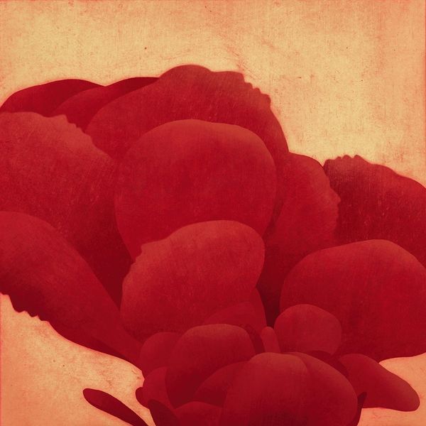
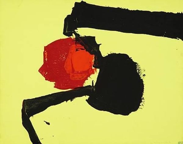
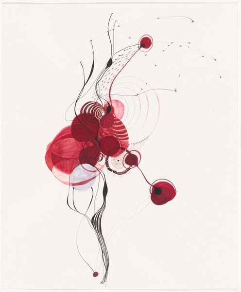
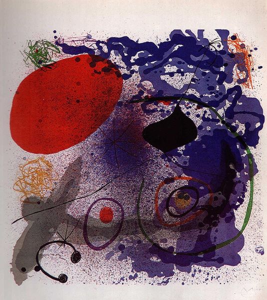
Dzevad Hozo made *The Joyful II*, and it is about as joyful as a Rothko chapel. It’s definitely not a landscape, but for me it's hard not to imagine a body here, albeit a weird, wonderful one. The shapes are layered and blobby, like soft organs pressed together, and the colour palette is muted, save for that saturated red, like a burst blood vessel. The dark patches on top and below feel like weights holding everything down. There’s a real physicality to the piece; you can almost feel the textures of the paper and the ink. The title is what really gets me, it makes the image more about the *idea* of joy, rather than joy itself. I think of artists like Philip Guston, who embraced ambiguity and multiple interpretations in his work. Maybe Hozo is doing the same, reminding us that joy isn’t always simple or straightforward.
Comments
No comments
Be the first to comment and join the conversation on the ultimate creative platform.
More like this