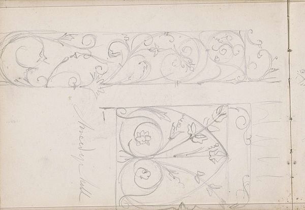
drawing, pencil
#
drawing
#
hand-lettering
#
pen sketch
#
arts-&-crafts-movement
#
hand drawn type
#
hand lettering
#
personal sketchbook
#
ink drawing experimentation
#
geometric
#
pen-ink sketch
#
pencil
#
pen work
#
sketchbook drawing
#
decorative-art
#
sketchbook art
Dimensions: sheet (irregular): 6.2 × 25.6 cm (2 7/16 × 10 1/16 in.) mount: 29.9 × 45.6 cm (11 3/4 × 17 15/16 in.)
Copyright: National Gallery of Art: CC0 1.0
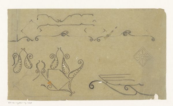
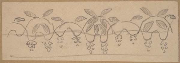
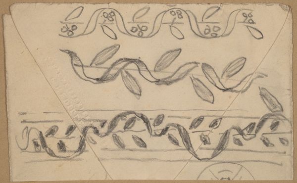
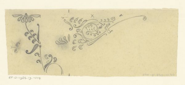
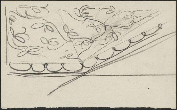
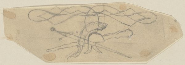
Curator: Here we have Charles Sprague Pearce's "Study for a Border Design," created between 1890 and 1897, a pen and pencil drawing. What's your initial reaction to it? Editor: My first thought is that it looks incredibly delicate, almost tentative. The soft pencil lines give it a very ethereal feel. Curator: Pearce worked within the Arts and Crafts movement, which emphasized handcraftsmanship and design that was both beautiful and functional. We can see these sensibilities in this work. I wonder what that border could have been designed for? It does strike me that borders, physically or symbolically, also establish boundaries and can often serve to divide rather than unify. Editor: That's a powerful perspective! Looking at it through that lens, one might consider the visual language used – the floral motifs, the geometric repetitions – as constructing a specific sense of place or even asserting power within a defined space. Was it for an illustration in a book or magazine, perhaps reflecting societal roles? Curator: Quite possibly. The late 19th century witnessed rising anxieties about class divisions. If this design was used in a domestic setting, could it subtly reinforce ideas about order and status? Perhaps the organic elements signify life and nature, a controlled nature, while the rigid geometry represents social structures. The two together within one composition may suggest how nature and society existed in tandem, albeit uneasily. Editor: That resonates. Thinking of it formally, the repetitive elements evoke mass production even while it retains a "hand-made" sensibility through slight variations. And hand-lettering gives the drawing the feel of a personal sketchbook and underscores its value as one-of-a-kind artifact. It invites speculation about artistic intent versus potential applications of the design within a society wrestling with industry and craft. Curator: Yes! It’s an insightful tension—mass production versus individual artistry, control versus fluidity. Viewing this seemingly innocuous design through an intersectional lens reveals those potent power dynamics and cultural negotiations at play. Editor: It really reframes how we view something as straightforward as a border. It's fascinating to think that something so seemingly simple holds such complex layers.
Comments
No comments
Be the first to comment and join the conversation on the ultimate creative platform.
More like this