Curatorial notes
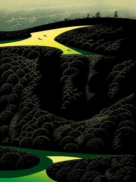
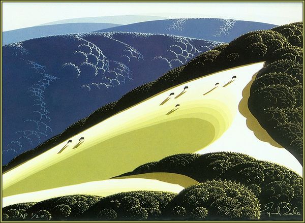
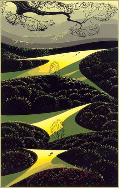
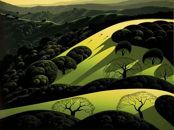
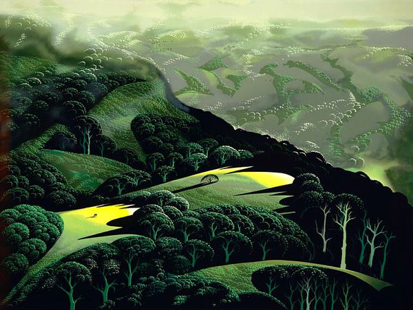
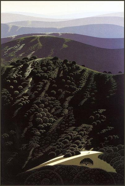
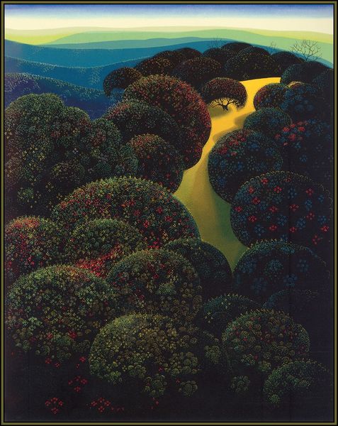
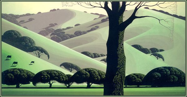
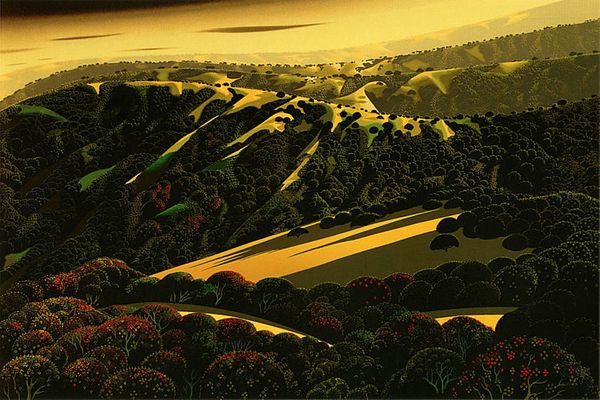
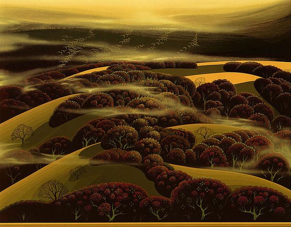
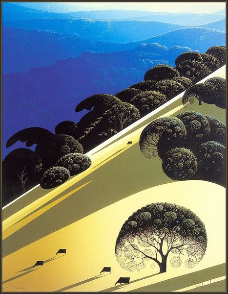
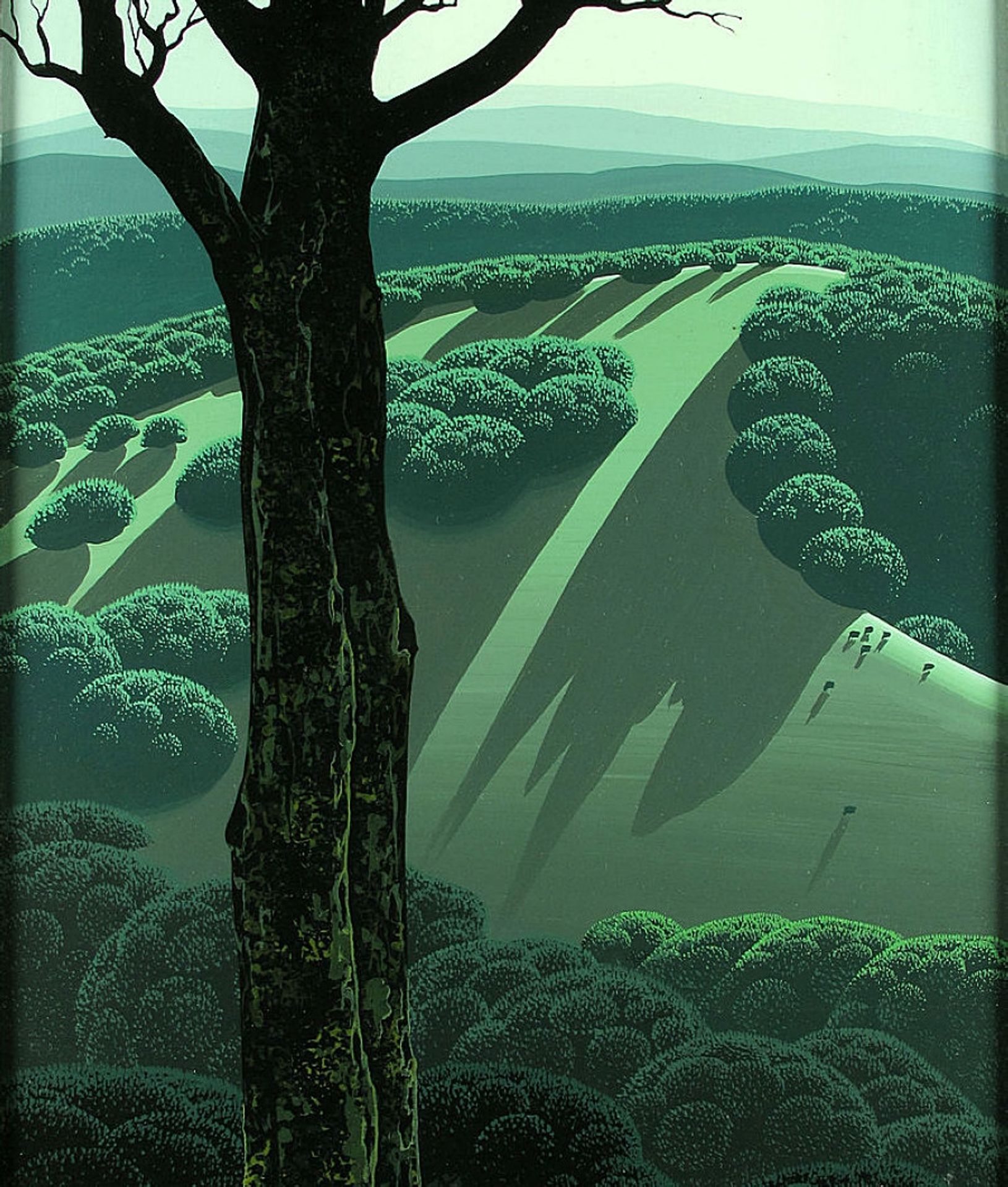
Curator: Let’s turn our attention to Eyvind Earle's “Green Hillside” created around 1970, using both tempera and acrylic paint. Quite an interesting combination of media. Editor: The color palette immediately strikes me. That almost monochromatic green…it's not exactly serene, but possesses a mysterious, almost enchanted quality. It feels more like a symbolic landscape than a naturalistic one. Curator: Indeed. Earle’s background in animation for Disney likely influenced his approach to landscape. This is no mere transcription of nature, but a meticulously crafted surface, layering thin applications of paint to achieve that distinct luminosity and texture. Note, too, how impasto contributes depth and dimension in selected areas. Editor: Precisely. Those trees, for instance. Are they sentinels? Do they embody a psychological presence within the composition? It's an iconic figure set against this backdrop, establishing a connection between foreground and background, perhaps representing time or memory. Also notice the light. Are the rays religious in symbolism or merely an exaggerated shadow? Curator: Well, from a materialist perspective, considering the historical context, the popularity of synthetic acrylic paints at the time gave artists a durable, quick-drying option to build up surfaces. And Earle clearly takes advantage of this. The interplay of textures here– the smooth hills versus the stippled foliage - reveals his command of process, of working with readily available manufactured mediums. Editor: While I appreciate the context of material innovation, for me the almost graphic representation of the hills resonates beyond just landscape. It echoes ideas of Arcadian symbolism, perhaps tinged with melancholy. Earle invites us to consider deeper symbolic meanings. Curator: Perhaps. Still, considering Earle’s broader oeuvre, his commitment to commercially viable art should be acknowledged. His paintings were often reproduced as serigraphs for wider consumption. He was working in a system that valued efficiency, precision, and accessibility in fine art reproductions. Editor: I still see it reaching into art history's trove of imagery, those long stark shadows could also recall concepts of vanitas, shadows being related to morality or the shortness of time. But your point about reproducibility certainly gives pause. Curator: Ultimately, seeing the materiality and considering his artistic approach adds depth and interest to my interpretation of “Green Hillside”. Editor: And tracing those familiar forms through cultural memory reveals layers of meaning that might otherwise remain unseen for me.