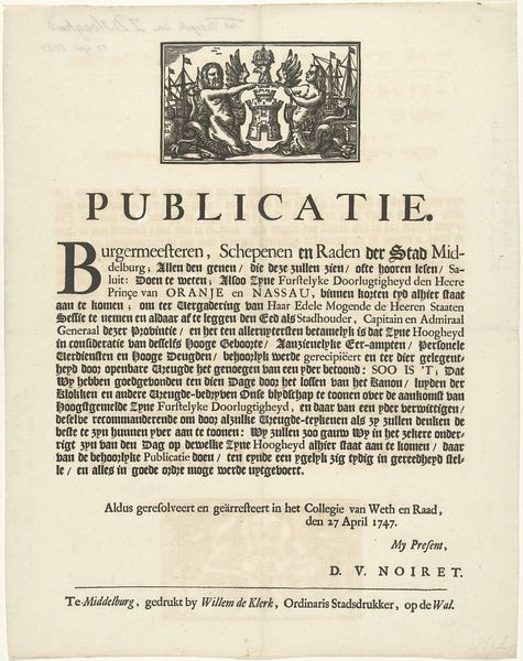
Aankondiging van het vuurwerk te Middelburg bij de geboorte van de prins van Oranje, 1748 1748
graphic-art, print, typography
graphic-art
baroque
dutch-golden-age
typography
Dimensions: height 406 mm, width 320 mm
Copyright: Rijks Museum: Open Domain
Curator: Let's examine this intriguing announcement, "Aankondiging van het vuurwerk te Middelburg bij de geboorte van de prins van Oranje, 1748," a printed piece created in 1748 by Willem de Klerk. Editor: My initial impression is one of stark formality; it’s imposing and declarative, not welcoming. The density of the text and the contrast of the black ink on the stark paper lend it a weighty feel. Curator: Indeed. The emphasis here isn't on aesthetic appeal so much as the communicative function. Note how the typography becomes a key structural element. The varying font sizes create a visual hierarchy, guiding the eye through the decree. Semiotics reveals the carefully chosen language that projects power and authority. Editor: From a materialist perspective, it's interesting to consider this as a mass-produced object. Willem de Klerk was the official city printer; think about the mechanics of printing this piece quickly and distributing it widely, reaching the populace to inform them of rules around celebration, mediating joy and governance. Curator: Precisely. The heraldic imagery at the top – the merpeople flanking a stylized city emblem – underscores the union of authority and local identity. These symbols would have instantly resonated with the public, reinforcing the message's legitimacy. Editor: The choice of print and typography is paramount. This wasn't designed for leisurely reading, but immediate dissemination, plastered on walls in public squares. Consider the paper quality too; was it meant to be ephemeral or archived? These aspects shaped consumption and the piece's lifespan. Curator: Furthermore, one can analyze the formal structure as a reflection of social structure. The balanced layout mirrors the ordered society that the announcement aims to maintain. There’s an underlying assumption of adherence to these established structures. Editor: Thinking about the labor involved: the type-setting, the ink-making, the physical act of printing—it speaks to a specific moment in production. And beyond, to its planned obsolescence as newer announcements replaced it, layered one atop another. Curator: True. Understanding its construction reveals power at play. Thank you; your attention to the making of it truly contextualizes its reception. Editor: It adds layers to what would otherwise appear a staid governmental broadside, underscoring that there’s no value-neutral artistic output; every stage is weighted by ideology.
Comments
No comments
Be the first to comment and join the conversation on the ultimate creative platform.