print, typography
#
aged paper
#
script typography
#
dutch-golden-age
# print
#
old engraving style
#
hand drawn type
#
hand lettering
#
typography
#
hand-drawn typeface
#
fading type
#
stylized text
#
thick font
#
historical font
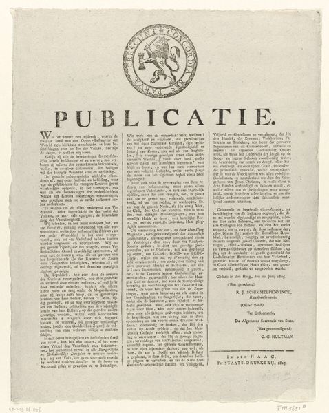
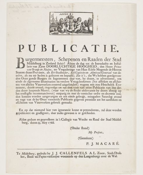
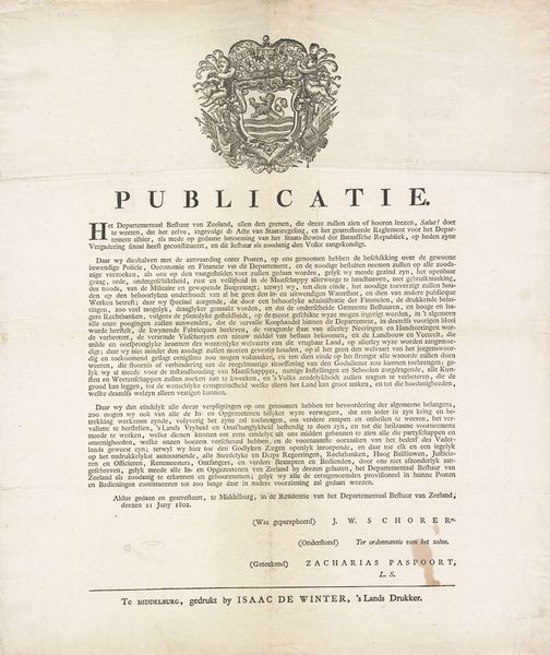
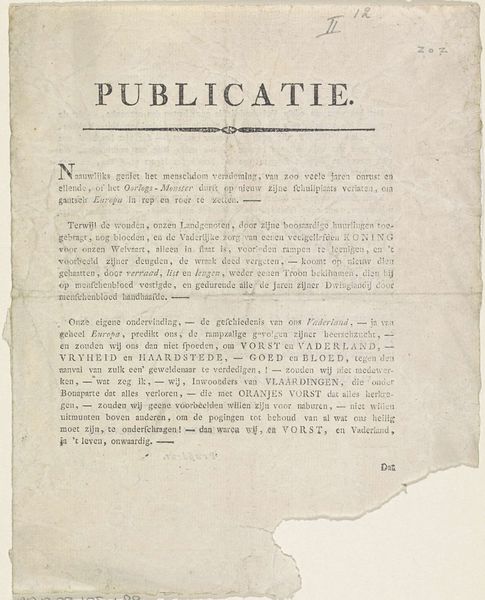
Dimensions: height 416 mm, width 330 mm
Copyright: Rijks Museum: Open Domain
Editor: This print, titled 'Publicatie over de invoering van de nieuwe psalmberijming, 1773', was made by Isaac Scheltus in 1773. Looking at this aged paper, I find myself wondering about the effort involved in its detailed typography. How would you approach interpreting this piece? Curator: The composition of this piece directs our focus immediately to its textual elements. Notice how the typography itself operates as a visual signifier, creating a sense of historical weight and authority. The formal arrangement of the text, divided into distinct blocks, mimics the structure of legal documents from the period. How does this design affect your understanding of the content? Editor: It almost feels less like reading and more like decoding something official and important, given its old engraving style and stylized hand lettering. Curator: Precisely. The contrast between the dense blocks of text and the ornamental header creates a visual hierarchy, suggesting both the solemnity and the institutional backing of the text. Editor: Now that you point it out, it's clearer how even the aging of the paper itself becomes a signifier, a kind of authenticating mark connecting it to the era it describes. I hadn’t considered the composition beyond its face value. Curator: Formal analysis reveals that the text operates on multiple levels: as a carrier of information, a display of skilled craftsmanship, and a statement of cultural power. It encourages us to engage not just with what it says but with how it presents itself. Editor: That's really fascinating; I hadn't thought about how the print's structure could convey so much. It pushes you to understand the purpose and background from how it’s made and what it is. Curator: Indeed. A close formal reading allows us to decode how meaning is constructed within the artwork, unveiling its intricate layers.
Comments
No comments
Be the first to comment and join the conversation on the ultimate creative platform.
More like this