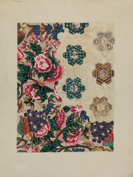
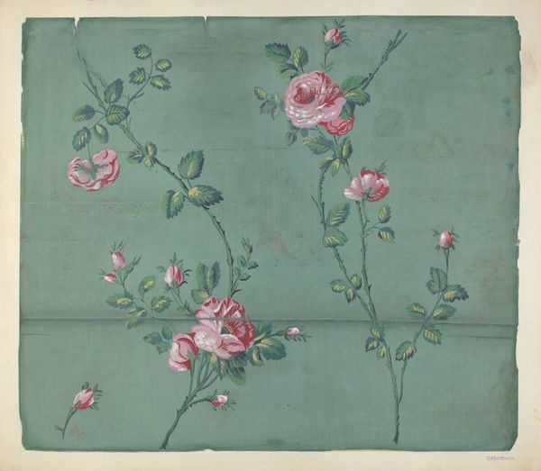
drawing, print, paper, impasto
#
drawing
#
water colours
# print
#
paper
#
impasto
#
decorative-art
#
watercolor
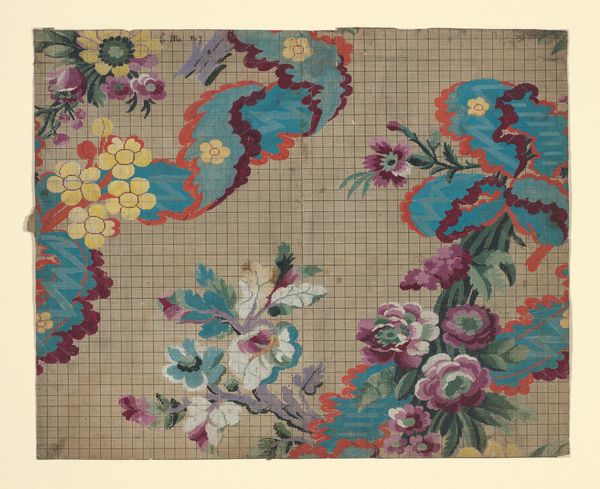
Dimensions: overall: 55.9 x 54.6 cm (22 x 21 1/2 in.)
Copyright: National Gallery of Art: CC0 1.0
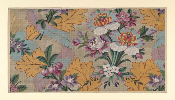
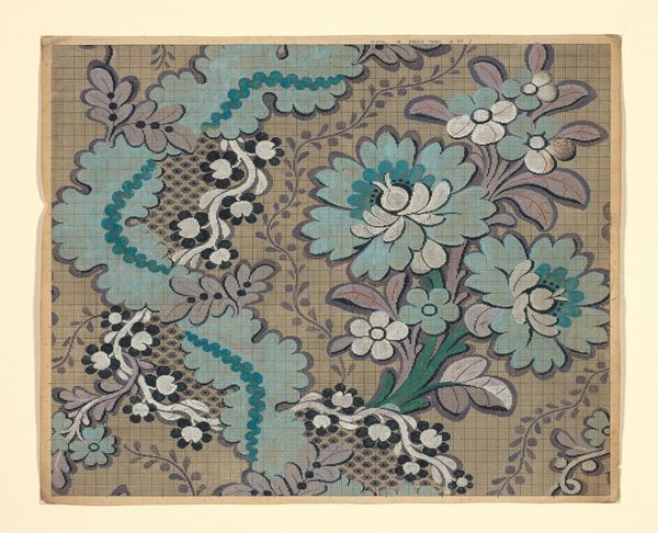
Curator: We’re looking at “Wall Paper,” a c. 1939 work on paper by Walter Doran. He employed printmaking and drawing techniques with watercolours, it seems. What's your initial take on this sample, Editor? Editor: Visually, it’s quite busy! There's a lot happening with the floral patterns and that pale green ground. A bit overwhelming, almost claustrophobic. Curator: Indeed. Note how the artist uses colour and layering to create a sense of depth. The impasto lends a certain tactile quality, especially within the white decorative patterns. The visual language seems intentionally flattening and emphasizes artifice. Editor: Looking at the larger context of the late 1930s, mass production and accessibility were reshaping design. Wallpaper, like this, wasn’t just about decoration; it spoke to broader changes in social values, with increasingly more women involved in these roles. The introduction of vibrant colours reflected optimism amid hardship, though the decorative arts were certainly undervalued as "feminine" domains. Curator: That is where my interpretation differs from your framing. From a formal point of view, I observe the complex interplay between geometric precision and organic form. The floral arrangements aren’t mere reproductions of nature. It is the structural arrangements of colour that dominate—a dialectic between realism and stylized presentation. It reveals more than surface design and becomes symbolic through geometric reduction. Editor: I concede that your emphasis on colour offers a crucial viewpoint. Colour trends can signal economic shifts, or changing consumer preferences tied to new production possibilities. However, the very notion of 'Wall Paper'—meant for the domestic space—positions it squarely in debates of taste, class, and the increasing consumerism that defines mid-century America. The wallpaper literally wallpapers social life. Curator: A compelling consideration. Although our divergent perspectives can both reveal insightful ways of thinking, the historical reading is essential, but I would caution against understating the symbolic potential within artistic gestures, within the pure play of colour and form. Editor: Perhaps our conversation proves the piece itself to be more interesting that at first I would’ve suspected. It represents a fascinating juncture—when design choices become enmeshed with societal norms, artistic aspirations and evolving visual culture.
Comments
No comments
Be the first to comment and join the conversation on the ultimate creative platform.
More like this