drawing, mixed-media, watercolor
#
drawing
#
de-stijl
#
mixed-media
#
water colours
#
painted
#
watercolor
#
geometric
#
abstraction
#
line
#
mixed media
Copyright: Public domain
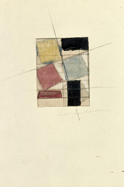
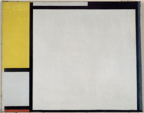
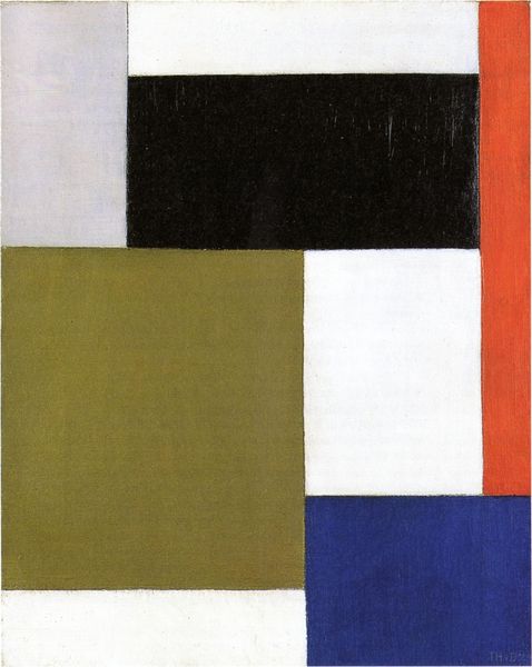
Theo van Doesburg made this preliminary design for a floor with paint and pencil on paper, and what strikes me is how provisional it all feels. You can see his process, the grid peeking through, a structure but not a constraint. Look at that ochre rectangle near the bottom – it isn't perfectly filled in, like he’s testing the colour, seeing how it sits with the blacks and grays. The surface has a beautiful texture, you can see the tooth of the paper, the way the pigment grabs in some spots and skips in others. The black bar on the right has an almost velvety quality, a real density, which really gives the piece weight. Van Doesburg reminds me of Mondrian, of course, but more playful, less dogmatic. He’s feeling his way through the composition, letting the materials speak, and in doing so he kind of invites us to do the same. The beauty is in the searching, not the finding, if you know what I mean?
Comments
No comments
Be the first to comment and join the conversation on the ultimate creative platform.
More like this