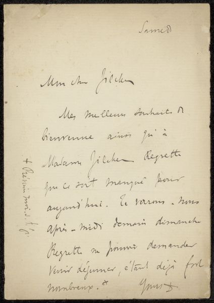
drawing, paper, ink
#
drawing
#
hand written
#
hand-lettering
#
impressionism
#
hand drawn type
#
hand lettering
#
paper
#
personal sketchbook
#
ink
#
hand-written
#
hand-drawn typeface
#
sketchbook drawing
#
handwritten font
#
small lettering
Copyright: Rijks Museum: Open Domain
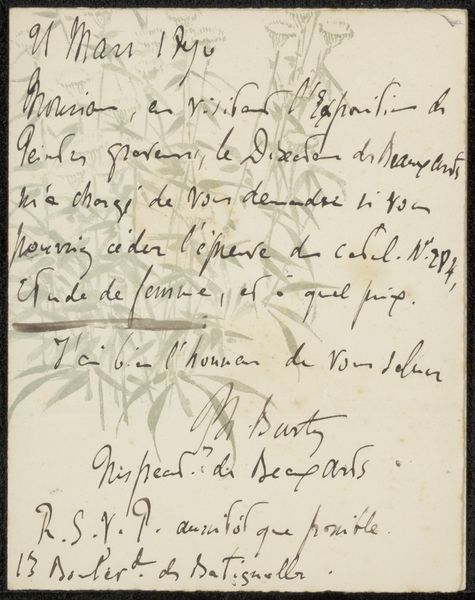
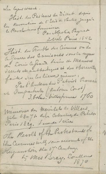
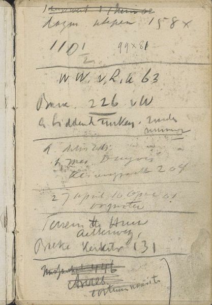
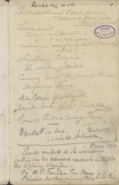
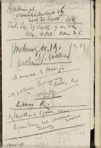
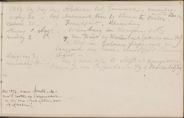
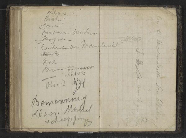
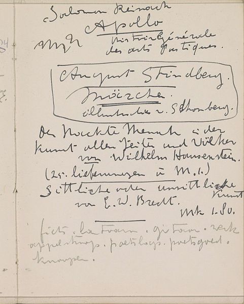
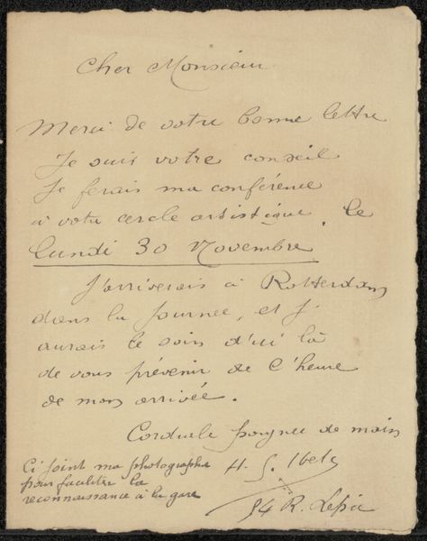
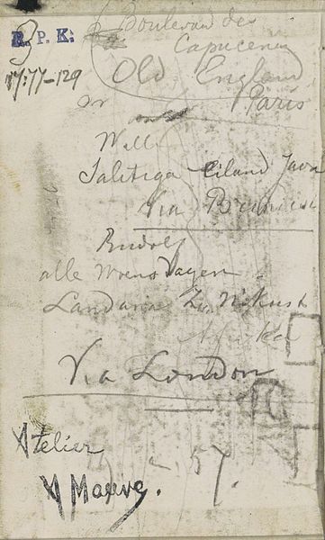
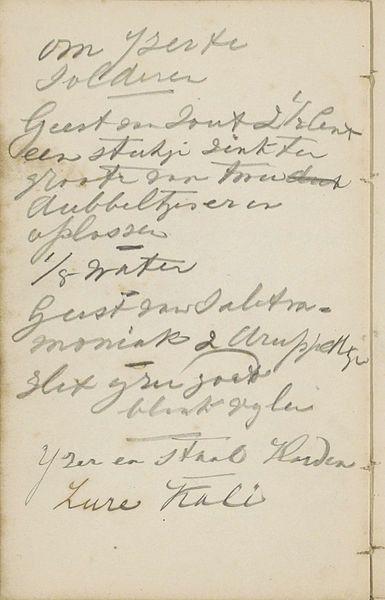
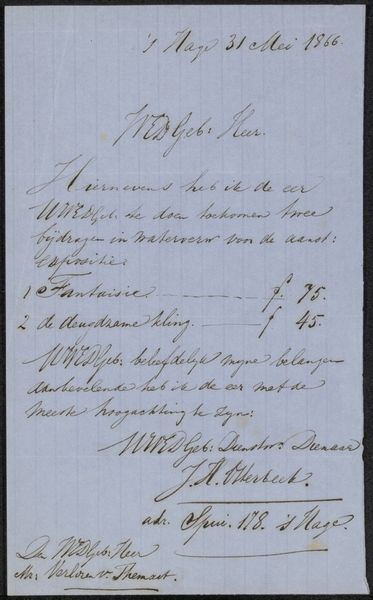
Editor: Here we have "Boektitels," or "Book Titles," a George Hendrik Breitner ink drawing from around 1880, currently residing in the Rijksmuseum. Looking at it, I'm immediately struck by the varying weights and styles of handwriting; it's like a calligraphic experiment! What do you make of its composition, or perhaps its graphic qualities? Curator: Well, setting aside representational or historical analysis for the moment, consider first the relationship between the forms themselves. Note the interplay between the dense clusters of lettering and the surrounding negative space. How does this balance guide your eye across the surface? Editor: It's true; the contrast between the filled areas and the empty page creates a kind of rhythm. The eye jumps from one title to the next, almost like reading musical notes on a staff. Curator: Precisely. Breitner here uses line, texture, and spatial arrangement to create a visual experience independent of the text's content. One might apply a structuralist lens, seeing the individual book titles as signifiers, and the overall page design as the signified. The sum becomes greater than its parts, suggesting an engagement with the *act* of recording, beyond the information recorded. Note also how the angled positioning of certain phrases disrupt an easy reading, introducing dissonance into the viewing experience. What does that suggest to you? Editor: That it's a personal record, not meant for immediate consumption or clarity. Perhaps the drawing resides as a repository of ideas and concepts rather than serving an explicit informative function? Curator: An astute observation. And if we look closely at the textures of the ink itself— the varying pressures, the occasional blot—what do they tell us about the artist’s hand and his process? Editor: That Breitner was deeply immersed in the physicality of creation? It shows a different aspect of the artwork beyond mere content; It gives the page another dimension of analysis to explore. Thank you!
Comments
No comments
Be the first to comment and join the conversation on the ultimate creative platform.
More like this