drawing, paper, ink, pen
#
drawing
#
comic strip sketch
#
script typography
#
hand-lettering
#
old engraving style
#
hand drawn type
#
hand lettering
#
paper
#
personal sketchbook
#
ink
#
hand-drawn typeface
#
pen work
#
pen
#
handwritten font
Copyright: Rijks Museum: Open Domain
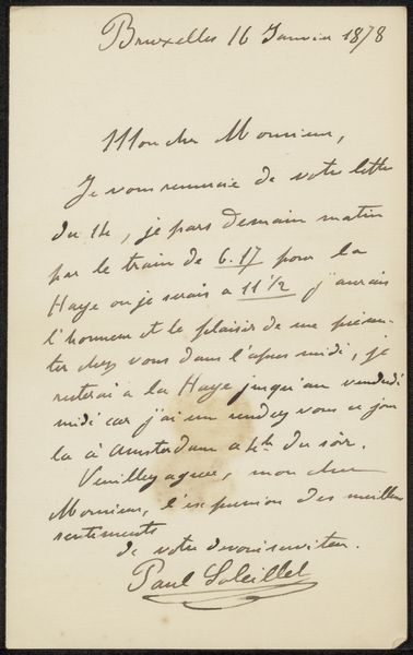
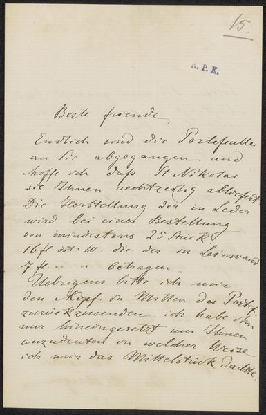
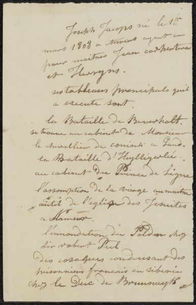
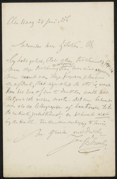
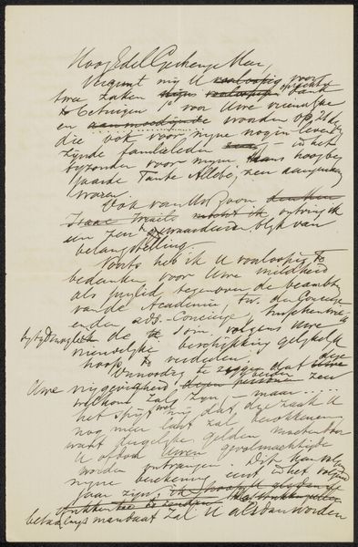
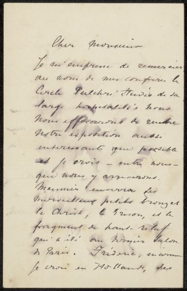
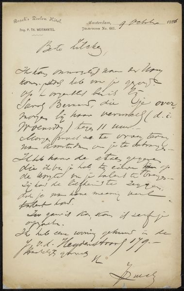
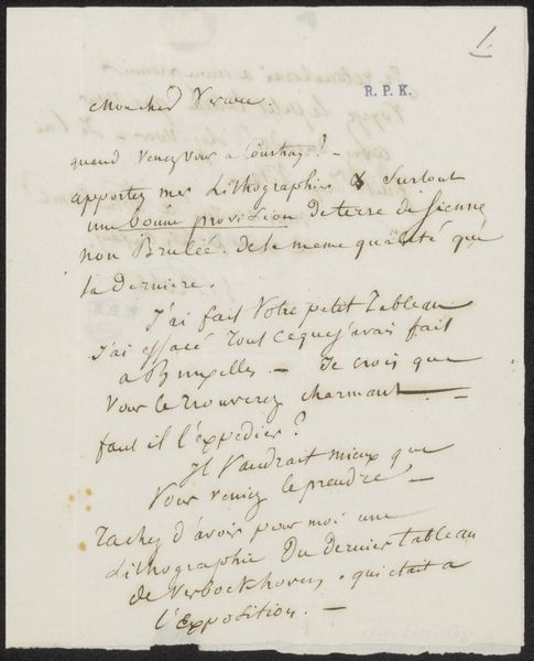
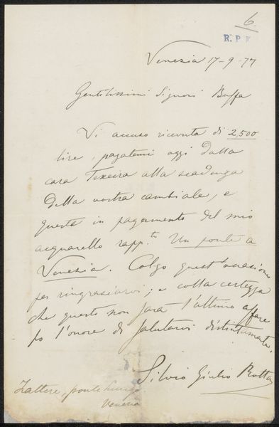
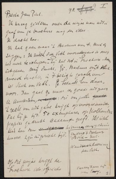
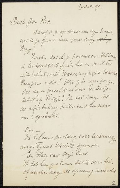
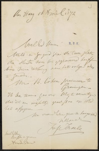
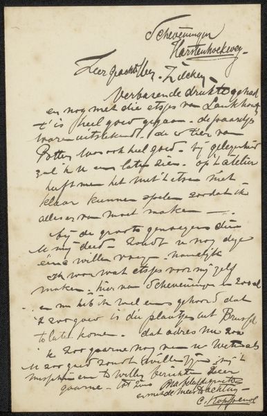
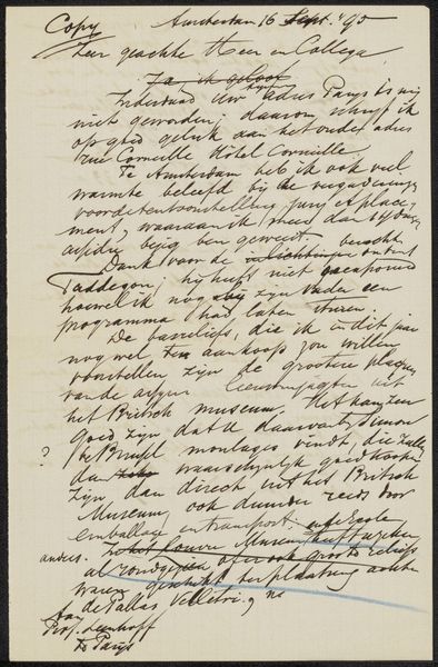
Curator: "Brief aan Anna Dorothea Dirks" translates to "Letter to Anna Dorothea Dirks," created sometime between 1874 and 1925 by Antoon Derkinderen. This drawing utilizes pen and ink on paper, offering an intimate glimpse into personal correspondence. Editor: Well, first impression? It feels delicate, you know? A quiet whisper of a past conversation, trapped in ink. I love how immediate handwriting feels – so personal. Curator: Absolutely, and I think the materiality supports that. Ink, as a medium, lends itself to replication but here it's uniquely rendered. Consider the labour: each word carefully formed, embodying a social relationship. It's not just information transfer, but a carefully crafted artifact of communication. Editor: You can almost *feel* the writer pausing, maybe mid-thought, before continuing. There's a rhythm there, like breathing. I wonder what their relationship was like. I almost wish I could read Dutch! Curator: Right! Without translating it immediately shifts the context, the meaning transforms into visual impression. It forces one to grapple with materiality, craft and labor. Note the composition: The layout conveys a sense of immediacy. The hand-lettering blurs the lines between functional script and drawing. Editor: True. It’s more than just utilitarian script. The loops and flourishes, it’s got personality for days! More like a dance between text and image. Like capturing thoughts as they flew by and almost sketched. Curator: I agree, blurring the lines in such a personal way, it goes beyond pure functionality, pointing to that inseparability between form and content. A social practice rendered material! Editor: Thinking about how we dash off emails nowadays… it really highlights the intention behind this letter, doesn't it? Something almost… sacred about slowing down to this speed. Curator: Exactly. So much intentionality that forces one to ponder its significance and deeper meaning within Derkinderen’s broader practice. Editor: It is funny, isn’t it? A casual letter transforming into this… tangible relic of connection. Something profound hiding within the everyday. Curator: Precisely! Everyday labor and connection transforming to legacy and document!
Comments
No comments
Be the first to comment and join the conversation on the ultimate creative platform.
More like this