graphic-art, print, typography
#
graphic-art
# print
#
asian-art
#
typography
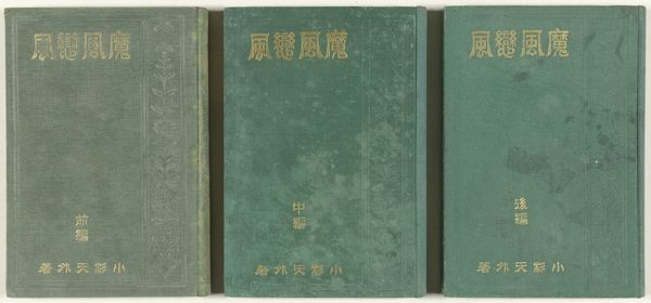
Dimensions: height 224 mm, width 153 mm
Copyright: Rijks Museum: Open Domain
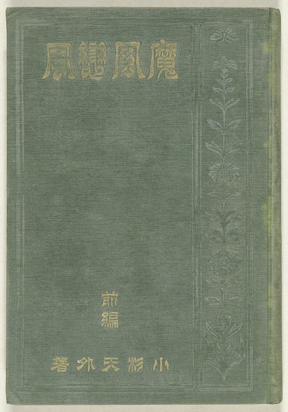
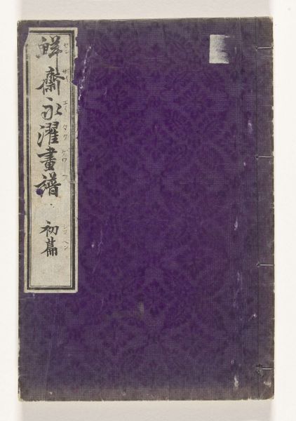
This is Kosugi Tengai's Kwaadaardige wind, liefdevolle wind - middelste deel, a Japanese book from around the early 20th century. The muted green cover feels almost like a painting in itself, doesn’t it? Like a canvas that’s been worked and reworked, faded, and stained, with those gold letterforms popping out. I’m really drawn to that surface. It’s got this beautiful aged quality, like an old wall with layers of history embedded within. You can almost feel the texture, see the subtle variations in the color that suggests the kind of handmade process. I’m sure there is an element of chance at play in this process, it is impossible to repeat exactly. The cover is designed with some botanical motifs, maybe added with a stencil and then scrubbed back. I love the way the gold letters stand out against that slightly distressed background, a touch of glamour against the ordinary. In a way, it reminds me of some of the raw and unrefined qualities you might find in Cy Twombly's work. There is something about the imperfection of this that makes it feel so alive. It is a reminder that art is an ongoing conversation, and that beauty can be found in the most unexpected places.
Comments
No comments
Be the first to comment and join the conversation on the ultimate creative platform.
More like this