graphic-art, typography
#
graphic-art
#
asian-art
#
typography
Dimensions: height 225 mm, width 155 mm
Copyright: Rijks Museum: Open Domain
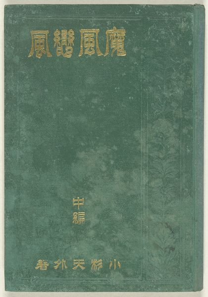
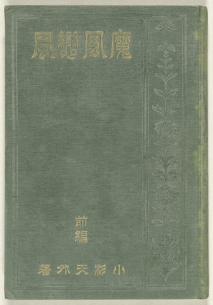
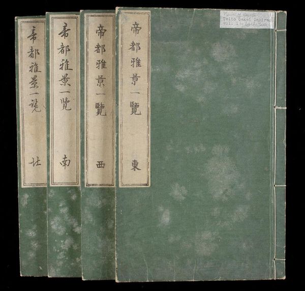
Kosugi Tengai created these three printed books, Kwaadaardige wind, liefdevolle wind, with an eye for process. The muted green, almost grey, backgrounds of each book set a somber but subtle tone. It's like he was trying to capture the essence of wind, not just its visual representation, by using color. These aren’t paintings, but printed books, with a definite material quality. The texture created by the patterned cloth covering gives them a tactile dimension, while the faded gold lettering contrasts beautifully with the muted greens, creating a visual hierarchy that draws your eye. It makes you think about the stories hidden within, and about how a cover can speak volumes. Consider how the title is rendered, in a bright gold that stands out from the greyish green background. This creates a focal point, a moment of visual tension, that brings the work together. Looking at these, I can’t help but think of Agnes Martin's subtle grids, but with a narrative twist. Like Martin, Kosugi Tengai uses repetition and subtle variations to create a meditative experience, reminding us that art, in any form, is an ongoing conversation.
Comments
No comments
Be the first to comment and join the conversation on the ultimate creative platform.
More like this