drawing, ink, pen
#
drawing
#
hand-lettering
#
dutch-golden-age
#
hand drawn type
#
hand lettering
#
personal sketchbook
#
ink
#
hand-drawn typeface
#
ink drawing experimentation
#
pen-ink sketch
#
pen work
#
sketchbook drawing
#
pen
#
post-impressionism
#
sketchbook art
Copyright: Rijks Museum: Open Domain
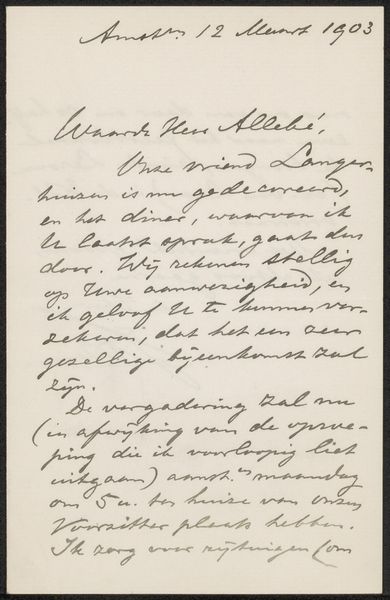
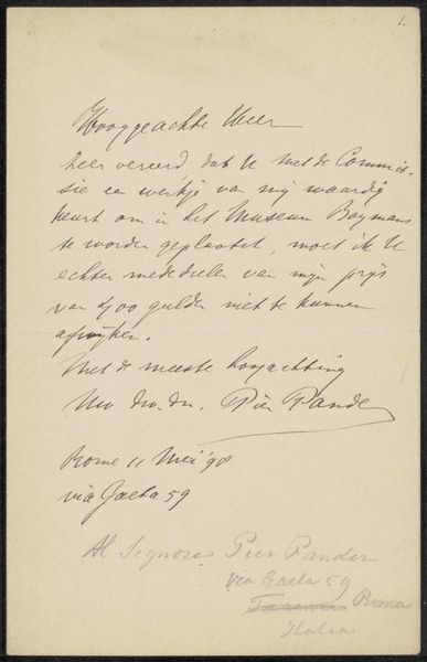
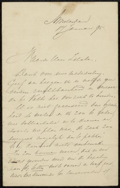
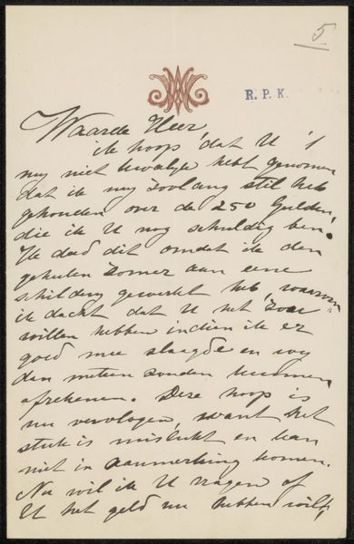
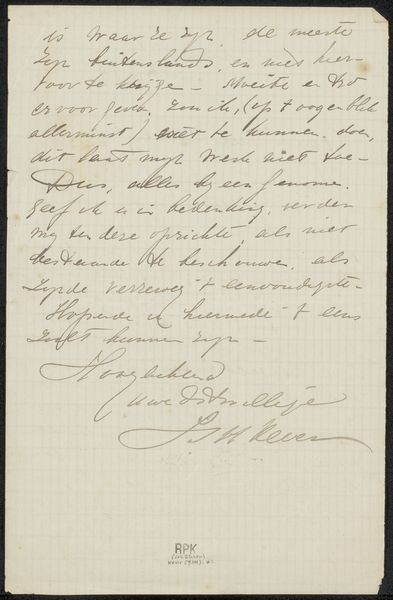
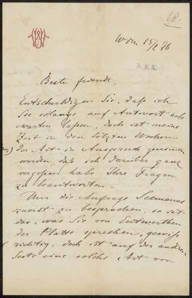
Editor: Here we have "Brief aan Johannes Arnoldus Boland," possibly from 1898, by Paul Joseph Constantin Gabriël. It’s a pen and ink drawing on paper. The script looks so elegant, yet dense...it almost feels like a code. What symbols or cultural echoes do you see in a piece like this? Curator: Indeed! Handwriting itself is a powerful symbol, isn't it? Each stroke, each flourish, a reflection of the writer's personality and time. The Dutch Golden Age calligraphy has a specific cultural memory attached to it. Editor: I see it. Curator: Note how the formality contrasts with the intimacy of a handwritten letter. It suggests a world where personal and professional lives were carefully intertwined. Even the ink carries weight; it evokes a sense of permanence, of a message meant to endure. What kind of feeling do you get when reading a handwritten text compared to an email or digital text? Editor: It feels more personal, weighty with thought... somehow more important. Curator: Precisely! It embodies the act of careful crafting. Look how the script takes on a different meaning than mere communication—the symbol is elevated. Don’t you think? Editor: Definitely, it reminds me of the artistry found in illuminated manuscripts. It highlights how handwriting can move beyond conveying basic content. I will keep in mind these cultural implications. Curator: It is important to appreciate the artistic and human expression within such symbolic pieces.
Comments
No comments
Be the first to comment and join the conversation on the ultimate creative platform.
More like this