drawing, paper, ink, pen
#
drawing
#
script typography
#
hand-lettering
#
hand drawn type
#
hand lettering
#
paper
#
personal sketchbook
#
ink
#
hand-drawn typeface
#
pen-ink sketch
#
pen work
#
sketchbook drawing
#
pen
#
sketchbook art
#
modernism
Copyright: Rijks Museum: Open Domain
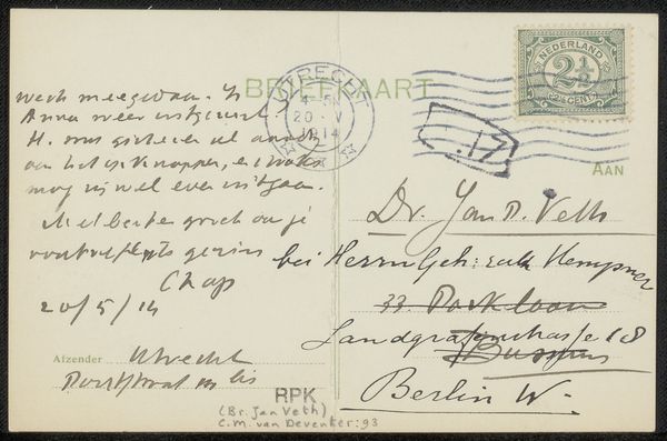
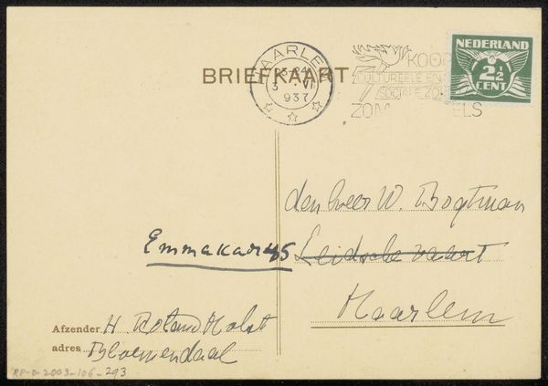
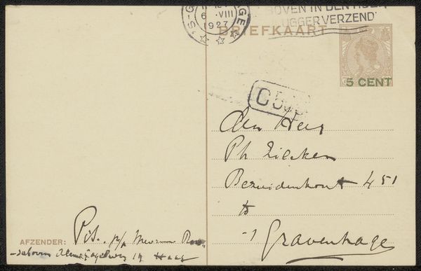
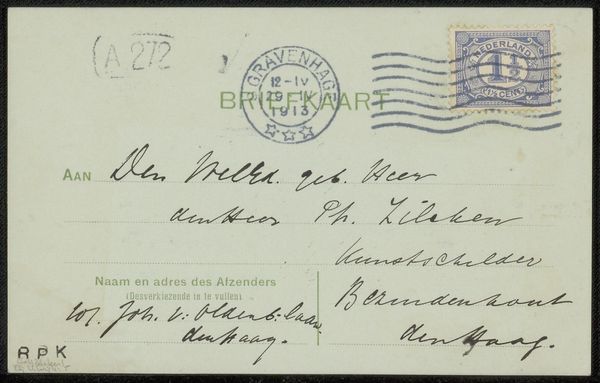
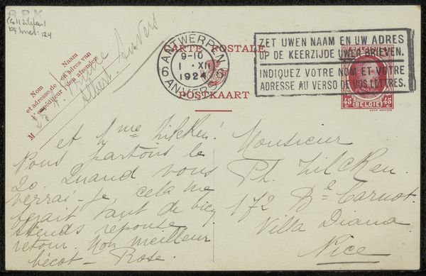
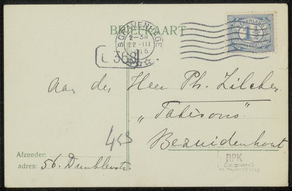
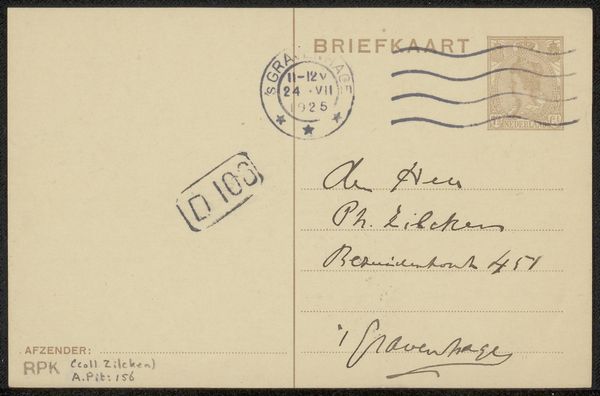
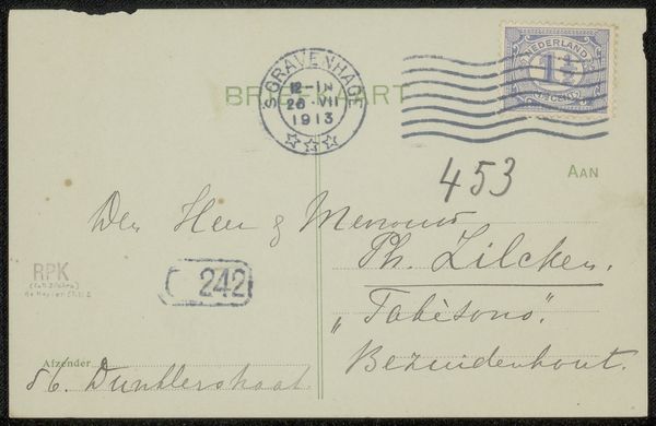
Curator: Ah, this little gem! A postcard to Jan Veth, possibly from 1920, drawn by Isaac Israels with pen and ink on paper. What do you think of it? Editor: It's so casual, almost like a snippet from someone's personal sketchbook. The handwriting gives it such an intimate feel. I wonder, what was Isaac Israels trying to convey in such a simple message? Curator: Isn't it delicious? I think it offers us a peep into Israels' mind – the hasty scribble of the handwriting gives off a breezy, ‘thinking out loud’ vibe. Maybe this wasn’t intended as ‘Art’ with a capital A, but more like a shared thought, or a visual note tossed off between friends. And isn’t that Modernism in a nutshell? Reaching out to connect? Editor: So, the lack of formality IS the point. But who was Jan Veth, and why would Israels send him this? Curator: Veth was a well-known artist, critic and poet – quite a Renaissance man! This card could have been a brief hello, a response to something, maybe even a quick artistic commentary between peers. Perhaps Israels had seen something in Dordrecht that he felt compelled to share with Veth, and ‘quite alright’ was an affirmation, of the town itself. Makes you wonder, doesn’t it? Did they bounce artistic energy off one another, and this the quickest and sweetest note of support? Editor: It does! The ordinariness is almost profound. Thanks – I am walking away from this postcard with a much deeper appreciation. Curator: That is what art does for us: reminds us we are connected and that we must reach out to grasp the infinite. Now I wonder to what that postman thought…
Comments
No comments
Be the first to comment and join the conversation on the ultimate creative platform.
More like this