Copyright: Public Domain
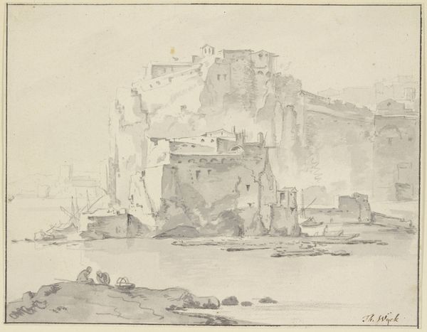
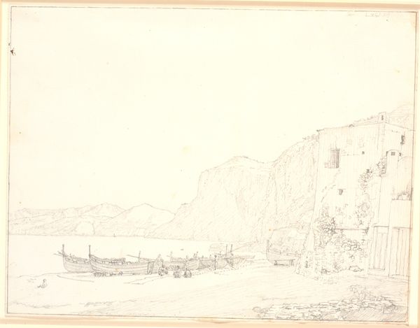
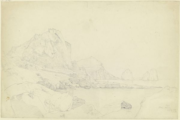
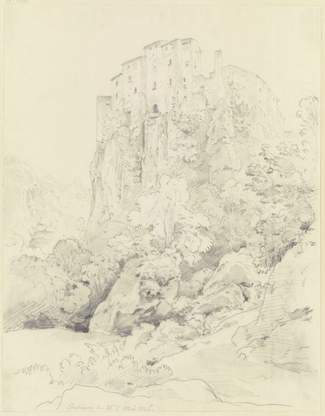
Editor: This drawing is called "Sorrent, Marina Piccola," made around 1825 by Ernst Fries, using graphite and pencil. The stark contrast of the stone against the open water creates a compelling, almost unsettling atmosphere. What stands out to you when you look at this piece? Curator: Note how the artist contrasts rough textures with smooth lines. The jagged, almost violent forms of the cliff face stand in stark opposition to the calculated, clean lines of the architecture perched atop it. Consider also how Fries manipulates light. Editor: So, it’s like a visual push and pull between the natural and the man-made? Curator: Precisely. Notice how the light falls unevenly across the structure. The architectonic construction reflects a precise geometric order against the unorganized roughness of the grotto formations. Also note the almost classical use of light to evoke mood. Are we looking at a romantic idealization of nature? Editor: Perhaps a reflection on our relationship with nature itself. There’s something about how the building is almost crumbling into the rock face that speaks volumes. What did you think about the relation between the architectural and the natural, its visual effects? Curator: A fascinating dialogue, indeed. The sharp detail rendered through pencil is worth studying. It makes you wonder: what’s lasting, and what’s in decline? It also appears that Fries' primary formal element is light. Consider, if the work wasn’t black and white but a painting. Would light remain dominant in coloring all formal attributes? Editor: That's something I’ll certainly be considering next time I see this piece. I will be mindful of these textures as potential light carriers. Thanks.
Comments
No comments
Be the first to comment and join the conversation on the ultimate creative platform.