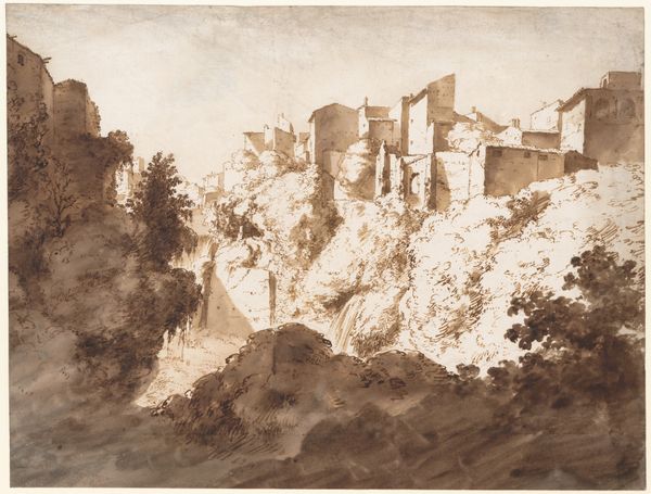
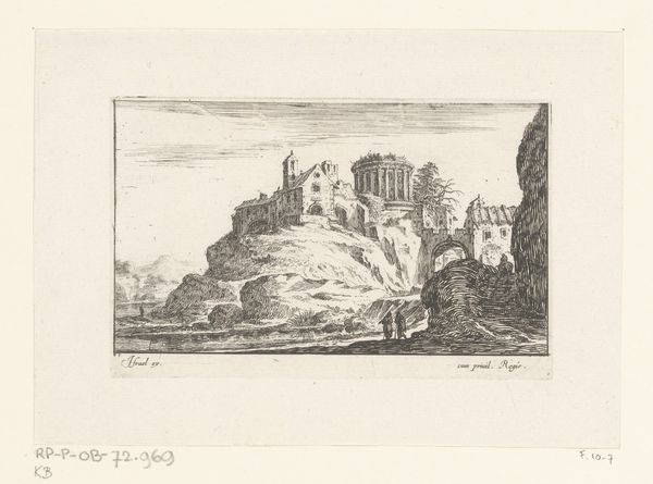
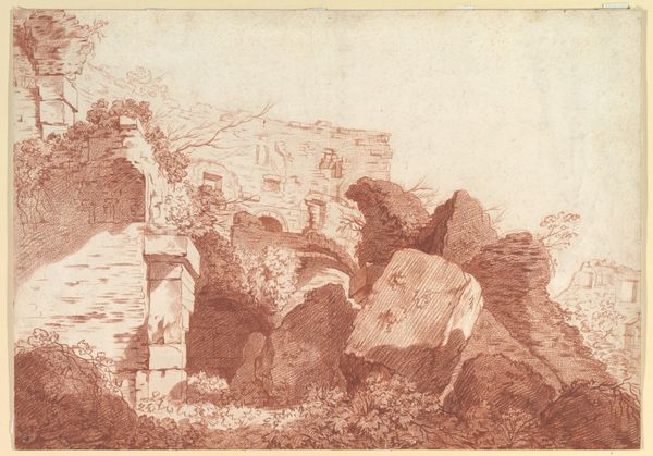
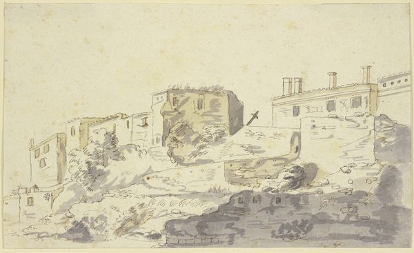
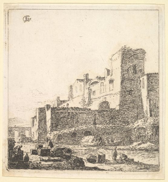
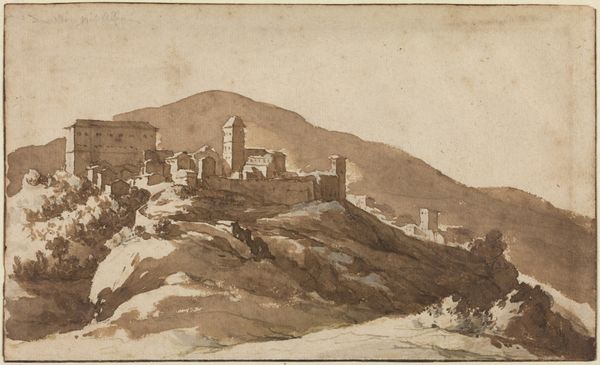
View of the "Palazzo Maggiore" on the Palatine Hill, Rome 1648 - 1671
0:00
0:00
drawing, print, etching, ink
#
drawing
#
baroque
#
ink painting
# print
#
etching
#
landscape
#
etching
#
charcoal drawing
#
ink
#
cityscape
#
watercolour illustration
#
street
Dimensions: sheet: 3 3/4 x 6 3/16 in. (9.6 x 15.7 cm)
Copyright: Public Domain
Curator: The ink and etching we see before us is titled “View of the 'Palazzo Maggiore' on the Palatine Hill, Rome” by Jan de Bisschop, created between 1648 and 1671. Editor: Immediately, I'm struck by the monochromatic rendering and the tonal values – so subtle yet effective in conveying a sense of spatial depth. There's a feeling of serene monumentality, isn’t there? Curator: Precisely. Bisschop, though Dutch, captured the Roman cityscape with incredible precision. The architectural forms, especially that Palazzo looming on the Palatine, demonstrate a profound understanding of baroque aesthetics translated through line and form. Consider also the very careful articulation of the ancient ruins. Editor: It's compelling how the artist plays with positive and negative space. The Palazzo, solid and weighty, is contrasted by the wispy washes that suggest atmosphere. I wonder about the role this type of artwork had in 17th-century art markets or patronage networks. Did it contribute to a larger image of Rome or Dutch Identity? Curator: It did both. Bisschop was creating a visual archive for fellow artists, as well as the growing tourist base that needed images of the city for their collection. The etching method would've allowed for many reproductions, offering affordable imagery for collectors in expanding markets. Editor: Speaking of dissemination, the loose style and broad strokes belie a strategic control of media. Notice how he wields the brush in the middle ground. Curator: It is an illusion; etching demands intense preparation! But ultimately, I concur about that interplay between calculated marks and impressionistic rendering here, a clever use of etching for sure. Editor: Indeed, it seems Bisschop successfully melded detailed architecture with a captivating mood. Thank you for those important details. Curator: And thank you for drawing out the deeper artistic meaning.
Comments
No comments
Be the first to comment and join the conversation on the ultimate creative platform.
More like this