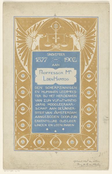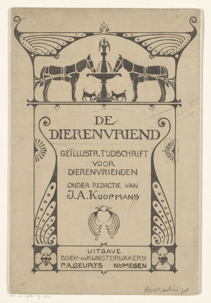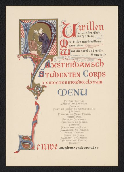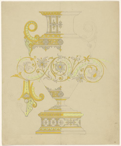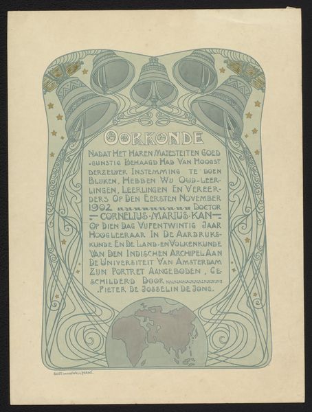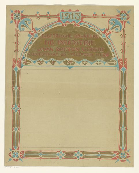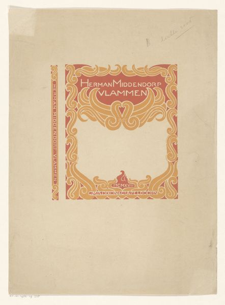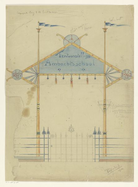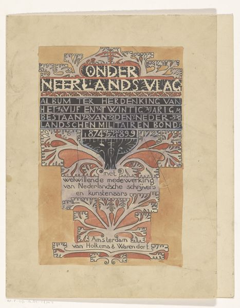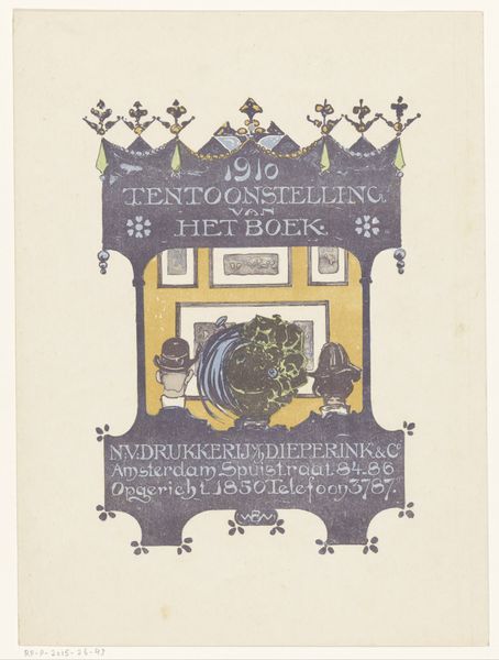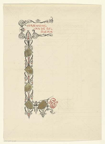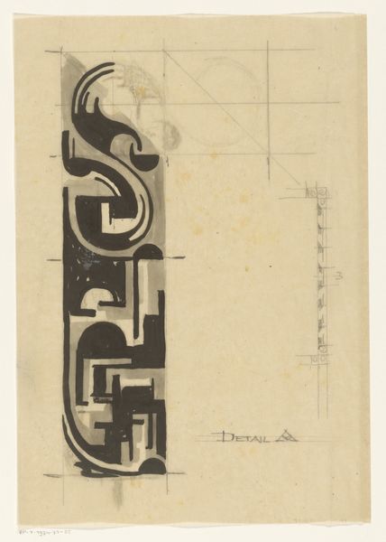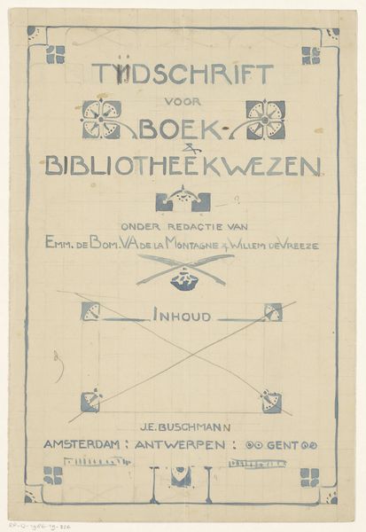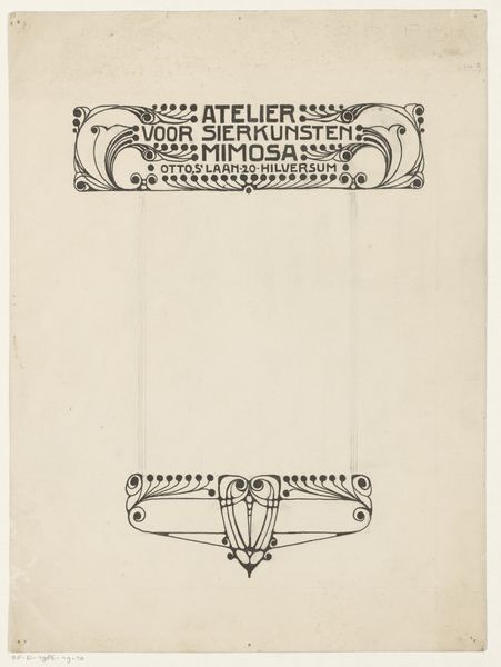
Omslagontwerp voor: De Bedrijfsreklame: Officieel orgaan van de Vereeniging ter bevordering der bedrijfsreklame, juli 1919 1919
0:00
0:00
graphic-art, watercolor, poster
#
graphic-art
#
art-nouveau
#
blue ink drawing
#
watercolor
#
geometric
#
symbolism
#
watercolour illustration
#
poster
Dimensions: height 311 mm, width 226 mm
Copyright: Rijks Museum: Open Domain
Curator: This cover design, executed by Reinier Willem Petrus de Vries in 1919, presents an intriguing fusion of geometric precision and fluid Art Nouveau sensibilities. The work uses watercolor and graphic art to capture our attention. Editor: Immediately, I'm struck by its almost heraldic quality, the confident symmetry. The pale yellow and blue create a sense of… well, perhaps restrained optimism, quite formal but still inviting, do you agree? Curator: I do, particularly in relation to its purpose. This was a cover for "De Bedrijfsreklame," a publication of the Association for the Promotion of Business Advertising. In the historical context, business was recovering after the end of WWI, and you see a sense of hope. I would argue it's carefully optimistic, conveying an industry ready to take flight, presented almost as a modern, clean emblem. Editor: So the symbol almost functions like a family crest for the burgeoning advertising industry itself? Curator: Precisely! Each carefully rendered flourish becomes a badge of professional pride. Consider also that the geometric pattern subtly underpinning the whole composition suggests structure, progress and order in commerce at that time. Editor: And I imagine the clean lines were a stark contrast to the heavy ornamentation that had previously dominated design, indicating a shift towards functionalism that influenced early modernism. It strikes me as the optimistic visual language of business ready to adapt. Curator: The colors too. The careful distribution of yellow and blue creates balance and a forward-looking statement in a time when businesses were reshaping the landscape. Editor: Thinking about visual symbols in a broader sense, the whole composition seems rooted in the visual vocabulary of idealized industrial progress. Very persuasive for any advertising body in 1919! I am especially taken with how effectively the artist merged this visual precision and these more decorative touches from Art Nouveau. Curator: It's a really compelling encapsulation of its moment in time, offering us a glimpse into a period of transformation and growth in advertising culture. Editor: Indeed, an enduring visual record of a nascent industry striving for legitimacy through carefully constructed symbolic forms.
Comments
No comments
Be the first to comment and join the conversation on the ultimate creative platform.
