painting, acrylic-paint
#
op-art
#
muted colour palette
#
painting
#
colour-field-painting
#
acrylic-paint
#
abstract
#
form
#
geometric
#
muted colour contrast
#
geometric-abstraction
#
line
#
modernism
#
hard-edge-painting
Copyright: Modern Artists: Artvee
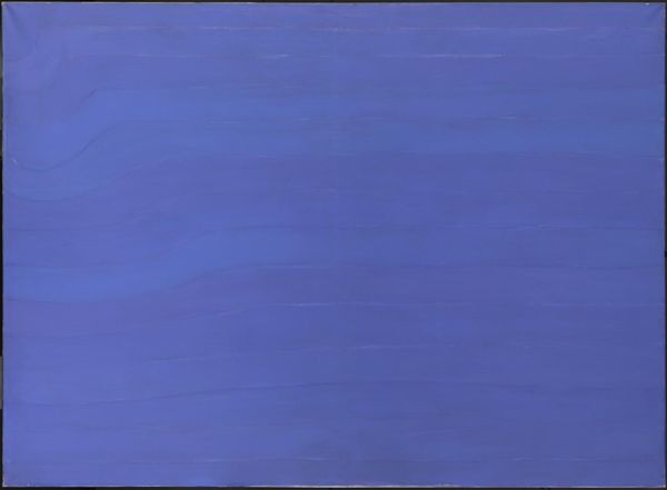
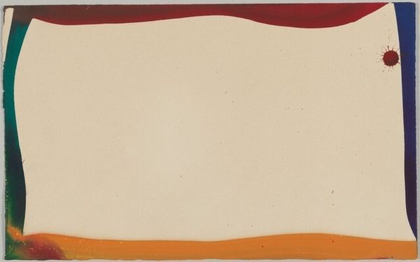
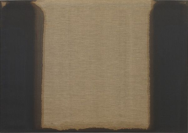
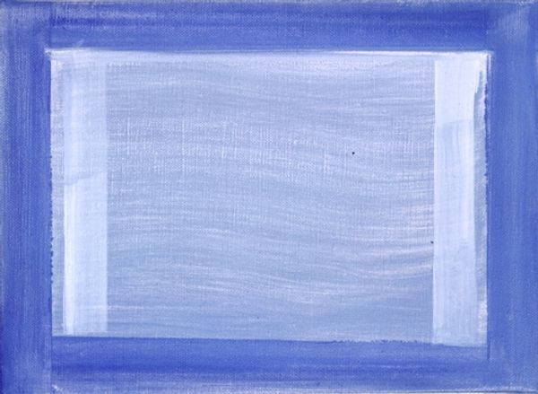
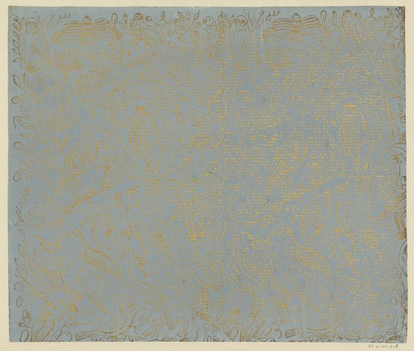
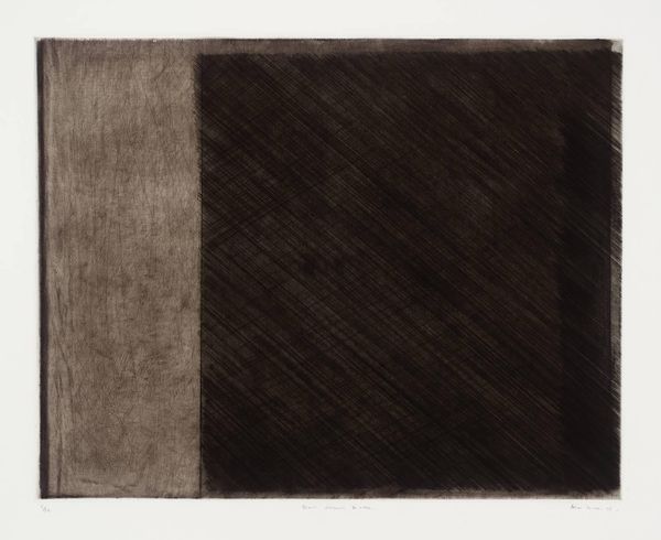
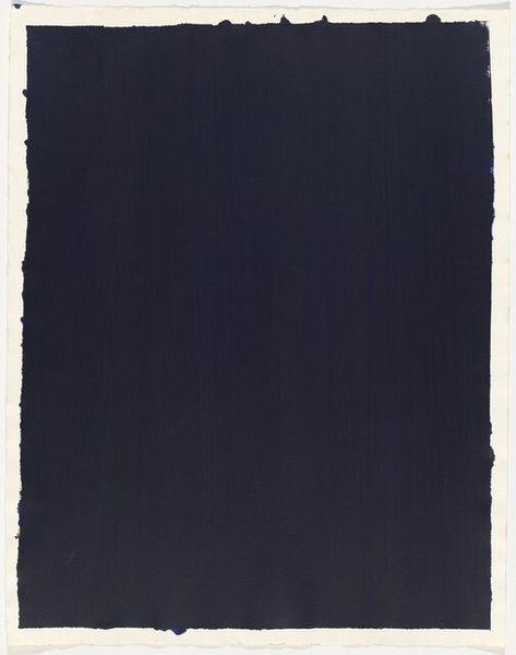
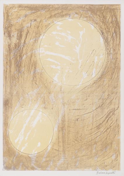
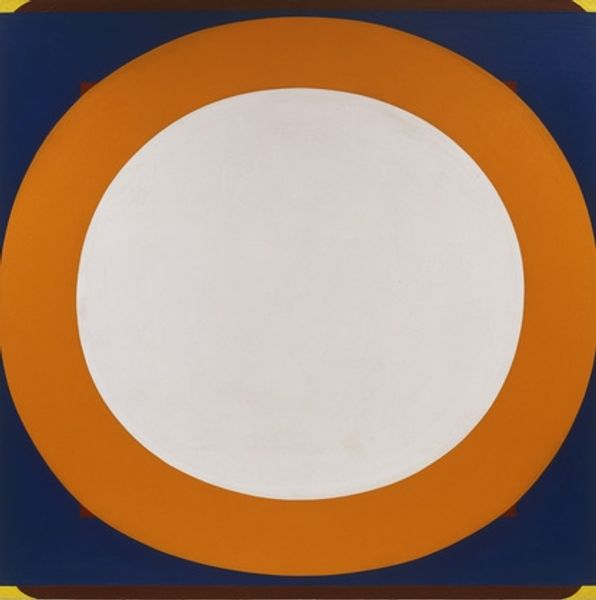
Editor: So, here we have Victor Vasarely's "Belypse," painted in 1951 using acrylics. What immediately strikes me is its surprising calmness. The muted colours and the basic oval form create a very stable, almost meditative feel. How do you read its visual language? Curator: Precisely. One must consider how Vasarely deploys formal elements to structure visual experience. Observe the carefully calibrated interaction between the oval and the rectilinear frame. Do you see how the subtle shifts in colour intensity create a push and pull effect, a tension between surface and depth? Editor: Yes, the darker shades surrounding the central oval almost make it feel like it’s floating or receding into the background, while the blue and grey lines create this unusual visual frame, but in two dimensions. Is that intentional? Curator: Intention is a construct we must approach cautiously. However, we can analyze the visual effects. The composition refuses to settle. There's a constant play of figure and ground, flatness and illusionism, achieved through purely formal means, colour, line, and shape. It anticipates his later exploration of Op Art, disrupting our perceptions. What do you make of that large, pale form set within that grid? Editor: It's very compelling, though somewhat aloof. I am still surprised how those basic geometrical forms have such a dynamic interplay. Almost contradictory; still yet kinetic. Curator: Indeed. Vasarely invites us to consider how seemingly simple forms, when organized according to precise formal principles, can activate our visual senses and challenge our understanding of space and form. By focusing on those optical and sensory phenomena we achieve aesthetic awareness. Editor: It makes a lot more sense now. The piece is about how we perceive rather than what we perceive. It's less representational and more experimental! Curator: A most insightful synthesis.
Comments
No comments
Be the first to comment and join the conversation on the ultimate creative platform.
