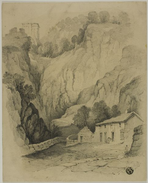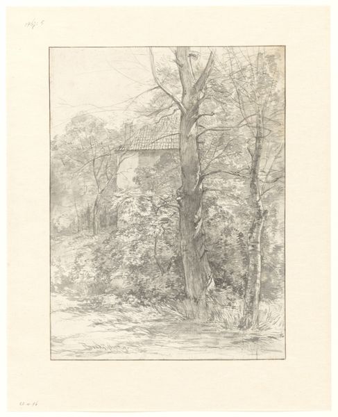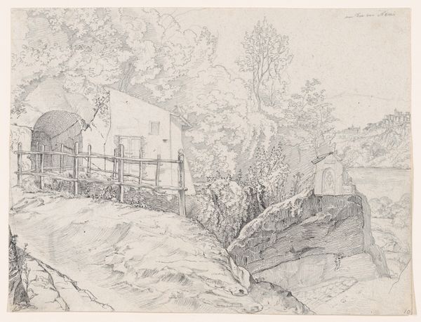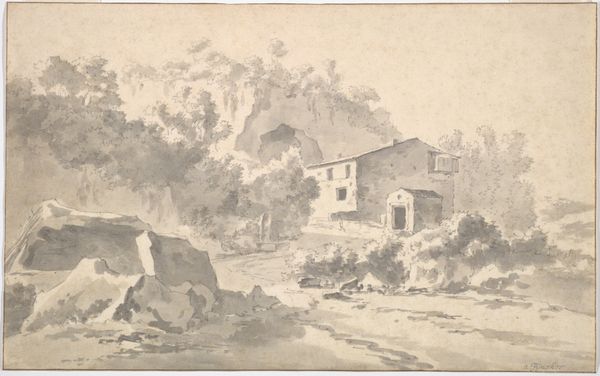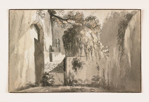
Houses in front of a cliff
Listen to curator's interpretation
Curatorial notes
Editor: So this is "Houses in front of a cliff" by Jan Asselijn. It looks like a drawing done with chalk, ink, and watercolor on paper. There's a real stillness to it, almost like time is frozen. What do you see in this piece? Curator: I see a reflection of power structures embedded within landscape and architecture. Asselijn presents us with what appears to be a tranquil scene, yet the imposing cliffside, the dwellings built into it, hint at a negotiation – perhaps a struggle – with nature's dominance. Editor: A struggle? I just thought it was pretty. Curator: But what does "pretty" mean in this context? Who gets to define the aesthetic? Consider how the buildings seem almost subservient to the rock face. Are we looking at a comment on the limitations, even the oppression, of human endeavor when confronted with the immensity of the natural world? Think about class dynamics, land ownership... whose houses are these, really? Editor: Oh, I never considered that. So the very composition, the arrangement of houses against the cliff, speaks to that? Curator: Precisely. And the limited color palette reinforces a certain somberness. This isn't just a landscape; it’s a commentary on humanity’s place within a potentially indifferent, even hostile, environment. What if Asselijn is encouraging us to see beyond the surface and question who benefits from this arrangement? Editor: I see what you mean. It definitely makes you think about the relationship between the houses and their surroundings differently. It is definitely more complex than just pretty. Curator: Exactly! And questioning those ingrained power dynamics is how we begin to truly see the world, and the art in it, with fresh eyes.