drawing, graphic-art, print, typography, pen
#
portrait
#
drawing
#
graphic-art
#
aged paper
#
hand-lettering
# print
#
old engraving style
#
hand drawn type
#
form
#
personal sketchbook
#
typography
#
hand-drawn typeface
#
pen
#
golden font
#
northern-renaissance
#
decorative-art
#
word imagery
#
historical font
#
columned text
#
calligraphy
Dimensions: height 179 mm, width 237 mm
Copyright: Rijks Museum: Open Domain
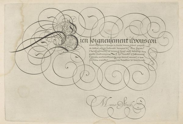
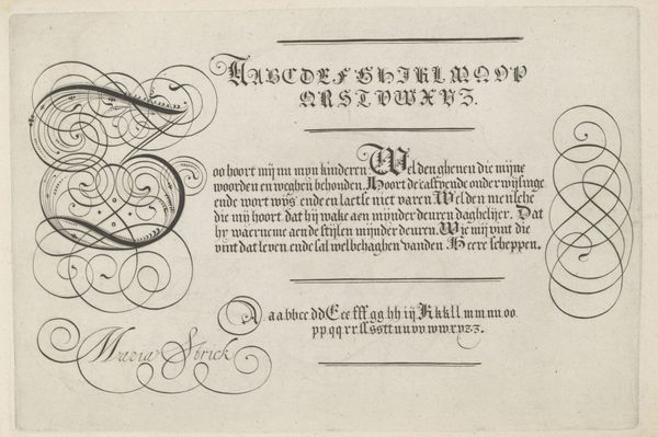
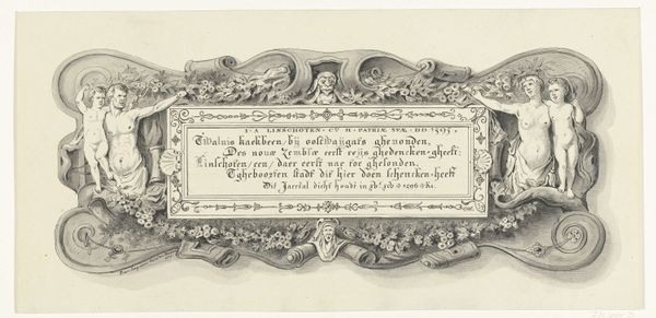
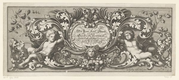
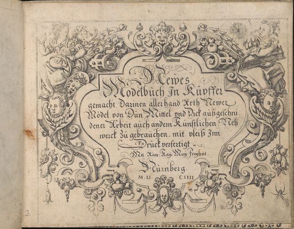
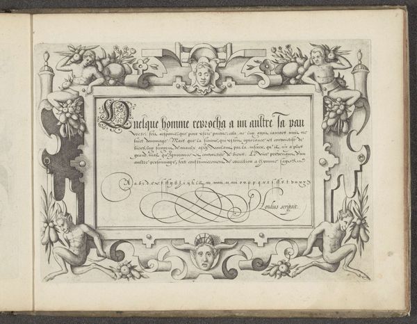
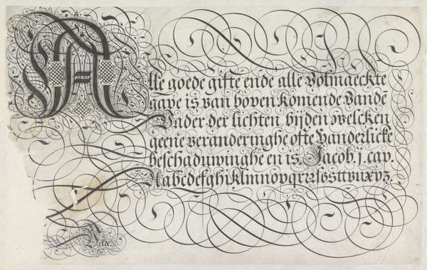
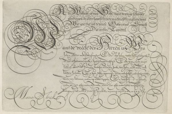
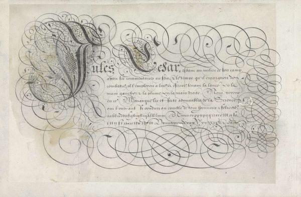
Curator: Before us, we have “Schrijfvoorbeeld met schrijvende hand,” or "Writing Sample with a Writing Hand," made before 1625 by Antonius Smyters. The work showcases a writing hand encased in an oval frame, surrounded by stylized script. Editor: It's ornate! The contrast between the precision of the hand and pen and the swirling embellishments is immediately striking. The hand's almost sculptural, juxtaposed with the graphic quality of the surrounding typography. Curator: Smyters was a master calligrapher. This isn’t simply about aesthetics; it’s about the very craft of writing and the labour involved. The details—the feathered quill, the depicted hand—are the tools, the raw materials of the scribe’s trade. And observe, the quality of the paper would have been paramount! Editor: Absolutely. We must consider this piece within the historical context of literacy and learning. Who would have been commissioning and consuming such work? How did the role of the scribe impact social structures of that era? It almost speaks to the power held in carefully crafted documents. Curator: The repetitive flourishes become particularly fascinating when you consider this could very well have been a practice sheet. This very item, we’re looking at, likely assisted a scribe-in-training. Was Smyters attempting to demonstrate skill for a specific commission or teach certain letter-making techniques? Editor: Indeed. Consider the institutional role. Calligraphy, particularly during the Northern Renaissance, was heavily connected with religious texts, governance records, and personal correspondence for elites. How did the Church or the wealthy elite influence Smyters, his practice, and the overall perception of scribes and graphic art? Curator: That level of precision implies the labor wasn’t simply transactional. Smyters clearly poured immense focus into the materiality, even creating his own designs to encircle the writing example. There's no dichotomy between “high” art and “mere” craft, only carefully planned choices made to ensure visual harmony between the elements. Editor: Right, and through the art of penmanship, he also wielded a certain influence. Before the printing press’s mass adoption, scribes and their presentation of texts and documents shaped our very perception of historical narratives, religious interpretations, and legal statutes. Curator: Seeing this example makes me admire the craftsmanship behind letter-making anew! Editor: Agreed! It provides valuable insights into the political and social meaning embedded in imagery of written material.
Comments
No comments
Be the first to comment and join the conversation on the ultimate creative platform.
More like this