About this artwork
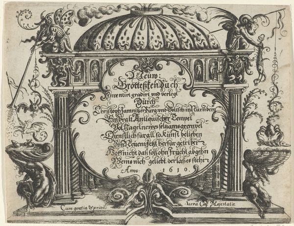
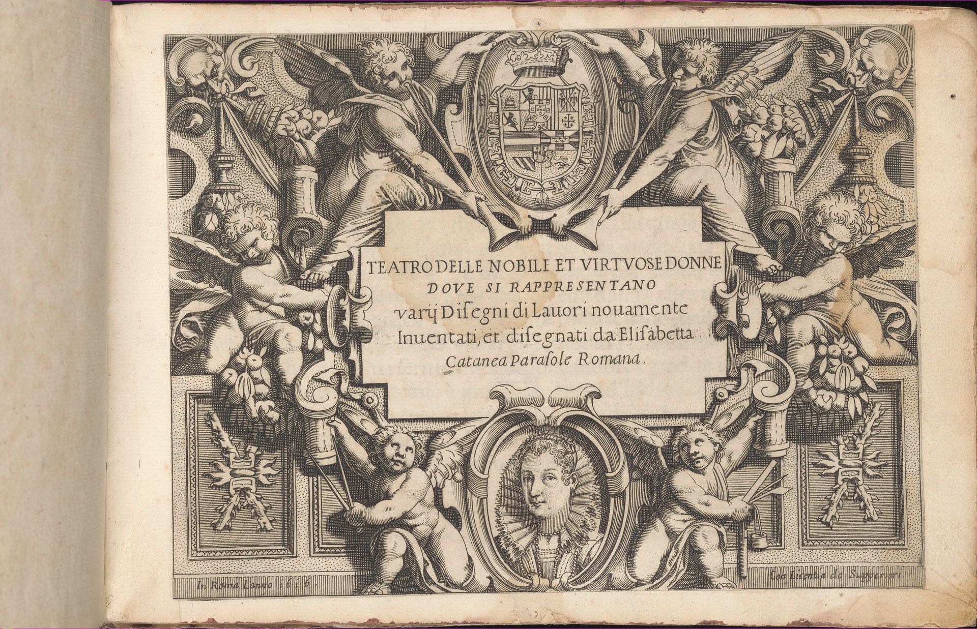
Curator: Look at this title page; it’s from Isabella Catanea Parasole's *Teatro delle Nobili et Virtuose Donne*, dated 1616, a collection housed at the Metropolitan Museum of Art. It's a print, most likely an engraving. Editor: Oh, wow, it’s so detailed! It gives off a really ornate vibe, like a doorway into a world of hidden stories and elaborate secrets. I'm getting a strong, whimsical feeling. Curator: It really showcases the convergence of art and industry. Consider that Isabella was one of the few recognized female artists and printmakers of her time. Her designs served practical purposes, particularly for lace makers, suggesting a democratization of artistic skill across social strata. Editor: Right, that is not something one might think about initially. Thinking more on its craft and labour context, all of those repeated details! All those cherubs framing the main text, that symmetrical composition...it seems almost like a factory design or serial design piece! Did this title page suggest these skills or that labour aspect in some way? Curator: Indeed. It subtly collapses high art and applied art through its very purpose, being at once visually elaborate and a tool for artisans and crafts persons, and, potentially, aspiring to be artists too. In a similar context, many portraits from that era were often circulated this way...the art became its means for social mobility and aspirational capital for those commissioning works from the original print or painting. Editor: I hadn’t considered it in that context before. Makes me feel quite different knowing that! Now, the woman's portrait seems almost incidental, despite the strong emphasis around her figure in a cameo at the very bottom center of the whole arrangement. Curator: I find it telling that Parasole emphasizes her first name in the main lettering, suggesting that female authorship in that historical moment necessitated clear signals of women at work. Editor: Now I see it so much more differently. Thanks, I really get a more fuller, richer sense of the work's value and context with these materialist ideas! Curator: Me too, understanding the artwork from your perspective makes it much more accessible to envision the emotional experience, and imagine other people doing so, too!
Teatro delle Nobili et Virtuose Donne...
1616
Isabella Catanea Parasole
1565 - 1625The Metropolitan Museum of Art
Metropolitan Museum of Art, New York, NYArtwork details
- Medium
- drawing, print, engraving
- Dimensions
- Overall: 7 1/2 x 10 7/16 in. (19 x 26.5 cm)
- Location
- Metropolitan Museum of Art, New York, NY
- Copyright
- Public Domain
Tags
portrait
drawing
pen drawing
italian-renaissance
engraving
Comments
Be the first to share your thoughts about this work.
About this artwork
Curator: Look at this title page; it’s from Isabella Catanea Parasole's *Teatro delle Nobili et Virtuose Donne*, dated 1616, a collection housed at the Metropolitan Museum of Art. It's a print, most likely an engraving. Editor: Oh, wow, it’s so detailed! It gives off a really ornate vibe, like a doorway into a world of hidden stories and elaborate secrets. I'm getting a strong, whimsical feeling. Curator: It really showcases the convergence of art and industry. Consider that Isabella was one of the few recognized female artists and printmakers of her time. Her designs served practical purposes, particularly for lace makers, suggesting a democratization of artistic skill across social strata. Editor: Right, that is not something one might think about initially. Thinking more on its craft and labour context, all of those repeated details! All those cherubs framing the main text, that symmetrical composition...it seems almost like a factory design or serial design piece! Did this title page suggest these skills or that labour aspect in some way? Curator: Indeed. It subtly collapses high art and applied art through its very purpose, being at once visually elaborate and a tool for artisans and crafts persons, and, potentially, aspiring to be artists too. In a similar context, many portraits from that era were often circulated this way...the art became its means for social mobility and aspirational capital for those commissioning works from the original print or painting. Editor: I hadn’t considered it in that context before. Makes me feel quite different knowing that! Now, the woman's portrait seems almost incidental, despite the strong emphasis around her figure in a cameo at the very bottom center of the whole arrangement. Curator: I find it telling that Parasole emphasizes her first name in the main lettering, suggesting that female authorship in that historical moment necessitated clear signals of women at work. Editor: Now I see it so much more differently. Thanks, I really get a more fuller, richer sense of the work's value and context with these materialist ideas! Curator: Me too, understanding the artwork from your perspective makes it much more accessible to envision the emotional experience, and imagine other people doing so, too!
Comments
Be the first to share your thoughts about this work.