drawing, paper, ink, pen
#
drawing
#
pen sketch
#
paper
#
ink
#
ink drawing experimentation
#
expressionism
#
pen
#
monochrome
Copyright: Rijks Museum: Open Domain
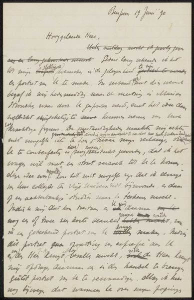
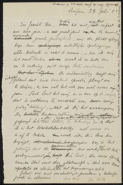
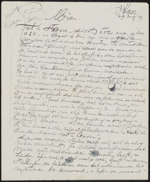
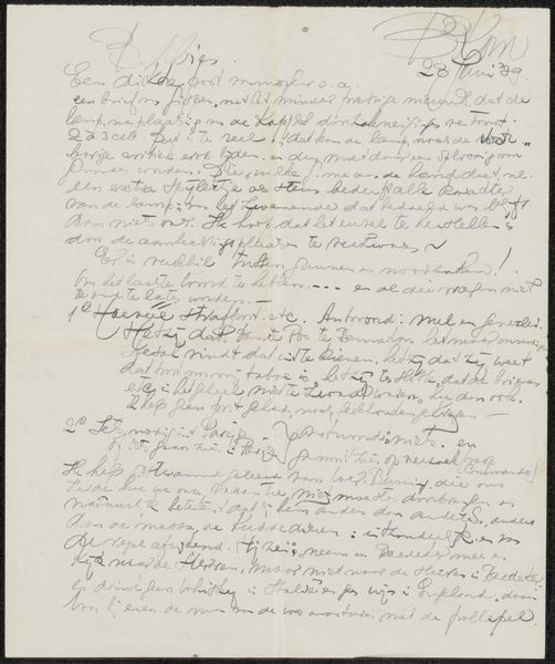
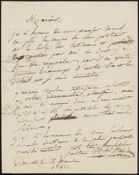
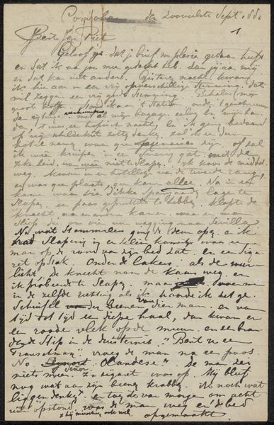
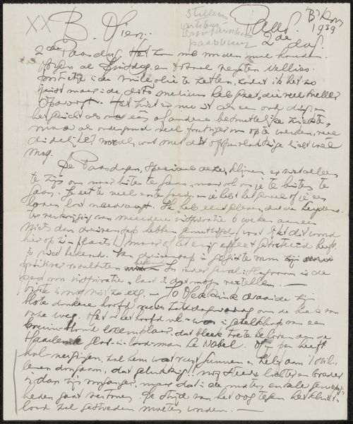
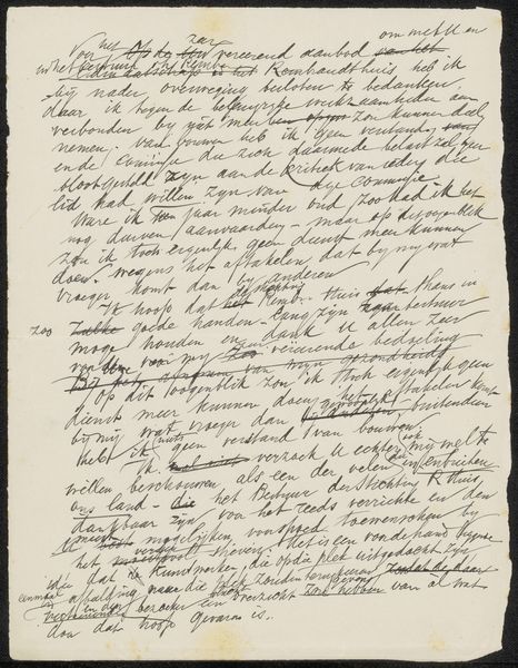
Curator: Welcome. We’re looking at a drawing, “In Memoriam Johannes de Koo,” possibly from 1909, by Philip Zilcken. It's part of the Rijksmuseum's collection. The piece is primarily ink on paper, creating this wonderfully monochrome effect, almost like a page ripped from a private journal. Editor: It definitely has that intimate feel. Like a candid thought, barely captured before it fluttered away. There's a nervous energy to the handwriting— a quickness in the execution of the pen, doesn't it seem? A little glimpse into someone's raw, unfiltered thoughts. Curator: Indeed, Zilcken uses a pen with what seems like incredible speed and pressure variations, and this is pure expressionism. Look at how the ink bleeds and pools in certain areas, emphasizing key phrases… it feels so personal. The content appears to be a written letter or note, complete with cross-outs. It’s almost stream of consciousness writing. Editor: What fascinates me is the tension between the personal and the formal aspects. We have a handmade, deeply felt message, yet presented with the tools of traditional calligraphy, but executed with a freedom bordering on rebellion against refined aesthetics. I’m sure that type of work had very little market demand back then. You know, it speaks of the value society places on crafted works, the perceived worth of labor poured into something like this. And how it shifts or does not across historical divides. Curator: I agree. And there's something undeniably moving in the fact that it is a "memoriam." Perhaps the artist has immortalized his raw reaction and feeling in response to Johannes de Koo's passing. And yet, the fact that it's on paper suggests a level of permanence... a decision made to record something that could have been ephemeral. A deeply felt, scribbled monument. Editor: So well said. The physicality of the ink, the deliberate choice of permanence within what seems fleeting... a lovely contrast. Thanks for highlighting such important work that’s so seldom given any real consideration these days. Curator: Indeed. It’s a work that reminds us to consider value beyond the surface of materials.
Comments
No comments
Be the first to comment and join the conversation on the ultimate creative platform.
More like this