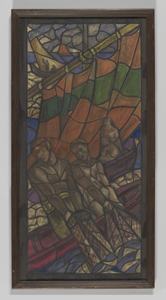
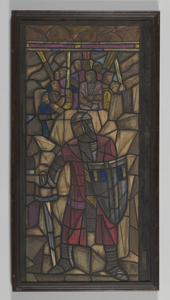
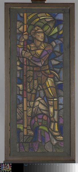
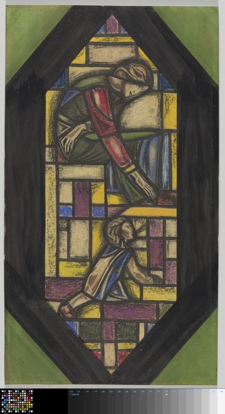
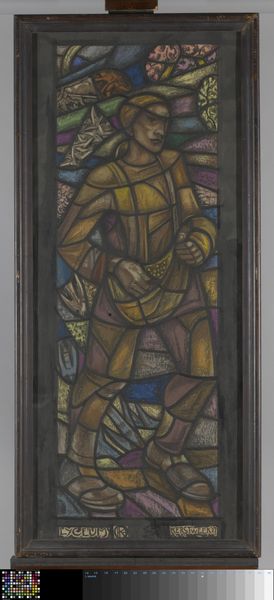
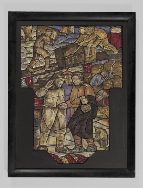
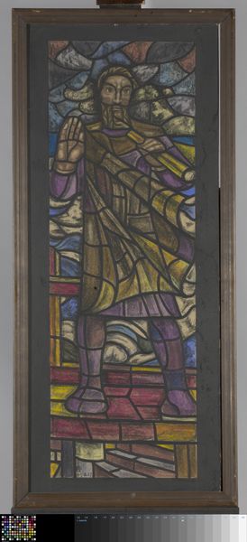
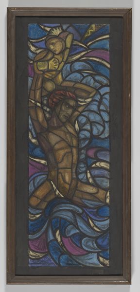
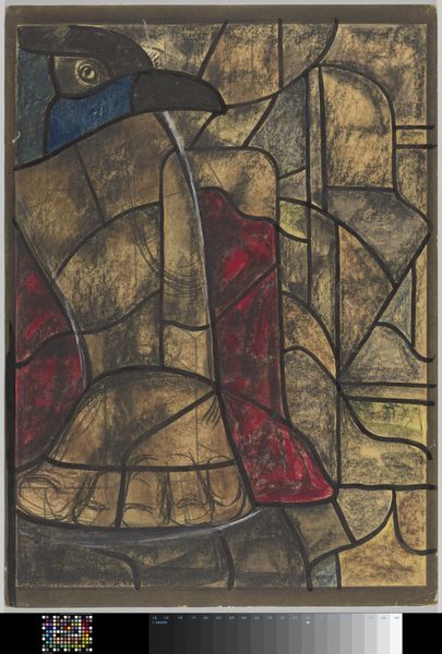
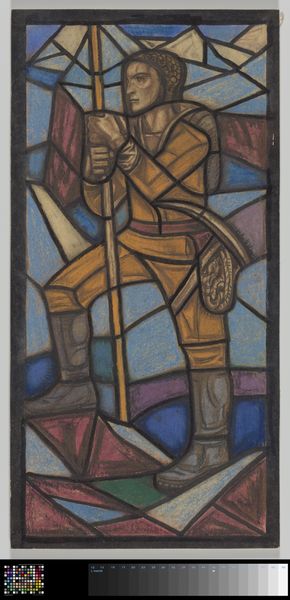
Ontwerp voor raam in het Stadhuis in Amsterdam before 1938
0:00
0:00
richardnicolausrolandholst
Rijksmuseum
drawing, tempera, painting, mural
#
drawing
#
tempera
#
painting
#
figuration
#
geometric pattern
#
geometric
#
history-painting
#
mural
#
modernism
Dimensions: height 1615 mm, width 795 mm, height 1660 mm, width 800 mm
Copyright: Rijks Museum: Open Domain
This is Richard Nicolaüs Roland Holst's 'Ontwerp voor raam in het Stadhuis in Amsterdam', made with mixed media. It looks like chalk or crayon, maybe gouache, on paper. See how the angular forms create an image, but also fight against it, creating a push-pull effect? Up close, the texture is really interesting. The colours are earthy, browns, ochres, reds, but there are also these surprising pops of purple in the background, like buried jewels. The pigment seems to have been rubbed into the paper, a very physical process. I keep thinking about that brown line running down the right of the image - is it a shadow, a structural support, or a figure? It suggests weight, like gravity pulling everything down, but it also feels totally ambiguous and strange. Looking at the piece, I'm also thinking about Käthe Kollwitz, who similarly used graphic art and a muted palette to explore themes of labour, struggle, and resilience. What do you see?
Comments
No comments
Be the first to comment and join the conversation on the ultimate creative platform.
More like this