drawing, paper, pencil
#
drawing
#
neoclacissism
#
aged paper
#
toned paper
#
light pencil work
#
homemade paper
#
ink paper printed
#
parchment
#
paper
#
tea stained
#
form
#
personal sketchbook
#
geometric
#
pencil
#
academic-art
#
decorative-art
Dimensions: height 198 mm, width 279 mm
Copyright: Rijks Museum: Open Domain
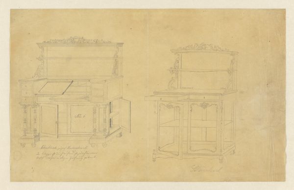
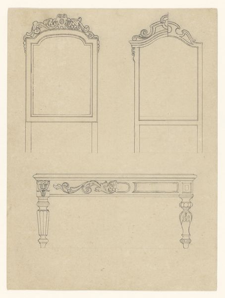
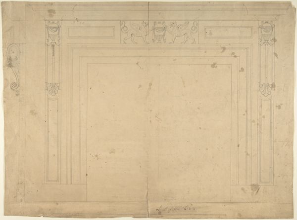
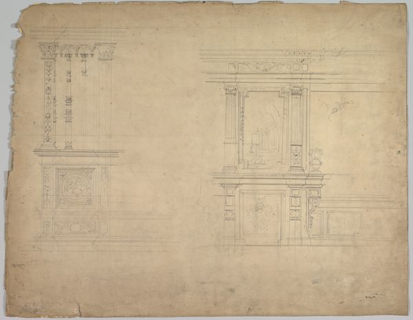
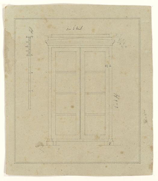
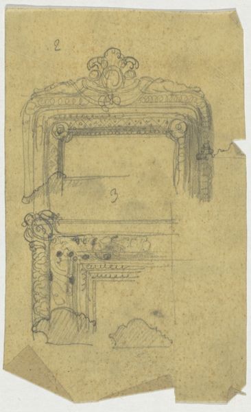
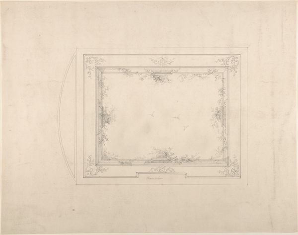
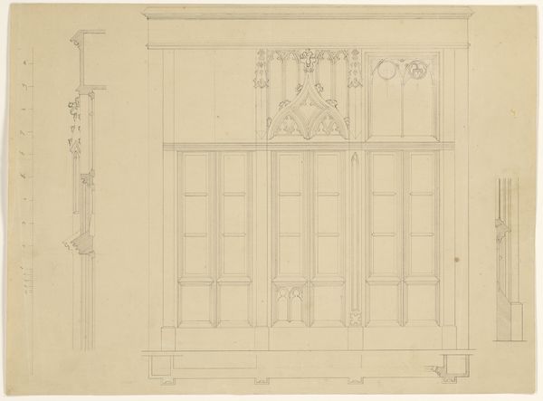
Curator: Welcome. Before us, we have B. Winghofer's "Ontwerp voor twee secretaires," a pencil drawing on paper, dating from around 1852 to 1855. Editor: My immediate impression is one of quietude, a deliberate stillness. The aged paper lends a sort of solemnity, wouldn’t you say? It’s like peeking into someone’s private thoughts. Curator: Indeed. Consider the rigorous linearity, the precision in rendering these secretary desks. The structure adheres to Neoclassical principles – a commitment to symmetry and proportion, hallmarks of that movement's embrace of rational form. The careful execution really commands our attention. Editor: But aren’t secretary desks themselves deeply symbolic? Think of the secrets held within, the private letters, the financial documents. These weren't mere functional objects; they were guardians of identity and power. The almost shrine-like upper compartments... fascinating how such utilitarian designs carry such loaded symbolism. Curator: Absolutely. It is tempting to read narratives into their forms. But let's focus for a moment on Winghofer's draftsmanship. The subtle tonal variations achieved with just pencil, the implied depth, even on what you pointed out as "aged paper," all underscore a deep understanding of his materials and a conscious artistic decision-making. Editor: Speaking of "decision-making," consider that left-hand drawer pulled ajar. The openness invites a curious voyeurism – a glimpse behind the facade. A strong metaphor, perhaps, for the opening of oneself through letters and documents housed inside it. Do you believe the designs differ significantly from one another? Curator: While both feature the core drop-front desk design, one can see variation in the upper shelving and internal organization. I want to say these differences, no matter how subtle, reveal a designer fine-tuning for personalized utility. I like that you are keen to spot difference! Editor: This piece offers a delightful collision of the tangible and intangible. Looking past surface and symbolism reveals its subtle beauty. Curator: Quite. Winghofer's work serves as a poignant reminder of how aesthetic principles are brought into practical application; moreover it reveals its cultural impact.
Comments
No comments
Be the first to comment and join the conversation on the ultimate creative platform.
