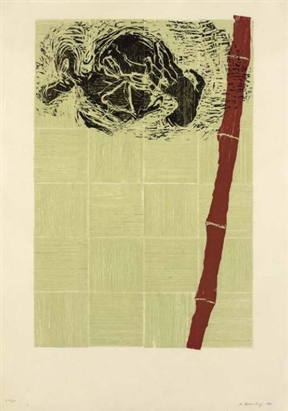
# print
#
linocut print
#
geometric
#
abstraction
#
modernism
Copyright: National Gallery of Art: CC0 1.0
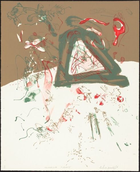
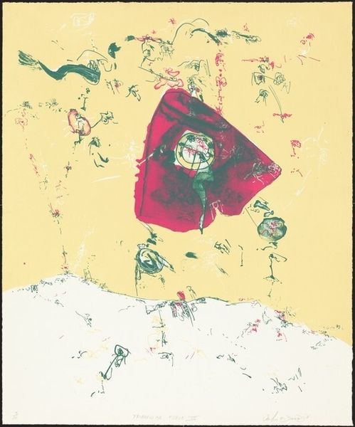
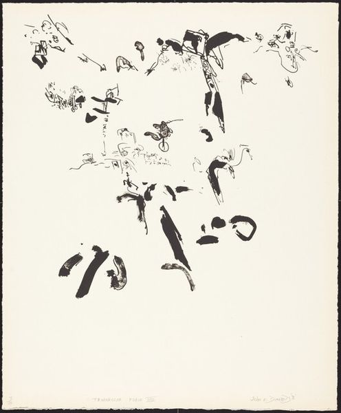
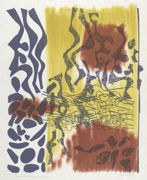
Curator: This is John Dowell's "Triangular Fugue IV," a linocut print created in 1965. What strikes you first about it? Editor: It feels… like a landscape collapsing in on itself. Or maybe a playful experiment gone slightly wrong. The big red triangle wants to be a strong focal point, but all the scribbles pull my eye in different directions. Curator: The interplay of geometric forms and spontaneous lines is really interesting. Dowell trained as a printmaker, and here you see him exploring the capabilities of the linocut. It's all about the texture, the way he cuts and manipulates the linoleum. Editor: Absolutely. There's an improvisational feel to the work. The little figures, scattered across the paper...they are almost whimsical! But against the weight of that brutalist triangle...it feels like resistance or protest. Did the '60s have a particular relevance? Curator: Very much so. Dowell came of age as an artist during the Civil Rights Movement. Considering that social backdrop, the tension between form and freedom, geometric order and gestural chaos, takes on a whole other layer of meaning. Linocut, too, had associations with working-class graphics and protest art at that time, an act of embracing a ‘low’ material Editor: That resonates, I suppose, given that he used quite earthy shades. I'm fascinated by how he merged the planned, structural aspect – the triangle – with what looks like sheer impulse. I keep wondering what a “fugue” means in relation to such a scattered but grounded picture. Is that simply an abstraction? Or some sense of escaping? Curator: The title certainly hints at that, “fugue” in music indicating a contrapuntal composition, a layering of voices. Dowell translated this into visual terms: layers of line, shape, and meaning working in concert, perhaps dissonantly at times. It’s not about easy harmonies; it’s about tension and release. And the materiality; consider the textures of the print itself - so raw. Editor: Thinking about it... That's it exactly! It’s about the tensions; and how those very different artistic languages find ways of clashing – and ultimately creating a space. Dowell definitely encourages our perception! Curator: Indeed. It invites us to really consider the tensions of form and freedom, material and message. Editor: Well, I've definitely found myself noticing the dance between chaos and calculation a bit more deeply now! Thank you!
Comments
No comments
Be the first to comment and join the conversation on the ultimate creative platform.
More like this