mixed-media, print, watercolor, ink
#
mixed-media
# print
#
watercolor
#
ink
#
abstraction
#
line
#
watercolour illustration
#
modernism
#
watercolor
Copyright: National Gallery of Art: CC0 1.0
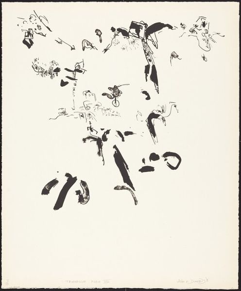
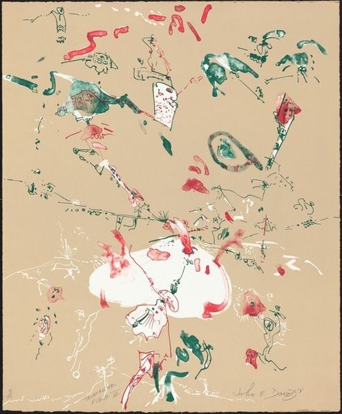
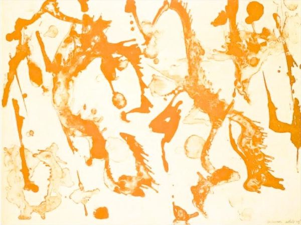
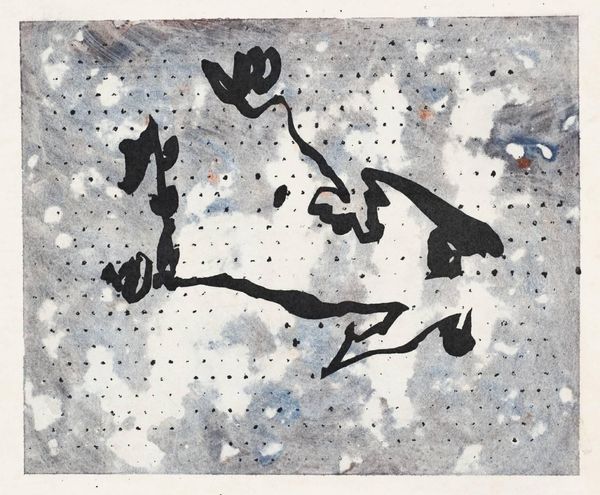
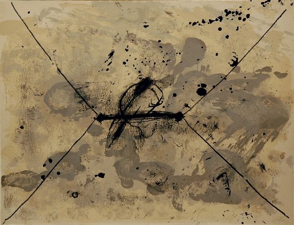
John Dowell made this print, Triangular Fugue VII, with a really open approach to mark making, like he's letting the materials lead the way, and I find that so freeing. The color palette is so interesting, too – a mix of blacks, browns, oranges and creams that gives the piece a real warmth. Looking at it, you can see how the ink lies on the surface of the paper. It's not about hiding the process, it's about celebrating it. The physicality of the medium is right there, exposed for all to see. There's this one black swoosh in the upper right corner, it’s like a punctuation mark. It stands out and creates a sense of depth and movement. Dowell's work reminds me a bit of Cy Twombly, in the way both artists embrace chance and imperfection. But Dowell has his own unique voice, his own way of making music on paper. Art is always a conversation, an ongoing exchange of ideas and influences across time, and it’s not about fixed meanings.
Comments
No comments
Be the first to comment and join the conversation on the ultimate creative platform.
