painting, oil-paint
#
portrait
#
painting
#
oil-paint
#
11_renaissance
#
history-painting
#
italian-renaissance
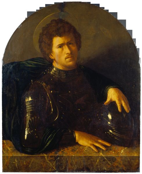
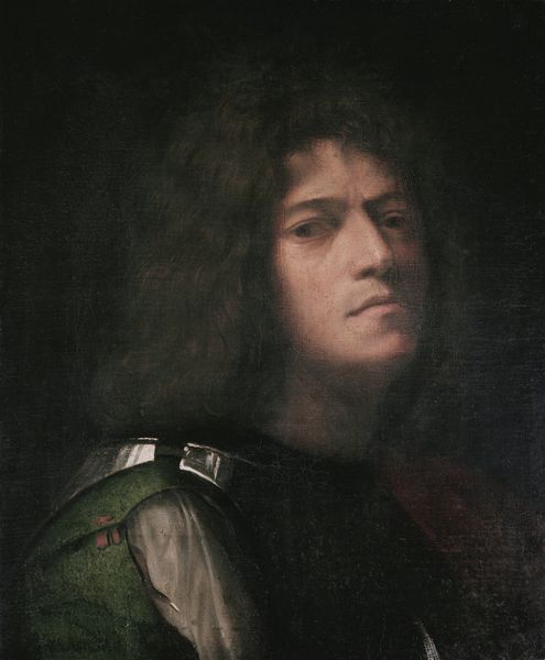
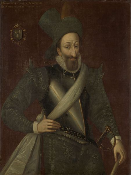
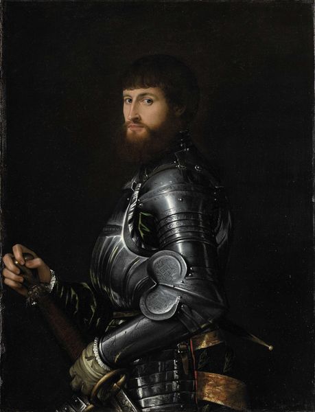
Dimensions: 90 cm (height) x 67 cm (width) (Netto)
Editor: Here we have Sebastiano del Piombo's oil painting, "Portrait of Charles the Bold", created sometime between 1500 and 1547. There's an intensity in the subject’s gaze, yet the almost monochrome palette makes it feel somber. What aspects of its formal qualities stand out to you? Curator: The stark contrast between light and shadow, or chiaroscuro, is immediately striking. It serves not just to model the figure, but also to heighten the drama. Notice how the artist deploys this technique to emphasize the contours of the face and the armor, effectively contrasting the softness of the skin against the hardness of metal. This binary, soft and hard, directs us toward what it means to represent a Duke, particularly one nicknamed ‘the Bold.' How does the textural differentiation affect your reading? Editor: I see what you mean; it's as if the contrasting textures—the smooth skin and reflective armor—somehow speak to the different facets of his character, both vulnerable and strong. What can we say about the composition overall? Curator: The composition adheres to a pyramidal structure, stable and imposing. The apex, naturally, is the face, the most illuminated part of the canvas. This stable form communicates strength, despite his somewhat melancholy expression. Furthermore, observe the meticulous rendering of light across the armor. Consider it almost a separate plane of geometrical forms created from light. The artist focuses our eye towards detail within defined areas. This suggests a concern not just for likeness, but also for structure. Do you find these details strengthen or detract from your viewing experience? Editor: I think they definitely strengthen it! Considering the way light interacts with texture adds another layer of complexity that draws me in. Curator: Precisely. A structuralist reading benefits from these observations because each of the binaries at play: light/dark, skin/metal, contribute to a constructed message about the subject and his place in the world. Editor: That's fascinating. I hadn't considered the semiotic weight of the contrast before. Thanks!
Comments
No comments
Be the first to comment and join the conversation on the ultimate creative platform.
More like this