#
op-art
#
op art
#
pop art
#
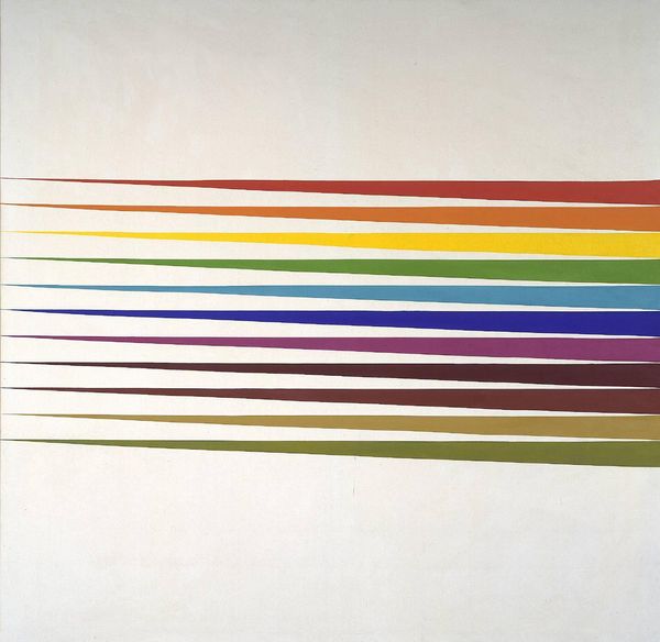
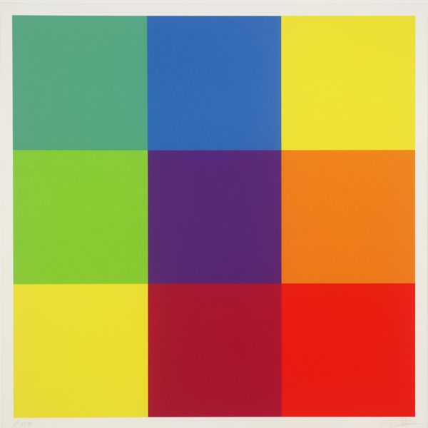
geometric
#
geometric-abstraction
#
line
Copyright: Verena Loewensberg,Fair Use
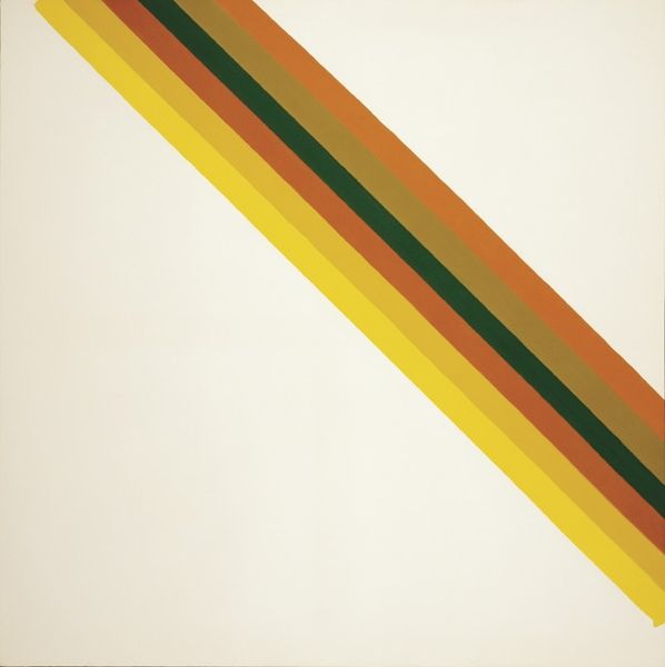
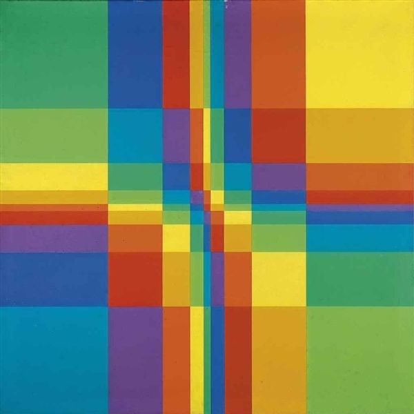
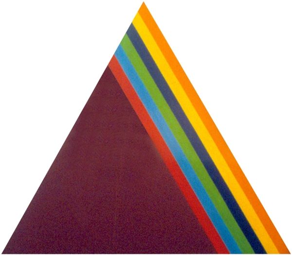
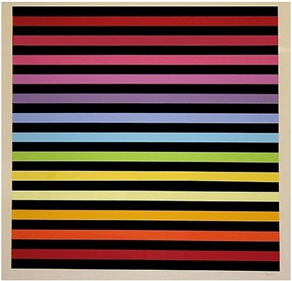
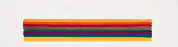
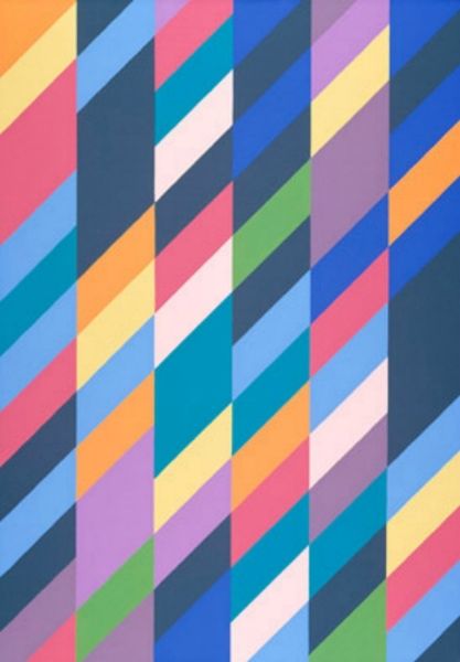
Curator: Verena Loewensberg's "Composition" from 1973 presents such striking simplicity; it appears at first glance as just two intersecting rainbow bands. Editor: That’s true, and I find its initial impact disarming in a pleasant way. The composition is stark, allowing the bright stripes against the negative space to dominate. It feels simultaneously direct and open to interpretation. What kind of materials did she employ here? Curator: Unfortunately, the exact material composition isn’t available to us right now, but considering it's an artwork from 1973, it may be useful to consider what kind of industrially produced paints and canvas options might have been used at the time. Also, do you think it is significant in any way that Loewensberg employed colors from a rainbow? Editor: Absolutely. Rainbows carry rich cultural weight. Historically, they are seen as symbols of hope, promise, or divine connection in various belief systems. But I think the choice might reflect a post-war optimistic view, embracing diversity and unity through the inclusive symbol of the rainbow. And notice how each stripe retains its autonomy, avoiding the blending that might signify homogenization. What do you think was behind her simplification? Curator: Perhaps she aimed to strip away ornamentation, focusing purely on color relationships and geometric interaction. I believe this approach brings attention to the precision in its execution: the uniformity of the bands, their intersection, and the considered space surrounding them all contribute to the overall impact of this art work. It speaks volumes on what constitutes an artistic decision, while challenging traditional definitions around labor by producing art which, if examined in abstraction only from its signature, might pass as industrially created. Editor: You’re right to note the labor implications here, but from an iconographic point of view, this absence could also serve a purpose. I wonder if the seemingly effortless nature might symbolize an ideal state, one achieved through harmony. It also creates that striking first impression: one clean diagonal sweep creating another and creating harmony. Curator: Perhaps in its manufacturing, it comments on those goals also. Considering her background, the intersection of industry, materiality, and aesthetics makes it a compelling reflection on its historical moment, don’t you agree? Editor: Definitely. This concise form delivers multiple possibilities, and Loewensberg's bold combination opens a valuable pathway to consider material practice with deep roots in our collective consciousness.
Comments
No comments
Be the first to comment and join the conversation on the ultimate creative platform.
More like this