drawing, print, ink, engraving
#
drawing
#
aged paper
#
toned paper
#
baroque
# print
#
pen sketch
#
pencil sketch
#
landscape
#
personal sketchbook
#
ink
#
geometric
#
pen-ink sketch
#
pen work
#
sketchbook drawing
#
cityscape
#
sketchbook art
#
engraving
#
pencil art
Dimensions: height 208 mm, width 241 mm
Copyright: Rijks Museum: Open Domain
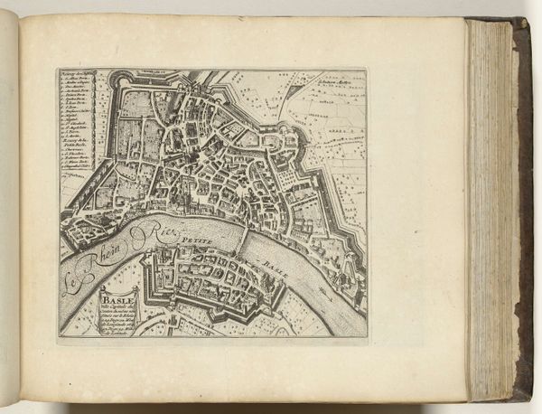
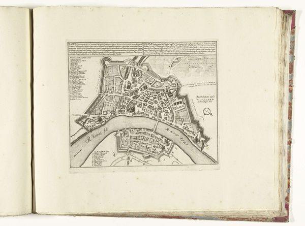
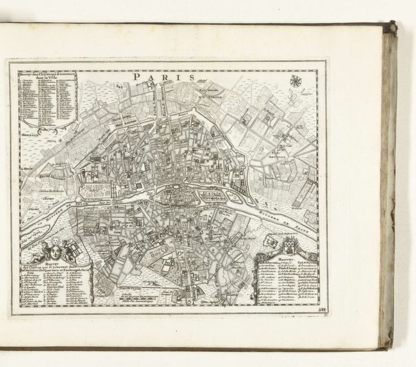
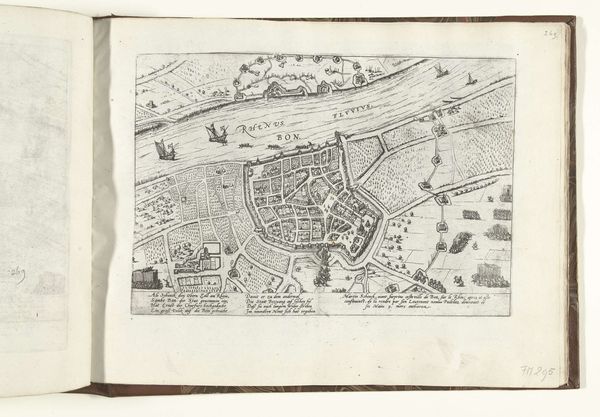
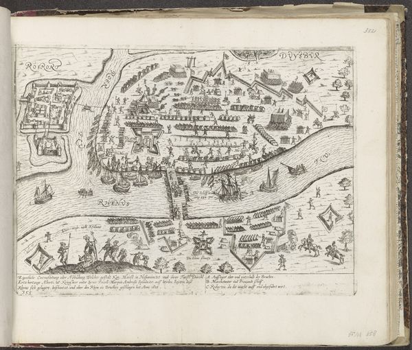
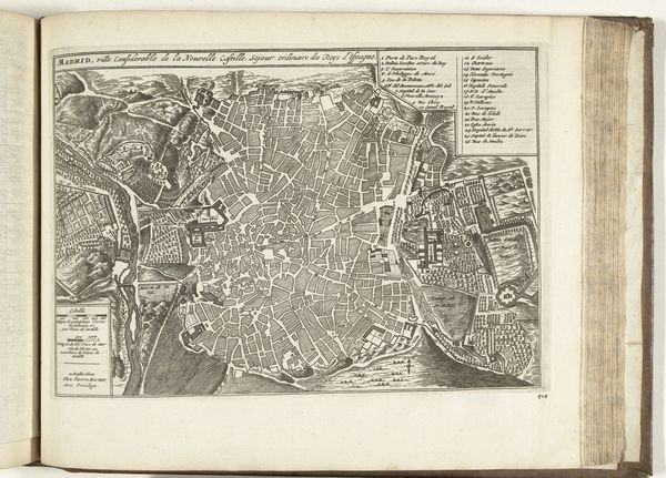
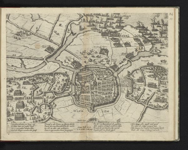
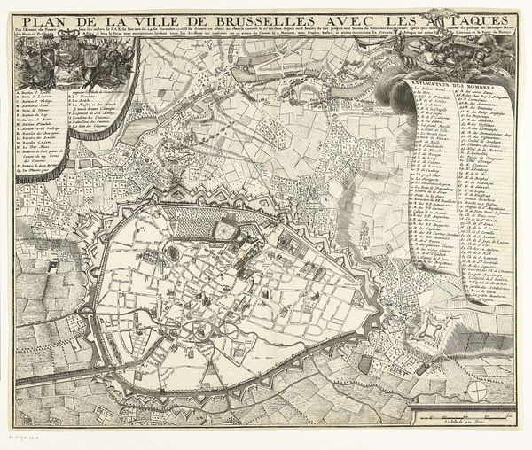
Editor: Here we have an intriguing piece: a 1726 print titled "Plattegrond van Basel" from the Rijksmuseum, created by an anonymous artist. The print's aged paper and baroque style give it a distinct old-world charm. How do you interpret its visual language, especially considering its geometric and landscape elements? Curator: Indeed, the visual grammar here is quite compelling. Observe how the rigorous lines and geometric shapes constitute a structured, almost architectural order. This speaks to the period's preoccupation with rationalism. What effect do you think the contrast between the contained, geometric city and the open landscape beyond its walls creates? Editor: It highlights the city’s defined structure versus the organic world outside, perhaps suggesting a tension or boundary. What I also find intriguing is how the varying line weights affect the legibility of the composition. Curator: Precisely. Note the contrasting pen work; this serves a structural function. Finer lines define individual buildings, while bolder lines delineate fortifications and the river. Do you think that tonal variation impacts how the artist establishes spatial relationships within the pictorial space? Editor: Absolutely. The subtle shading creates depth, especially along the river and the city walls. So, beyond pure documentation, the artist is also concerned with spatial dynamics and the balance between detail and overall composition. Curator: A vital observation. What is the overriding impression made through an analysis of the graphic composition? Editor: I see now that its formal language reinforces themes of order and containment. It is not just a map, but also a constructed visual statement. Thank you! Curator: An incisive assessment. My pleasure.
Comments
No comments
Be the first to comment and join the conversation on the ultimate creative platform.
