Lettres cabalistiques, ou, Correspondance philosophique, historique & critique, entre deux cabalistes, divers esprits elementaires, & le seigneur Astaroth 1741
0:00
0:00
gold, embossing
#
decorative element
#
book
#
gold
#
decorative
#
embossing
#
embossed
#
decorative-art
#
decorative art
#
foil embossing
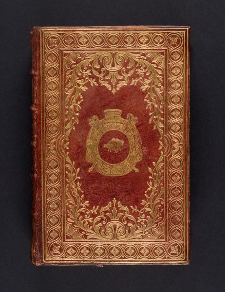
Dimensions: 6 volumes: illustrations, portraits; Height: 6 5/16 in. (16 cm)
Copyright: Public Domain
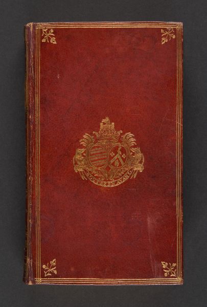
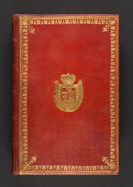
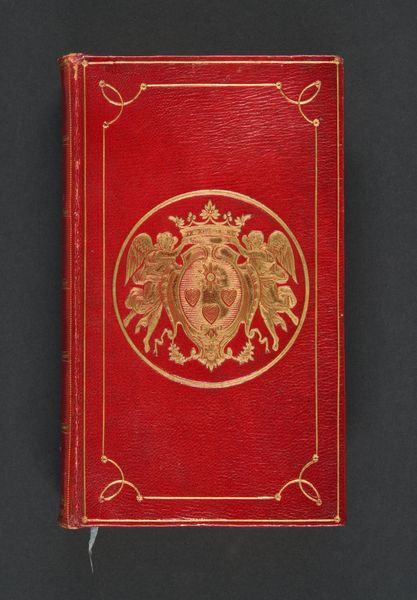
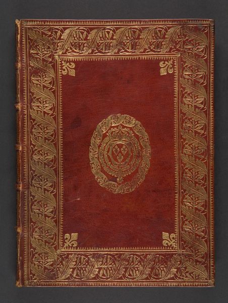
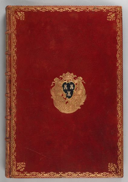
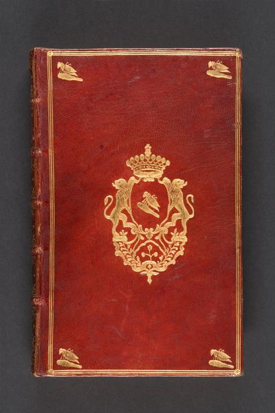
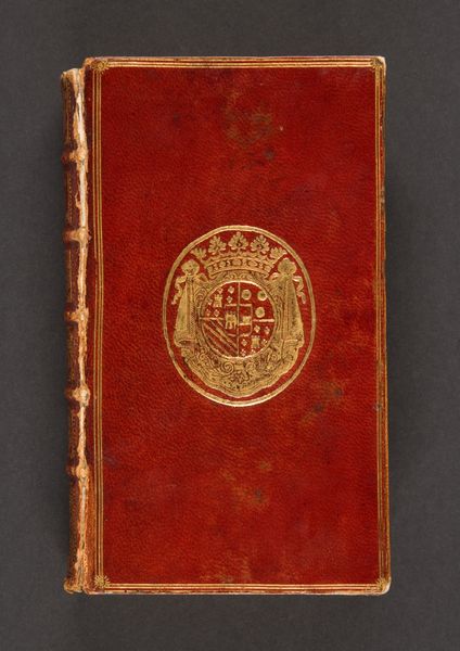
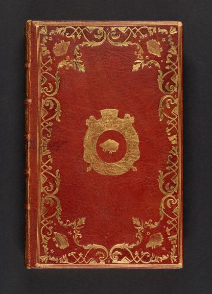
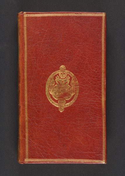
Curator: Today, we’re examining a remarkable volume entitled "Lettres cabalistiques, ou, Correspondance philosophique, historique & critique, entre deux cabalistes, divers esprits elementaires, & le seigneur Astaroth," created in 1741 by Jean Baptiste de Boyer, marquis d’Argens. It’s currently housed at the Metropolitan Museum of Art. Editor: The rich red of the binding, combined with the shimmer of the gold embossing, immediately creates a sense of restrained opulence. The craftsmanship speaks of a bygone era, a kind of gilded intellectualism. Curator: Indeed. Notice the intricate foil embossing. The binding's decoration utilizes this delicate process which applies a thin layer of gold leaf to the surface, adhering to a meticulous design. Editor: The central emblem is striking. A double-headed eagle motif surmounted by a crown, all encircled within an ornate oval. These heraldic symbols seem steeped in coded messages of power and esoteric knowledge. What can you tell us about them? Curator: These sorts of details represent established aristocratic motifs blended with the rising interest in occult practices in the 18th Century. The double-headed eagle, especially when coupled with that crown, suggests an embrace of complex and powerful ideas, potentially linking to lineage and possibly empire. Editor: The floral design around the edge has the effect of containing the content and design, an approach which further underscores its inherent preciousness. The book’s tactile and visual elements were designed to invite close examination, right? Curator: Precisely. These sorts of design choices are hardly accidental. Note the attention to the negative space. This contributes to the visual clarity while also making this beautiful binding seem much more striking. Editor: Seeing it through a semiotic lens, I find the volume's materiality to be as essential as its text. The cover isn't just protective but becomes an integral component of the message; an invitation to dive into esoteric discourses and historical reflection. Curator: Your focus makes me consider how these formal qualities speak to the original audience's perception of knowledge as something rare and deliberately ornate. A stark contrast with the democratization of information we experience today. Editor: And that ornate language of symbols, carefully embossed, truly reveals that persistent human desire to decipher our place in a world imbued with mystery.
Comments
No comments
Be the first to comment and join the conversation on the ultimate creative platform.
More like this