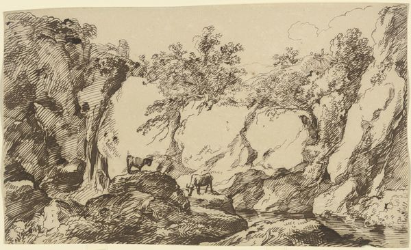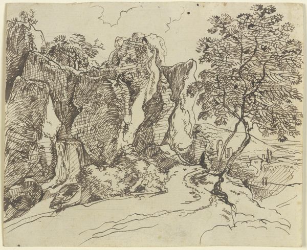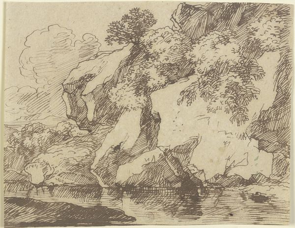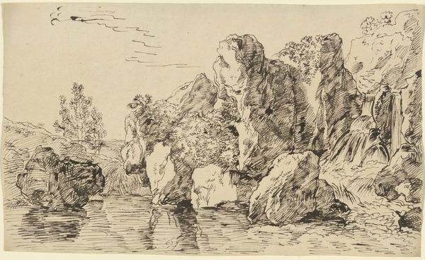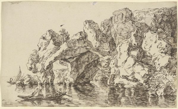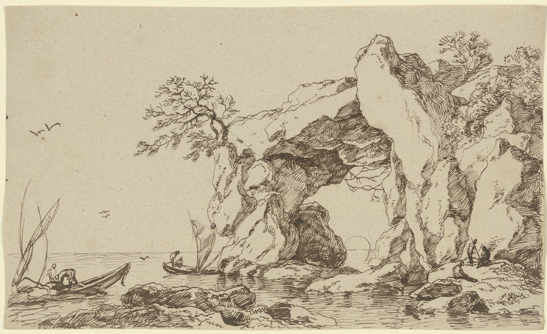
Felsentor an der Meeresküste mit Fischerbooten
Listen to curator's interpretation
Curatorial notes
Editor: Here we have "Felsentor an der Meeresküste mit Fischerbooten" - or "Rock Gate on the Seacoast with Fishing Boats" - an ink drawing by Franz Kobell, currently at the Städel Museum. I’m struck by the intricate linework; it almost feels like peering through a tangle of branches. What stands out to you in this composition? Curator: Indeed, the density of the line is quite remarkable. Notice how the artist uses hatching and cross-hatching not merely to delineate form, but to build tonal variations. This manipulation of light and shadow creates depth. The rugged rock formation is brought to the foreground and the figures are rendered as secondary. What do you make of that visual choice? Editor: That's a great point, it emphasizes the grandeur of nature over the human element. I hadn’t really considered that. So the boats and figures aren’t the subject, they’re just…accents? Curator: Perhaps. Consider, though, how Kobell frames the distant horizon line through the archway of the rock. It invites the viewer's eye into the distance, almost mocking the seascape scene. Where the artist focuses on minute visual effects, the subject acts to direct the audience to continue observation. Editor: It’s almost like the landscape itself is an actor. I suppose I focused too much on what was 'drawn' rather than *how* it was drawn. Curator: Precisely. The drawing's strengths are rooted in how it presents structural forms through considered manipulation of shade. I appreciate how Kobell manages to merge detail and dramatic tone using only ink on paper. Editor: I’ll definitely be paying closer attention to how artists use line and shading in the future. There’s so much to learn from a single drawing when you focus on those qualities.