drawing, ink
#
drawing
#
landscape
#
ink
#
romanticism
#
15_18th-century
Copyright: Public Domain
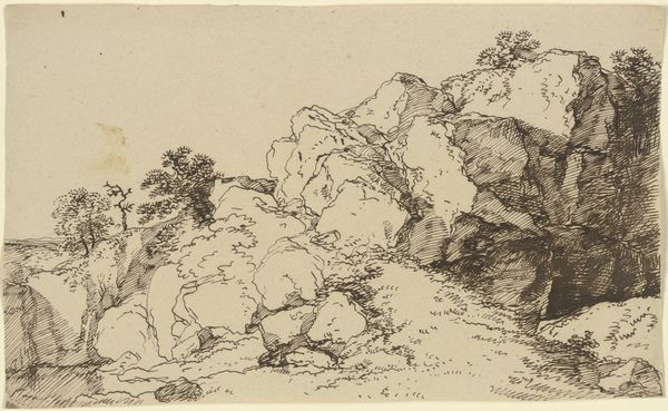
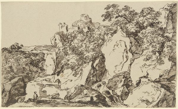
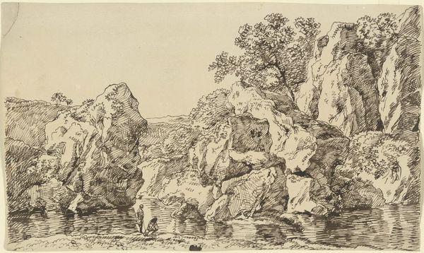
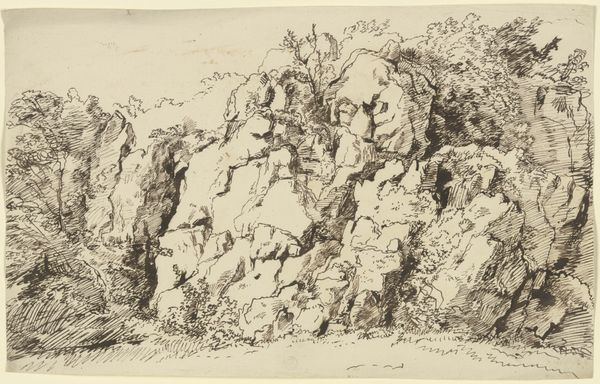
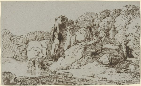
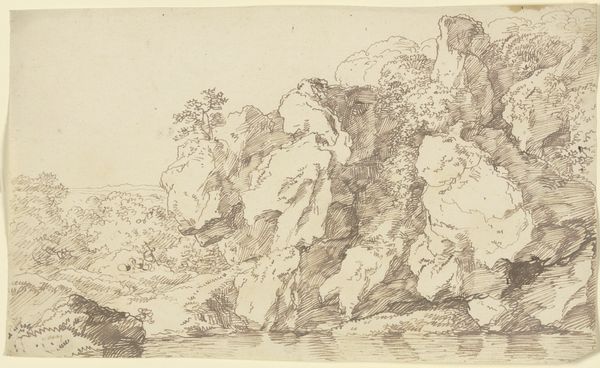
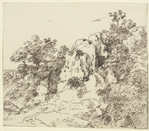
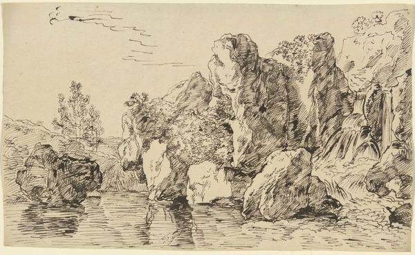
Curator: Here we have a landscape drawing by Franz Kobell titled "Precipice," rendered in ink. It appears to be a work from the 18th century, now residing here at the Städel Museum. Editor: "Precipice" pretty much nails it! Looking at it, I get a visceral sense of vertigo, as if teetering right on the edge. It is really impressive the artist gets that feeling across using what appears to be very little shading, giving it a haunting feeling. Curator: Indeed, Kobell's drawing employs stark contrasts, a stylistic calling card of the Romantic period. We see how dramatic use of light and shadow heighten the drama of this rocky scene. The drawing encourages us to feel a certain unease when confronted with untamed natural forces. Editor: There is almost an unfinished, urgent feel to the piece, like a snapshot of a dreamscape. I find it fascinating how the precision of the lines carves out such massive, rugged shapes from something as seemingly light as ink on paper. Did Kobell do much landscape art? Curator: He was known for it, yes. Kobell moved among intellectual and artistic circles who found aesthetic and spiritual significance in wild natural spaces. His landscapes reflect a broader 18th-century fascination with picturesque scenes, and were appreciated by upper middle class citizens for whom drawings or paintings offered opportunities for travel through imaginary places. Editor: I keep thinking of stage design. This has the rough, evocative quality of an unfinished background, hinting at deeper narratives or dramatic happenings right outside the frame. Do you get a sense of anything else happening just beyond the 'precipice'? Curator: Certainly, the sublime was the idea of capturing and staging feelings about moments, events, and objects of the past, nature included. What sets Kobell apart for me is his use of stark compositional elements and drawing that foregrounds what we might today call "negative space," which imbues a unique sense of the unknown or obscure into something recognizable. Editor: Right. I see how he coaxes such presence and weight out of seemingly minimal marks and shading; less can definitely be more. Thank you, I did enjoy looking at how it makes us reframe those initial moments and feelings from his art. Curator: An incisive comment, thanks. Now you'll leave us better equipped for what comes next.
Comments
No comments
Be the first to comment and join the conversation on the ultimate creative platform.
More like this