About this artwork
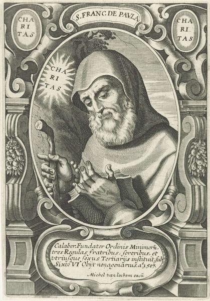
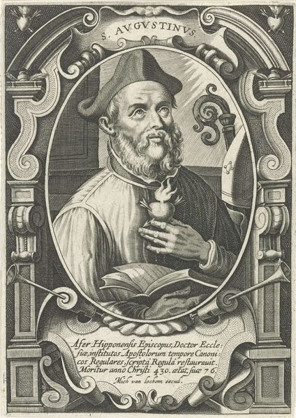
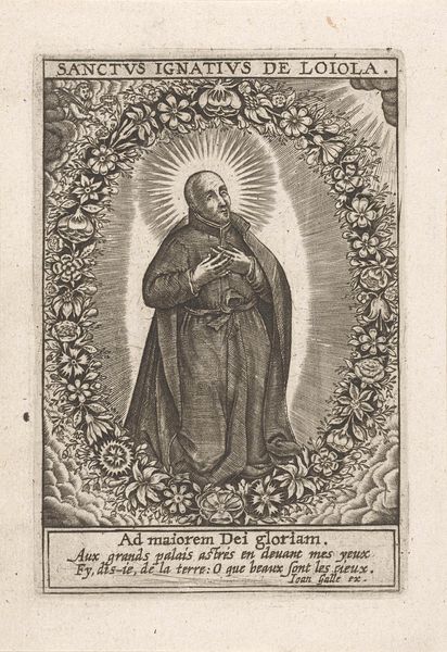
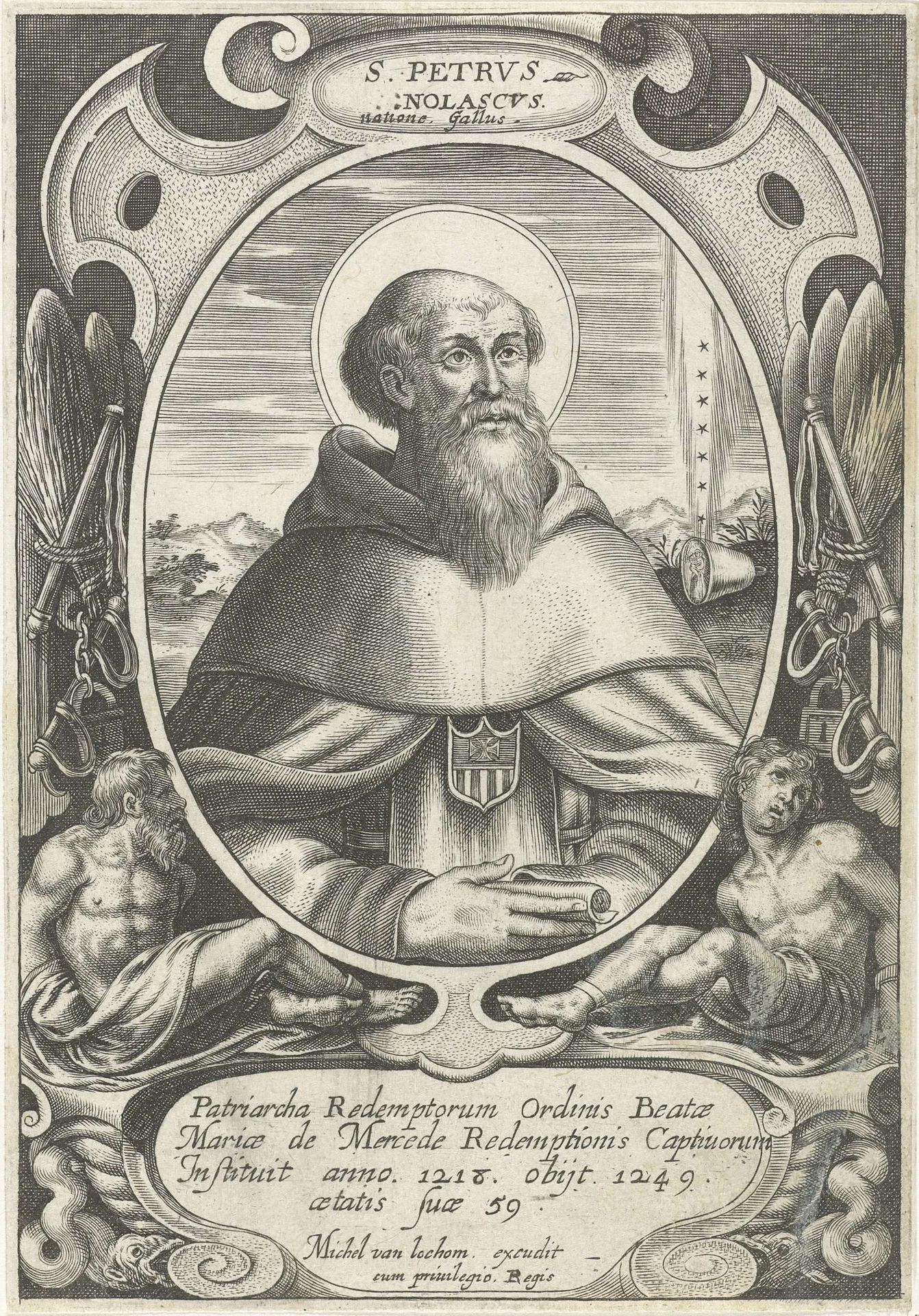
Editor: This is a print of "Portret van H. Petrus Nolasco" by Michel van Lochom, made sometime between 1611 and 1647. The detail in the engraving is striking, especially given its relatively small scale. What do you see as the most compelling aspects of its composition? Curator: The dominant feature, immediately, is the use of line. Notice how the artist uses variations in the thickness and density of lines to create a sense of depth and texture. This is particularly evident in the rendering of the robes and the face of Saint Peter Nolasco. The overall symmetry provides a rigid frame for the central subject matter, wouldn’t you agree? Editor: Yes, absolutely. It’s almost like a carefully constructed stage. How does this affect our interpretation of the artwork? Curator: The symmetry reinforces a sense of order and hierarchy. The central figure, framed by the oval border, occupies the primary visual plane, immediately drawing the viewer’s attention. It's a masterful deployment of semiotics and structuralist visual syntax. Notice, too, the positioning of figures; all presented to support the gaze towards the Saint. What statement can you decipher? Editor: It's interesting to consider the framework of the figures. Also, there is the inclusion of the chain that recurs through the overall presentation of the image; but ultimately there is a return to St. Petrus himself. He is serene. Curator: Precisely! That return – to the focused gaze and to the linear construction of the whole. It’s quite remarkable how the artist manages to convey so much with such restrained means. Editor: I never thought of looking at it that way. I was so caught up in trying to figure out who St. Petrus was and why he was portrayed that way. Now, looking at its composition, I see a controlled image directing you towards his grace. Curator: A semiotic journey through ink! Every carefully placed stroke contributes to the overarching effect.
Artwork details
- Medium
- print, pen, engraving
- Dimensions
- height 152 mm, width 106 mm
- Copyright
- Rijks Museum: Open Domain
Tags
Comments
Share your thoughts
About this artwork
Editor: This is a print of "Portret van H. Petrus Nolasco" by Michel van Lochom, made sometime between 1611 and 1647. The detail in the engraving is striking, especially given its relatively small scale. What do you see as the most compelling aspects of its composition? Curator: The dominant feature, immediately, is the use of line. Notice how the artist uses variations in the thickness and density of lines to create a sense of depth and texture. This is particularly evident in the rendering of the robes and the face of Saint Peter Nolasco. The overall symmetry provides a rigid frame for the central subject matter, wouldn’t you agree? Editor: Yes, absolutely. It’s almost like a carefully constructed stage. How does this affect our interpretation of the artwork? Curator: The symmetry reinforces a sense of order and hierarchy. The central figure, framed by the oval border, occupies the primary visual plane, immediately drawing the viewer’s attention. It's a masterful deployment of semiotics and structuralist visual syntax. Notice, too, the positioning of figures; all presented to support the gaze towards the Saint. What statement can you decipher? Editor: It's interesting to consider the framework of the figures. Also, there is the inclusion of the chain that recurs through the overall presentation of the image; but ultimately there is a return to St. Petrus himself. He is serene. Curator: Precisely! That return – to the focused gaze and to the linear construction of the whole. It’s quite remarkable how the artist manages to convey so much with such restrained means. Editor: I never thought of looking at it that way. I was so caught up in trying to figure out who St. Petrus was and why he was portrayed that way. Now, looking at its composition, I see a controlled image directing you towards his grace. Curator: A semiotic journey through ink! Every carefully placed stroke contributes to the overarching effect.
Comments
Share your thoughts