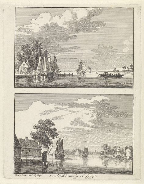
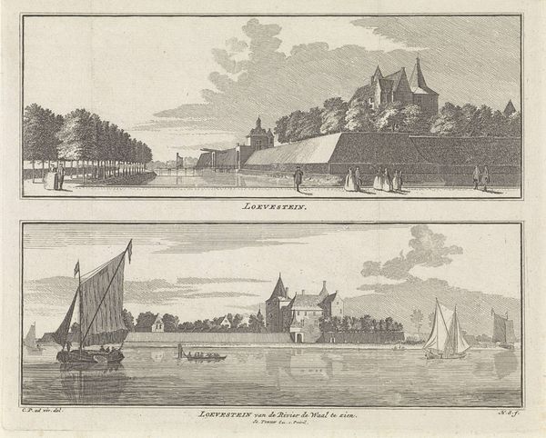
Gezicht op de vesting en gezicht op het gouvernement en de hoofdwacht, te Stevensweert, 1740 1746 - 1792
0:00
0:00
hendrikspilman
Rijksmuseum
Dimensions: height 167 mm, width 109 mm
Copyright: Rijks Museum: Open Domain
Editor: Here we have Hendrik Spilman's "Gezicht op de vesting en gezicht op het gouvernement en de hoofdwacht, te Stevensweert, 1740," dating sometime between 1746 and 1792. It's a drawing, engraving and print, now residing in the Rijksmuseum. The dual composition and delicate lines evoke a sense of peaceful observation, but it's difficult for me to grasp its formal intention beyond being representational. What do you see in this piece, focusing on its visual elements? Curator: The most striking formal feature is the bifurcated composition itself, separated horizontally. Observe how Spilman employs contrasting techniques within this structure. In the upper register, we see a distant, panoramic view rendered with delicate, almost atmospheric engraving, focusing on tonal gradations and implied depth. By contrast, the lower scene uses more assertive, linear engraving to define architectural forms and foreground details. Consider how this division impacts the overall reading; what effect does this arrangement create? Editor: It's interesting you point that out. I notice how the upper scene is looser and feels more expansive, whereas the lower scene feels grounded and precise. It almost feels like two separate studies placed together on one page. But what purpose would this serve, technically? Curator: Precisely. The duality prompts a comparative analysis. Note the repetition of vertical elements – the church tower in the lower panel mirrors, in a less defined manner, the architectural presence in the upper view. Also, notice the use of framing—trees in the foreground in the bottom half frame the space while clouds add framing in the top half, focusing our eye to the city beyond. Now, what about the light? Where is it, and how does the composition drive you to notice it? Editor: You’re right; the composition does subtly point to the interplay between clarity and ambiguity. The lower half does seem to have a direct light source hitting it, providing strong detail. I can almost trace where the light should be coming from! The light source for the top one is a lot harder to pinpoint, making that skyline fade into the distance more naturally. I see it now: the contrast pushes me to see two approaches on the same subject. Curator: Exactly. By examining the structural devices and the deliberate contrasts in technique and composition, we reveal Spilman's artistic approach. Editor: Thanks. Thinking about the framing of this piece, I now feel like my initial reaction was a bit superficial, only understanding the drawing at face value. There are nuances to its formal qualities I appreciate. Curator: And that's precisely what a formalist lens can help uncover—a deeper understanding of how visual language conveys meaning.
Comments
No comments
Be the first to comment and join the conversation on the ultimate creative platform.
More like this