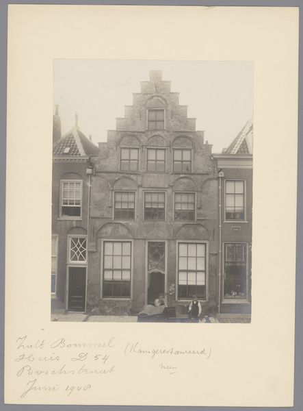
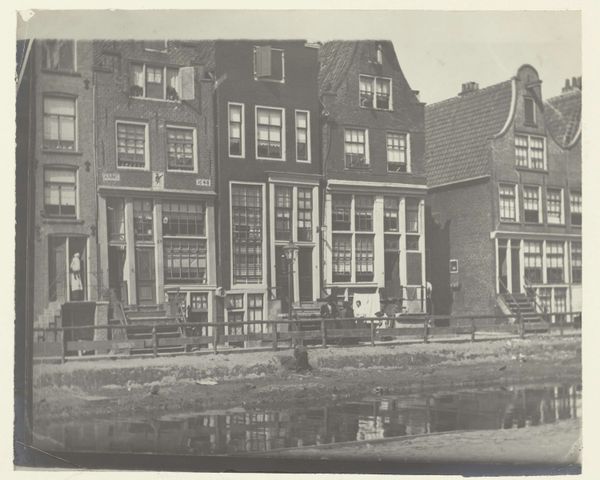
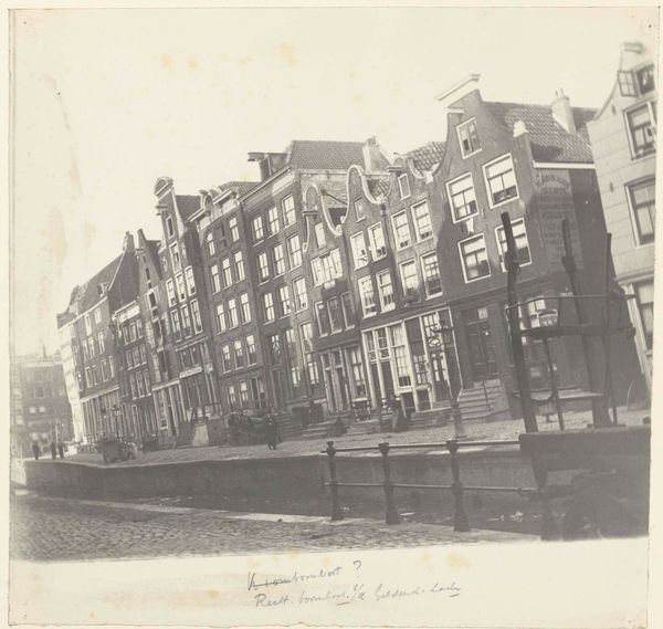
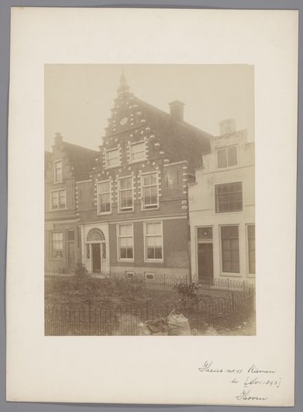
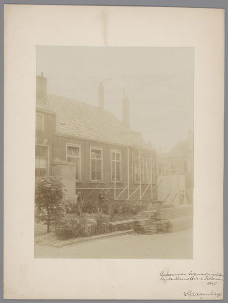
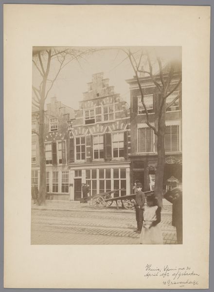
Gezicht op huizen aan de Rechtboomsloot in Amsterdam 1886 - 1910
0:00
0:00
georgehendrikbreitner
Rijksmuseum
photography, gelatin-silver-print
#
dutch-golden-age
#
street-photography
#
photography
#
gelatin-silver-print
#
cityscape
#
street
Dimensions: height 318 mm, width 367 mm, height 408 mm, width 448 mm
Copyright: Rijks Museum: Open Domain
Editor: This gelatin silver print, “Gezicht op huizen aan de Rechtboomsloot in Amsterdam,” was captured by George Hendrik Breitner sometime between 1886 and 1910. I find the composition so striking, the way the facades are presented head-on. What stands out to you in terms of its formal qualities? Curator: Indeed, the frontal composition is key. Notice how Breitner manipulates the flatness inherent in the photographic medium. The varying heights of the houses create a rhythmic structure, yet the subdued tones and consistent lighting flatten the scene, emphasizing surface over depth. Semiotically, what does this calculated shallowness evoke? Editor: I suppose it distances the viewer, makes them an observer rather than an inhabitant of the scene? What about the variations in the architectural details? Curator: Precisely. Each house front presents a unique configuration of windows, ornamentation, and rooflines, offering a visual language. This articulation resists pure uniformity. The photograph documents reality, but also organizes it into a constructed image, mediated through choices about viewpoint, focus, and tonality. Consider also the gelatin silver print, which grants specific qualities of sharpness, grayscale, and fine detail. How does Breitner harness it? Editor: You're right, there's a striking clarity despite the subdued tones. It allows you to study the minute architectural details. I had been so focused on the subject that I hadn’t fully appreciated how the medium itself shapes our perception. Curator: An artist's true genius lies in wielding formal constraints to construct layered significance, isn’t it? We should never disregard the intentional manipulation of form over simple representation. Editor: Thanks, that definitely gives me a new perspective on appreciating Breitner’s work.
Comments
No comments
Be the first to comment and join the conversation on the ultimate creative platform.
More like this