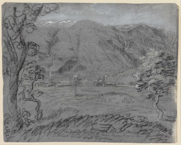
drawing, impasto, pencil, frottage
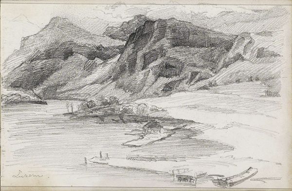
drawing
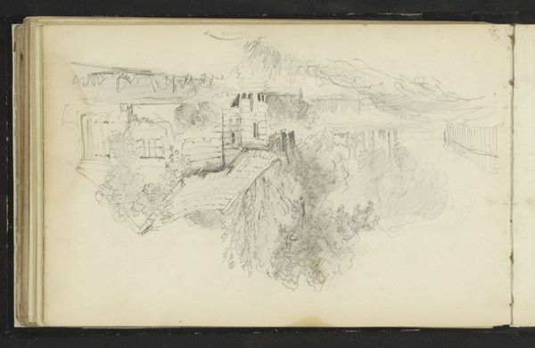
pencil sketch
landscape
impasto
coloured pencil
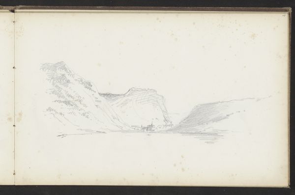
pencil
frottage
realism
Copyright: Rijks Museum: Open Domain
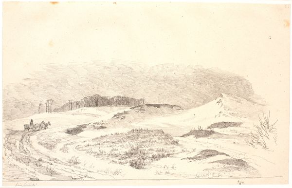
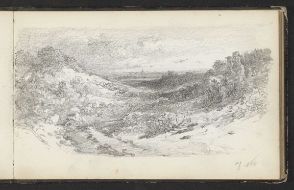
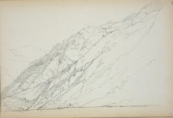
Editor: This drawing, "Duinlandschap met figuren," by Willem Bastiaan Tholen, probably created between 1870 and 1931, offers a rather stark view in pencil. It's a simple scene, but something about the starkness of the lines against the open space feels lonely. What strikes you most about this piece? Curator: I am immediately drawn to the artist's confident handling of line and form. Note the interplay between the dense, almost chaotic, hatching used to depict the dunes and the relatively spare treatment of the sky. Consider, too, the rhythmic distribution of the figures, leading the eye through the composition. The very contrast establishes a dialectic, where we’re led to inquire about how exactly each of these aesthetic aspects operates and interrelates. Editor: I see what you mean. It’s less about what is depicted, and more about how it’s depicted. I hadn't noticed how the figures really punctuate the space. Is there a structural element in that balance? Curator: Precisely. Think of semiotics; the figures serve almost as visual markers. Their placement establishes a field of vision and relational coordinates. Tholen presents to us not simply a landscape but a carefully constructed system of visual cues. Consider the relationship between line and form; does one dominate? Or is Tholen searching for an expressive relationship, a harmonic effect? Editor: So, it's about dissecting those elements, seeing how they function alone and together, almost like a language? I think I’m beginning to see the composition more analytically now, less about feeling and more about structure. Thanks! Curator: Exactly. Paying attention to the way these visual strategies correlate yields the rich essence that gives meaning to our visual experience.
Comments
No comments
Be the first to comment and join the conversation on the ultimate creative platform.